Posts Tagged: 'making+ij+pretty'

Oct. 27th, 2011


[info]aclonetraveller
[info]sabra_la_ooc

[info]aclonetraveller
[info]sabra_la_ooc

[No Subject]


[info]aclonetraveller
[info]sabra_la_ooc
I WAS USING MY DOCTOR JOURNAL FOR TESTING AND AM TOO LAZY TO LOG OUT--

Hi, everyone. This is Jeva aka Izaya/Kaito/Kurono, bringing you a new, bright, and shiny layout for our newest of new teams Apus!


Thanks again to people who made the codes originally because I'm really just plugging in colors and such. Herp.

Part 1: INSTRUCTIONS + Vulpecula, Hydra, Delphinus, Pavo, Cepheus
Part 2: Lepus, Cygnus, Pyxis, Canis, Lacerta
Part 3: Monoceros, Orion, Ophiuchus (2 layouts)
Part 4: Corvus, Lynx
Part 5: Cetus, Ursa; revamped Canis, Orion, Monoceros, Lepus, Cepheus, and Lacerta

Feb. 15th, 2011


[info]aclonetraveller
[info]sabra_la_ooc

[info]aclonetraveller
[info]sabra_la_ooc

Laaayouts


[info]aclonetraveller
[info]sabra_la_ooc
Okay, so I've been bored and also OCD and whatever or something. SO. I went and updated layouts with the new partner team arrangements. Hopefully they all worked out nicely. I'm still working on making Cetus's layout LESS BLINDING but it's proving to be a challenge. Huderp.

But... let it be noted that I am not fab at layouts and you do not have to change yours. If you know ways to make layouts better, feel free to share!

In the meantime, have at:
I AM NOT COOL ENOUGH TO GIVE YOU SAMPLES. SOB. also print screen function went kaput. idek. CAN HAS SAMPLES.

Ursa, Canis, Cetus, Orion
Monoceros, Lepus, Cepheus, and Lacerta

HA! Victory is mine! See also:

Cetus Layout version LESS BLINDING )


Original posts as followed (thanks to people for the layouts, I borrowed codes :> ♥):

Part 1: INSTRUCTIONS + Vulpecula, Hydra, Delphinus, Pavo, Cepheus
Part 2: Lepus, Cygnus, Pyxis, Canis, Lacerta
Part 3: Monoceros, Orion, Ophiuchus (2 layouts)
Part 4: Corvus, Lynx

Jul. 5th, 2010


[info]hidebehindthe
[info]sabra_la_ooc

[info]hidebehindthe
[info]sabra_la_ooc

SLT Layout Collection Posts [part 4]


[info]hidebehindthe
[info]sabra_la_ooc
Yaaaay new teams /o/ and that means new layouts for new teams \o\ which means I shamelessly steal formatting from Link's older posts \o/


Part 1: INSTRUCTIONS + Vulpecula, Hydra, Delphinus, Pavo, Cepheus
Part 2: Lepus, Cygnus, Pyxis, Canis, Lacerta
Part 3: Monoceros, Orion, Ophiuchus (2 layouts)

This Post: Corvus | Lynx

wheeeee layouts )

For any freshmeats Sabra gets, you're under no obligation to use any of these layouts :|d just something nice to have if you want 'em. I also HIGHLY ENCOURAGE you to check out what else is under the making ij pretty tag because ew Times New Roman and that Tweak thing :x

Oct. 27th, 2009


[info]our_only_goal
[info]sabra_la_ooc

[info]our_only_goal
[info]sabra_la_ooc

[Making IJ Prettier] minimal deTweak


[info]our_only_goal
[info]sabra_la_ooc
Okay, I swear I'm pretty much done after this. I think a lot of you have already seen the helpful IJ prettifier post with all the links to junk.

Just an intro on the topic )


SO ANYWAY, I MADE A STYLISH SCRIPT THAT INCORPORATES BOTH INTO ONE.
I call it InsaneJournal Minimal DeTweaker :|aa

The Pros:
- It has both in one, nuking all Tweaks in one go
- Leaves the text link to InsaneJournal at the top of the page, but hides the "Tweak Says" and the big Tweak face.
- This makes it so you don't need adblock to get rid of Tweak, so if you don't mind banner ads you can support IJ a bit without a paid account??

The Cons:
- I only know how to make it for Stylish.
- :|a Installing it is slightly more effort than just clicking a button

Stand by for copy-pasta of directions and the new Stylish code )

And just to be clear, you don't need to delete any of the styles you've already added, just check and uncheck them from the menu depending if you want to use them or not.


If you like personalizing and don't mind simple code, or just don't want to take up other people's bandwidth, you can upload your own 16px by 16px icons somewhere and replace the url of the pics in the code with your own.

Just ctrl+f ij_userinfo.gif and ij_community.gif to find the line you need to replace.

[info]vaticanpieninja
[info]sabra_la_ooc

[info]vaticanpieninja
[info]sabra_la_ooc

[Making IJ Pretty] favicons


[info]vaticanpieninja
[info]sabra_la_ooc
<-- lolo, used in conjunction with that Greasemonkey script that changes the favicons on your tabs. It works something like in
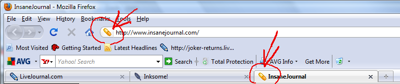
 this screenshot.

I had trouble figuring out how to get the icon I wanted to show up, so I'll spell it out here for people who haven't tried it yet but want to.


cut for directions )

Oct. 23rd, 2009


[info]vaticanpieninja
[info]sabra_la_ooc

[info]vaticanpieninja
[info]sabra_la_ooc

Default-page Fonts


[info]vaticanpieninja
[info]sabra_la_ooc
Edited the Changing IJ Default Fonts code for Stylish again, this time to make the text in the icon browser less huge.

The following code is the same as in the post I linked above, but this gives you instructions for how to edit if you've used it already, while the other is for people who haven't added it yet.

To Edit What You Have
- Click the Stylish icon in the bottom right of your window
- Click "Manage styles..." from the menu that pops up
- Click the name of the style you want to edit and hit the "Edit" button
- Then in the text box, where it says "@namespace" etc etc, delete everything and copy-paste this next bit of code:

- Hit the "Save" button
- Voila! Should go into effect immediately.

Oct. 3rd, 2009


[info]analyze_that
[info]sabra_la_ooc

[info]analyze_that
[info]sabra_la_ooc

sidebar table code


[info]analyze_that
[info]sabra_la_ooc
Example:


Code:
<center><table><tr><td bgcolor="#unitcolor"><center><a href="http://journalname.insanejournal.com"><img src="http://#" alt="" border="0" /></a><br><div style='display:inline; font-size:8pt; text-align:center;'><a href="http://tinyurl.com/sltsideb/tagname">name1<br>(name2)</a></center></div></td></center>

Paste into one of the free text boxes on the Customize Journal page! DON'T HIT ENTER: copy and paste the <td>s next to each other without spaces for multiple characters, and use &br;td>s for where you'd normally hit enter. IJ seems to hate line breaks in tables for layout stuff.

Sep. 26th, 2009


[info]vaticanpieninja
[info]sabra_la_ooc

[info]vaticanpieninja
[info]sabra_la_ooc

SLT Layout Collection Post [part 3]


[info]vaticanpieninja
[info]sabra_la_ooc
First Post: INSTRUCTIONS + Vulpecula, Hydra, Delphinus, Pavo, Cepheus
Second Post: Lepus, Cygnus, Pyxis, Canis, Lacerta

This Post: Monoceros | Orion | Ophiuchus (2 layouts)

Last layouts of this set )


REMEMBER:
- Header images are 190px tall and aligned right.
- The width is up to you
- The header pic should only touch the top or bottom edges, leave a bit of room on the sides
- If you want to change the header, keep those points above in mind
- ctrl+F "topimg" to find the correct image url and replace it with the url of your own uploaded header image to change it.

Alternate Headers )

Sep. 25th, 2009


[info]vaticanpieninja
[info]sabra_la_ooc

[info]vaticanpieninja
[info]sabra_la_ooc

SLT Layout Collection Post [part 2]


[info]vaticanpieninja
[info]sabra_la_ooc
Post got too big. See previous post for instructions and Vulpecula, Hydra, Delphinus, Pavo, and Cepheus layouts.

Watch this space for
Lepus | Cygnus | Pyxis | Canis | Lacerta

Moar layouts under the cut )

Maxed out another post. Proceed to the next one for the last three layouts.

[info]vaticanpieninja
[info]sabra_la_ooc

[info]vaticanpieninja
[info]sabra_la_ooc

SLT Layout Collection Post


[info]vaticanpieninja
[info]sabra_la_ooc
Some adjustments were made to previously posted layouts. Copy-paste the new css if you like.

INSTRUCTIONS, pretty much the same as before )


Keep an eye on this post. I will update with new layouts as I finish them.
Vulpecula | Hydra | Delphinus | Pavo | Cepheus

Layouts are here o/ )

Post got too big. See next post for more layouts.

Sep. 24th, 2009


[info]our_only_goal
[info]sabra_la_ooc

[info]our_only_goal
[info]sabra_la_ooc

FIRST OF.. TWELVE (maybe) LAYOUTS


[info]our_only_goal
[info]sabra_la_ooc
[info]our_only_goal <-- layout complete!

I'll explain how to do it in a bit. IF YOU KNOW HOW TO USE THIS, YOU CAN DO IT NOW.

ALSO THERE'S A COLOR KEY AT THE TOP FOR PEOPLE IF THEY WANT TO CHANGE STUFF. I think I got everything. The header image is 190px tall; width doesn't matter o/. ctrl+F "topimg" to find the header image url if you want to replace it.

ETA: Now with actual instructions )

WHAT THESE LAYOUTS HAVE:
- Sticky Note posts look fine
- Can use any of the column options

WHAT THESE DO NOT HAVE:
- Custom comment pages (plz to disable)
- The ability to make the subtitle go away on the friends page. \o/ MYSTERY. Either set the Journal Title and Friends Page title to the same thing or don't use the subtitle.

OH, also this! Another layout under the cut )

Sep. 21st, 2009


[info]our_only_goal
[info]sabra_la_ooc

[info]our_only_goal
[info]sabra_la_ooc

Moar making IJ prettier: FONTS


[info]our_only_goal
[info]sabra_la_ooc
SINCE I WAS FIDDLING AROUND ANYWAY: For people who don't like that IJ uses Times New Roman as the default font, here are two ways to fix it.

ONLY FOR FIREFOX

Method #1
- You don't need to install anything. Just go to Tools on your top menu > Options > Content, and change the default font.
- The Pros: no installation of anything needed.
- The Cons: font will be huge in size 16/15, and changing that will affect all other websites you look at, since it's a browser setting.


Method #2
- Install the Stylish Firefox add-on if you haven't already.
- Do all that restarting Firefox stuff so the add-on works

- Go to an InsaneJournal page (any will do) and click the "S" (like that but tiny) that appears in the bottom right of your browser.
- Click "Write New Style" from the menu that pops up, then "For insanejournal.com..."
- Next to "Name:" put whatever you want to name the style (I put "InsaneJournal Default Fonts")
- Then in the text box, where it says "@namespace" etc etc, delete everything and copy-paste this next bit of code:

- Hit the "Save" button
- Voila! Should go into effect immediately.

- The Pros: only affects IJ--and I made sure the font size is the same as LJ (at least I think it is)
- The Cons: much more fiddley than the first method

\o/ CROSSPOSTED FROM INKSOME