Just as a reminder, it's okay to post responses to prompts from previous weeks even if new prompts are already up. So if you have tried anything inspired by older prompts, please feel free to still post! Also, if you have any suggestions for drawing exercises and prompts, or comments/feedback on the ones I posted, please comment.
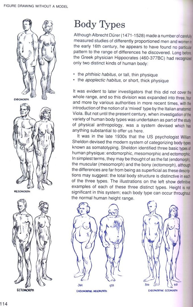
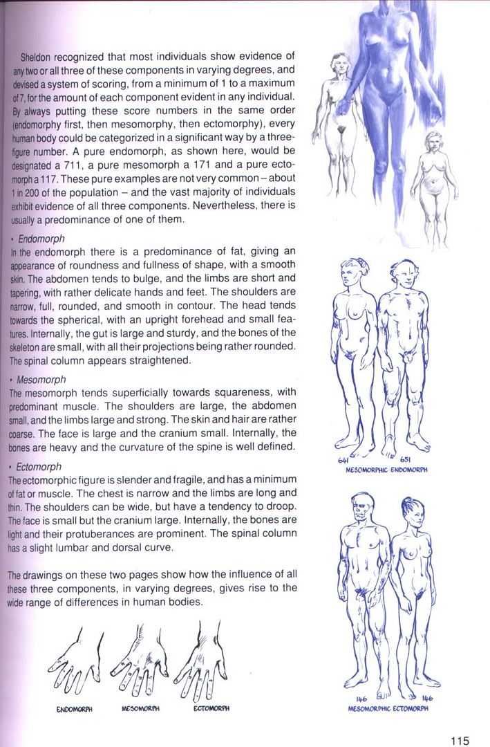
1. Drawing different human body types.While the standard "ideal proportions" approach to drawing anatomically correct humans is alright as a starting point, it does have the risk of all bodies one draws looking like the same default manikin. To avoid this trap, draw different body variations, that have real human proportions (not too exaggerated caricatures), but look visibly different from the "ideal human proportion" standard. As a starting point you can look at these two scans from Tiner's "Figure Drawing Without a Model" (
p. 114 /
p. 115) or at
this tutorial by Cedarseed.
As a side note: I do find it problematic when drawing books turn rather dubious (or at least highly controversial) "scientific" classification systems from the 19th/early 20th century into artistic tools without any reflection, for example the craniometry with its cephalic index (I didn't scan the pages applying those). Unfortunately that is a rather common practice. I mean, it doesn't bother me per se to read a chapter explaining about height/width characteristics of the human face and if they want use the terms "dolichocephalic", "mesocephalic" and "brachycephalic" for it, whatever -- but considering that Tiner's book was first published 1992, it bothered me a lot that from just reading those paragraphs you'd think it was it was just an "neutral" anthropological measuring and classification tool, not invented to be central for a multitude of more or less racist theories, which construed skull measurements into all kinds of things. The same goes for the fact that he uses William Sheldon's somatotypes system (that was the basis for his strange anthropometry psychology, with things like predicting criminals from their body types and such) without finding it problematic at all. It's not that I don't find the examples of body types somewhat useful (hence the scans), and while I find it mostly silly to call them "endomorphic mesomorph" and such, I wouldn't care about that and just appreciate it that in this book not all bodies look the same, if there was some brief reflection that these body types weren't meant to merely describe bodies, but that the system was created in a much more problematic context. Anyway, I just didn't want to let these terms go entirely unremarked.2. Trying different compositions.Sketch the same scene/motif in different compositions to see how the drawing and its effect change. Possible options for changes are the perspective, viewpoint, different crops (showing everything in an overview, just showing a part in a close up...), and so on, or different arrangements of the same picture elements, anything that results in different picture compositions (e.g. the motif being centered and static or seen in a way that creates lots of diagonals and angles giving a dynamic impression, different moods, etc.). The sketches could be just thumbnails, as long as the different picture compositions are still recognizable.
3. Drawing a fantasy animal.Create a fantasy animal, but one that could "work" in real life, or at least fakes "real" well enough to pass at first glance, i.e. base the fantastic elements on the common anatomy principles of real animals to make it work. If you aren't sure about the construction of animals, Cedarseed's tutorials (
basic animal anatomy and
drawing birds) cover the basics.
4. Foreshortening practice.Draw one or more bodies (or body parts, whatever you like) in such a way that you create the 3D illusion in the drawing through foreshortening. If you don't know how foreshortening works,
glockgal's tutorial is a good starting point.
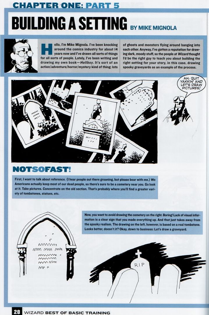
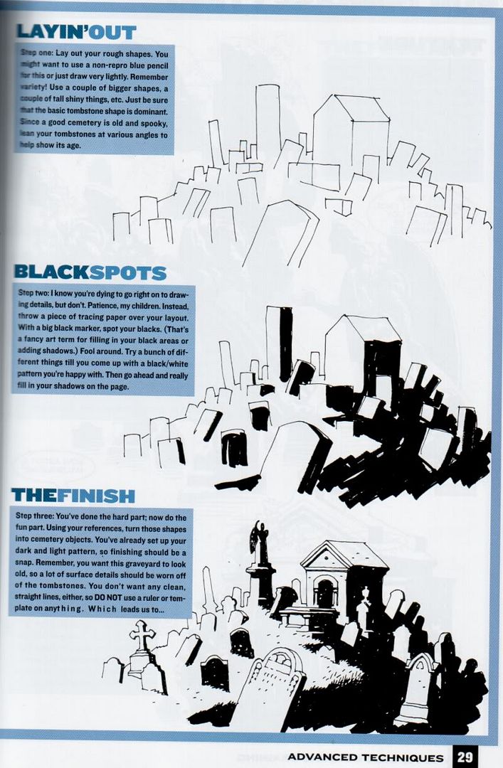
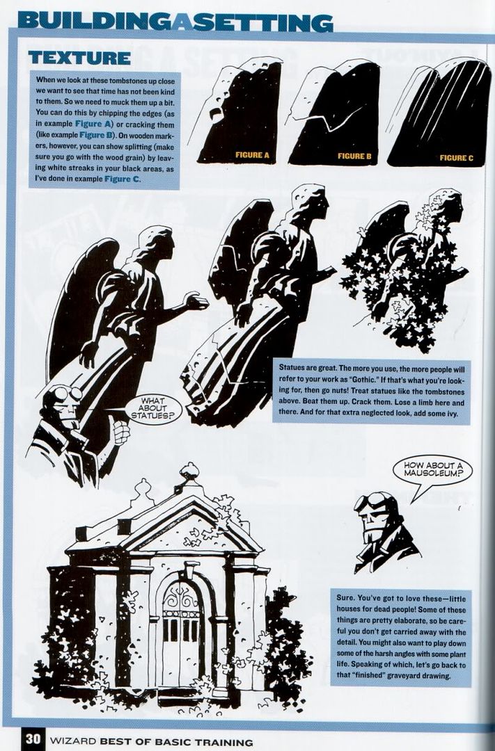
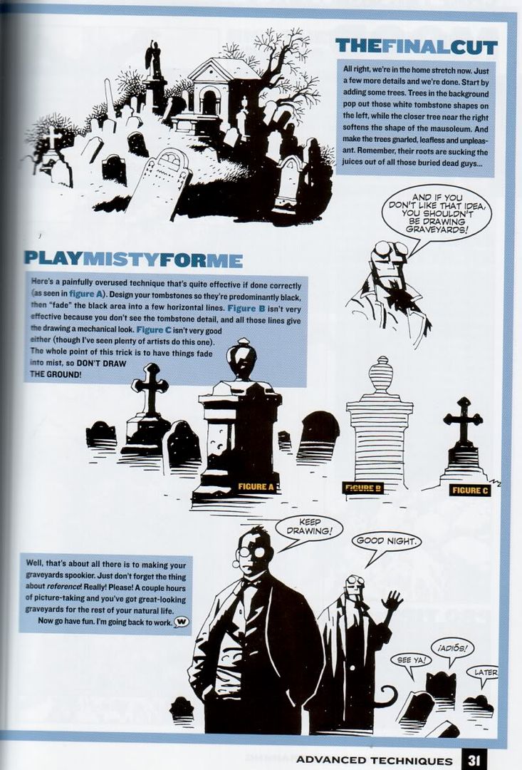
5. Spotting blacks.Draw an image with an interesting pattern of black areas and shadows, e.g. one that create a mood or works to guide the eye. This chapter by Mike Mignola illustrates how to distribute and use black effectively (
p. 28 /
p. 29 /
p. 30 /
p. 31).