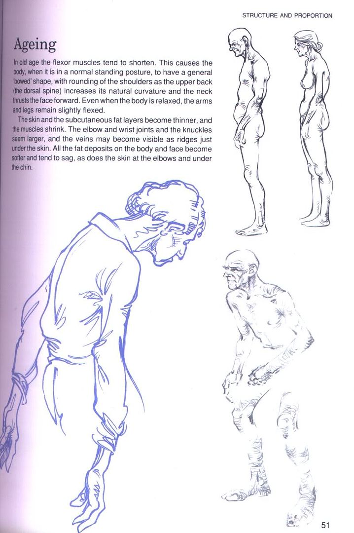
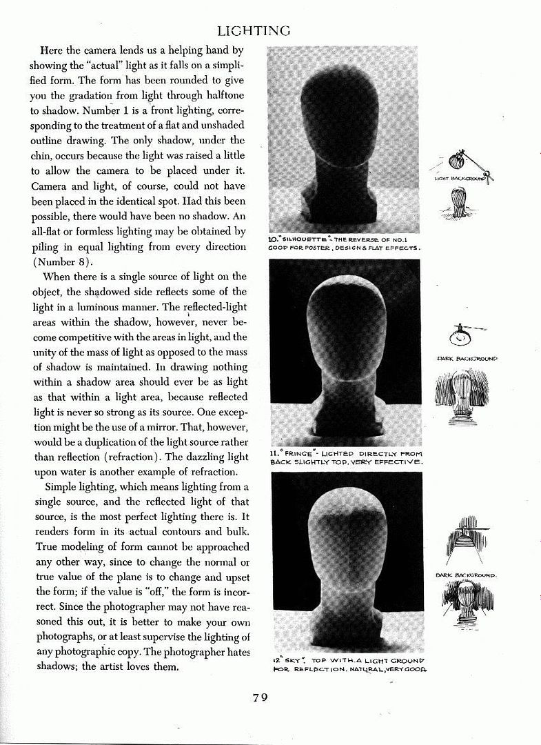
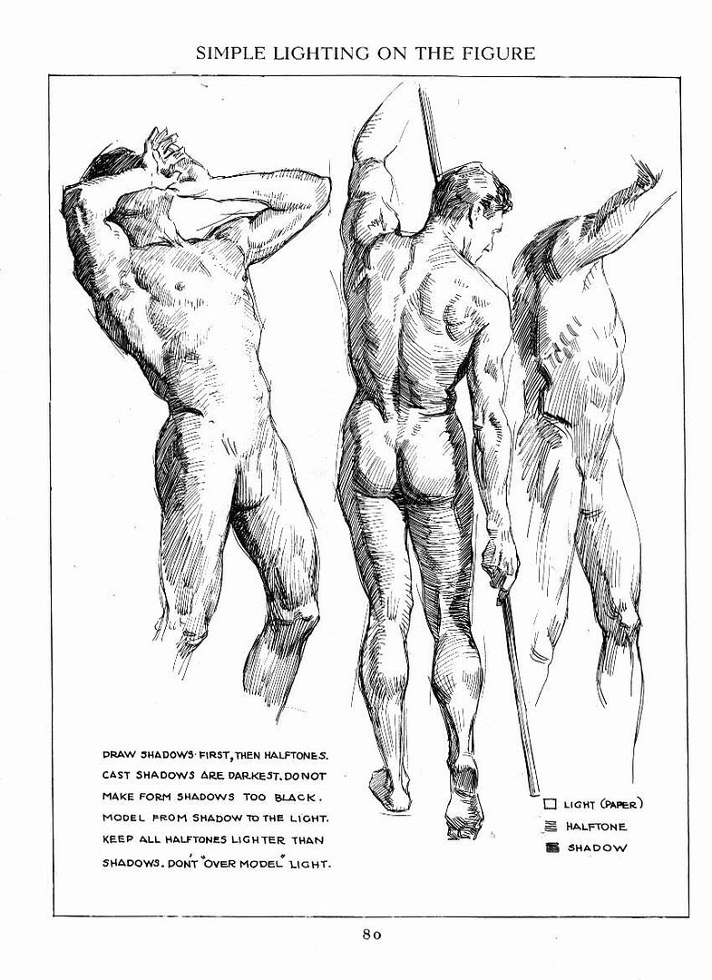
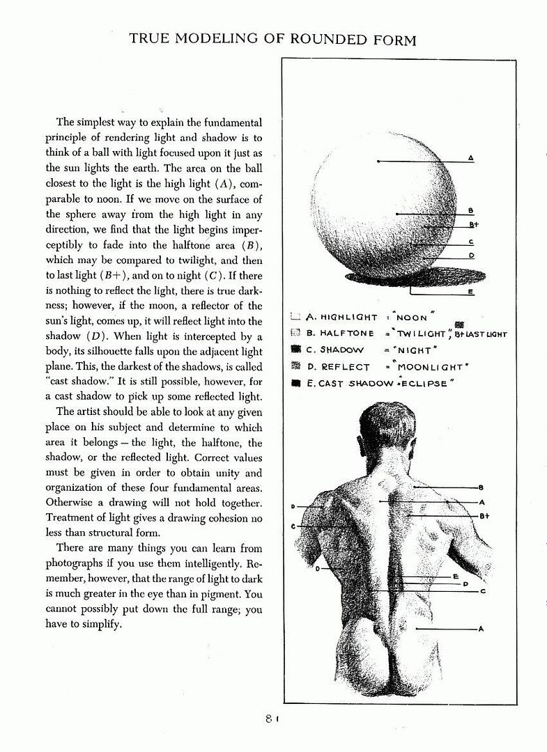
I know it's not been quite a week yet, but I'm not sure I can post tomorrow, and since the whole setup of this community is informal, it's okay to post responses to prompts from previous weeks even if new prompts are already up anyway. So if you have tried anything last week or want to draw anything for older prompts, please feel free to still post! Also, if you have any suggestions for drawing exercises and prompts, or comments/feedback on the ones I posted, please comment.
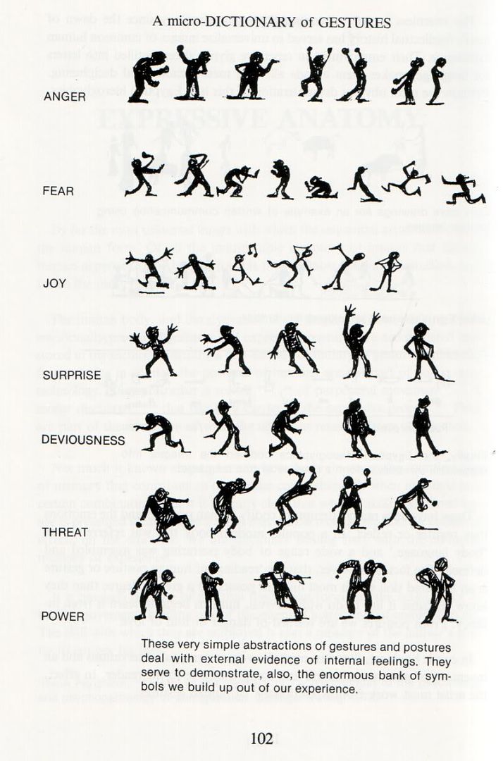
1. Drawing gestures/poses.This is an exercise from
Scott McCloud's comic Making Comics, it's taken from page 127 and is the companion piece to the facial expression exercise from last week:
Pick one or two attitudes from this list, and draw a body to match:- pompous
- uneasy
- impatient
- aggressive
- tired
- humble
- stubborn
No facial expression for this one, just a nose and ears to show head position.
Again, give the same list to a friend and ask him/her to guess which pose you were going for.
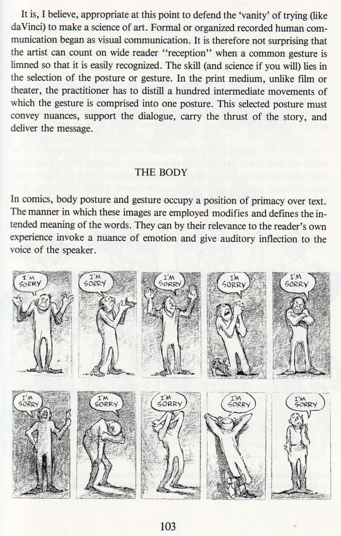
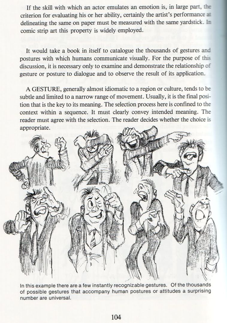
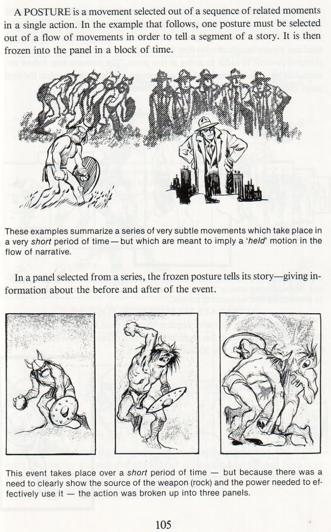
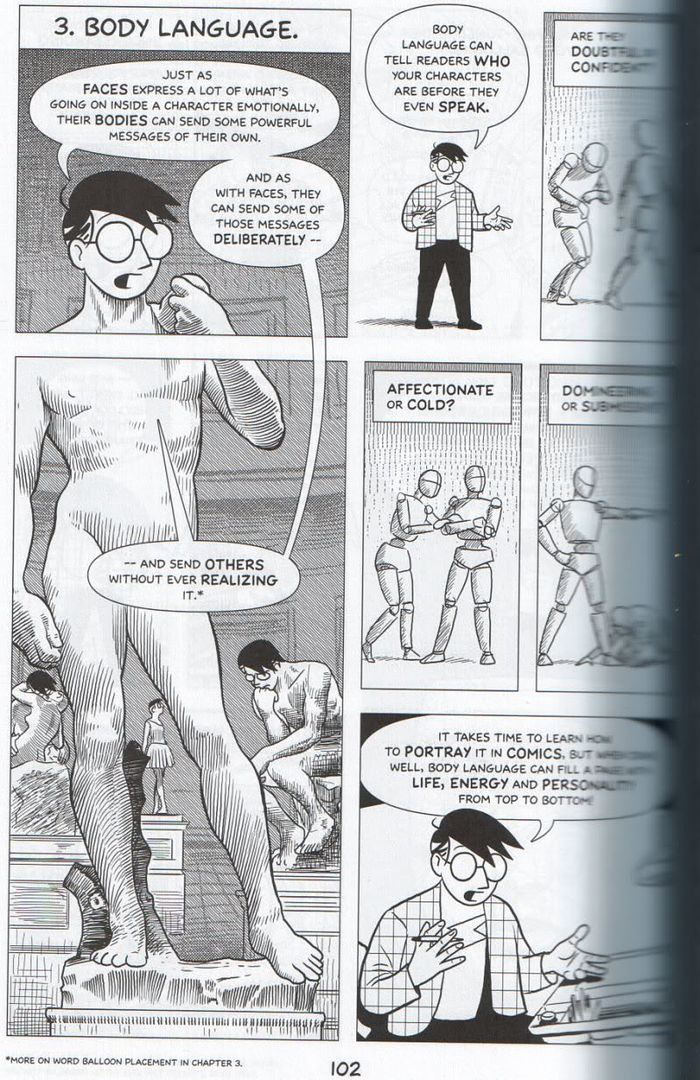
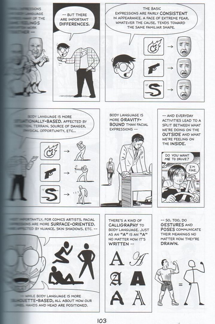
In case you have problems getting a handle on body language, I scanned a couple of pages for you from various drawing books. First four pages from Will Eisner's Comics and Sequential Art (
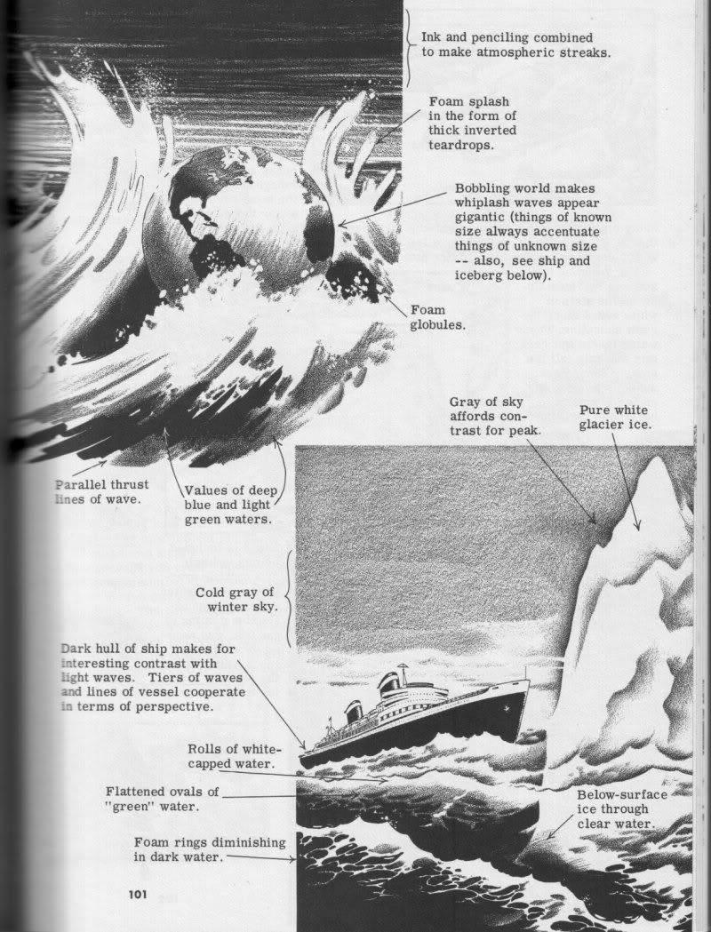
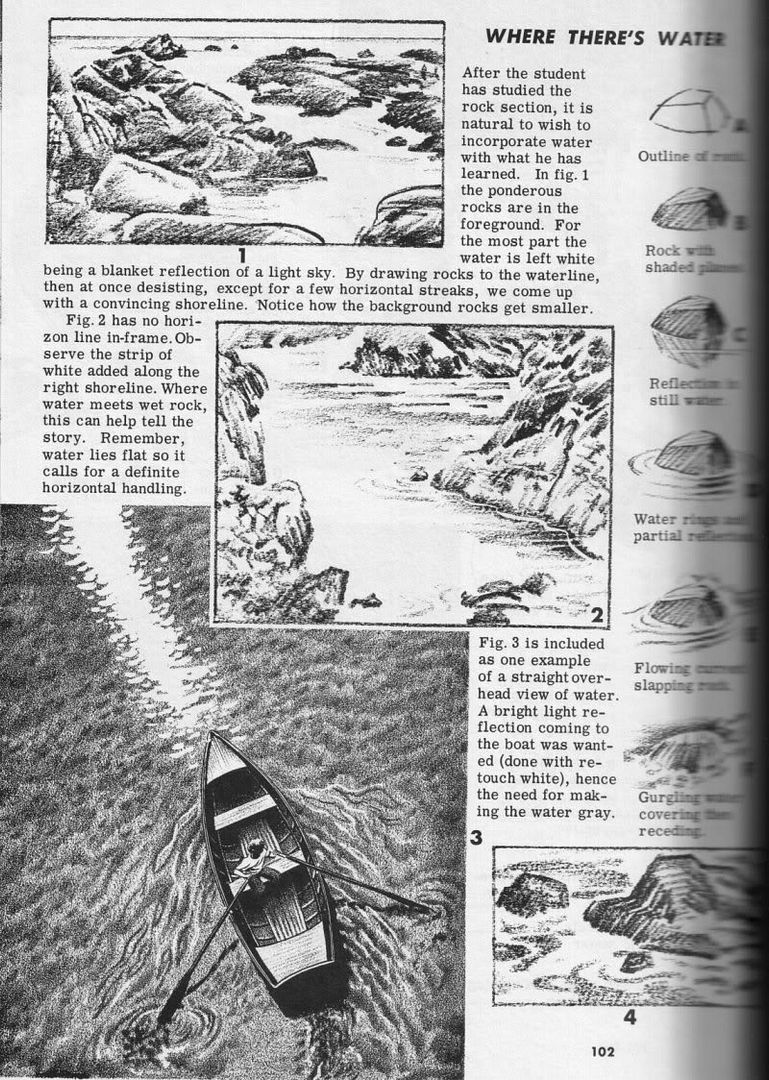
p. 102 /
p. 103 /
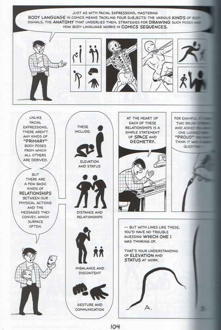
p. 104 /
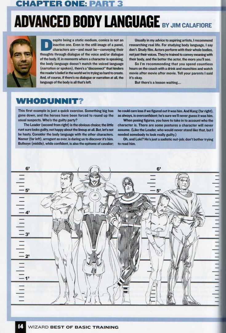
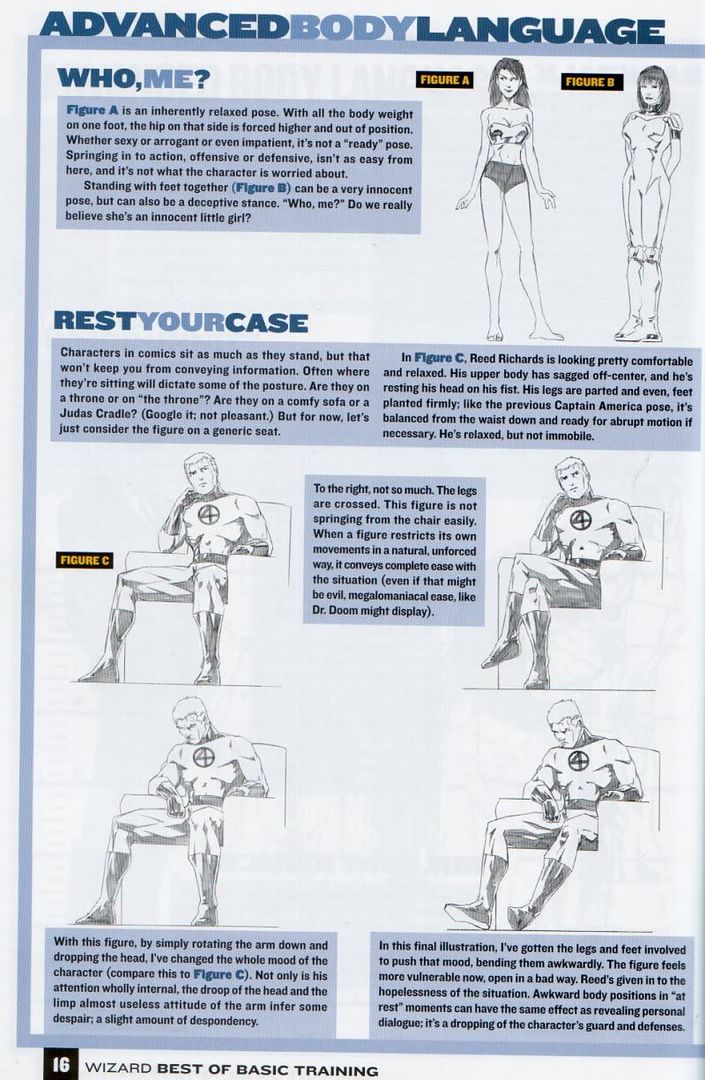
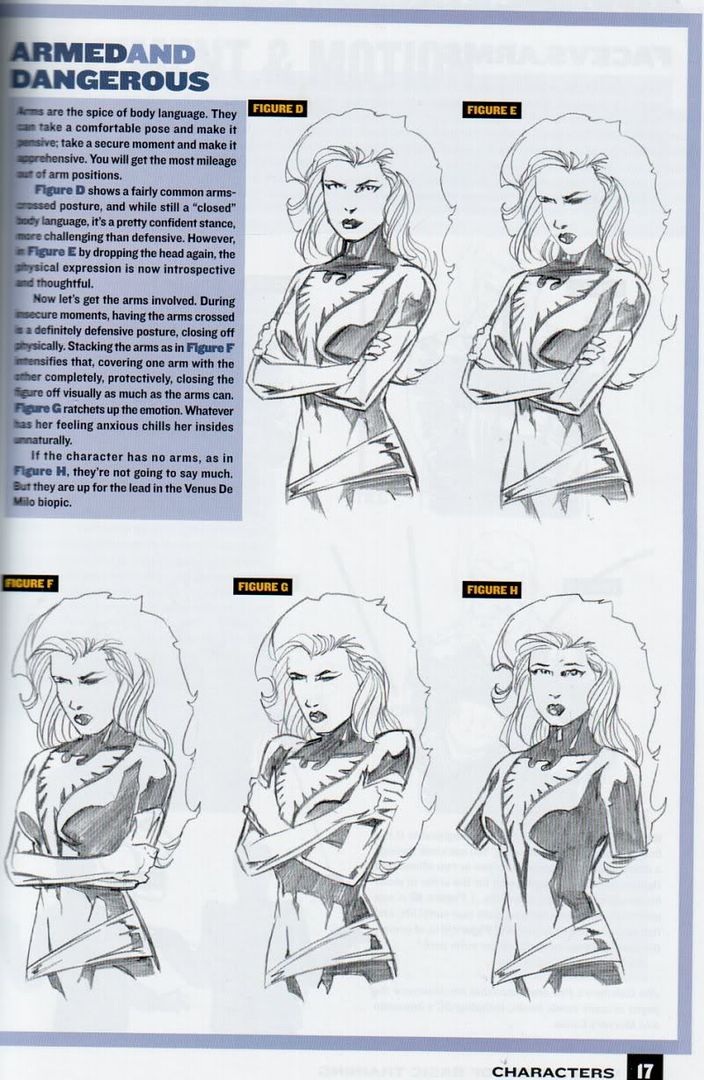
p. 105), four pages from a chapter on body language from Wizard How To Draw (
p. 14 /
p. 15 /
p. 16 /
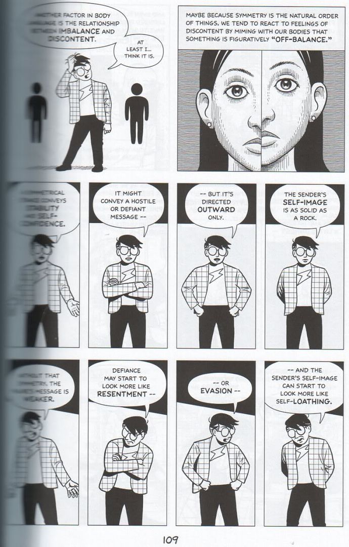
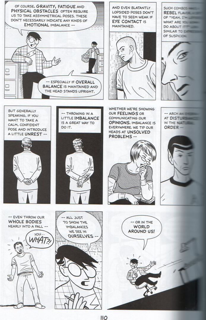
p. 17), and finally the first ten pages from McCloud's chapter on body language (sorry for the blurriness towards the spine side of these scans, I just didn't want to break the back of my comic completely, I can just recommend buying or borrowing the actual comic for a decent look --
p. 102 /
p. 103 /
p. 104 /
p. 105 /
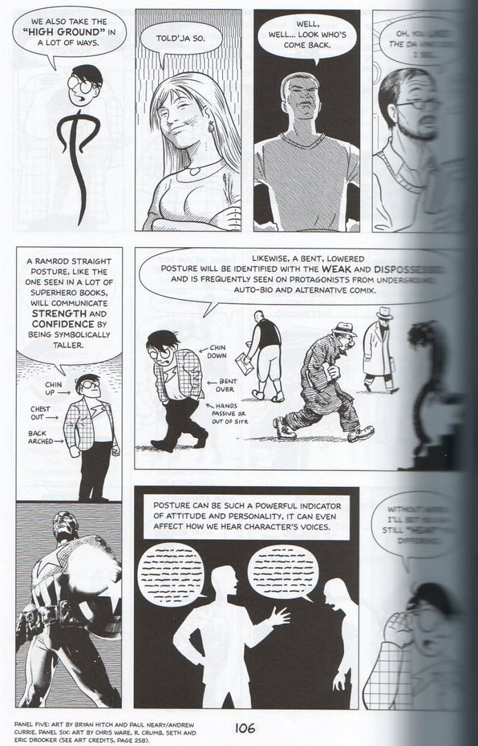
p. 106 /
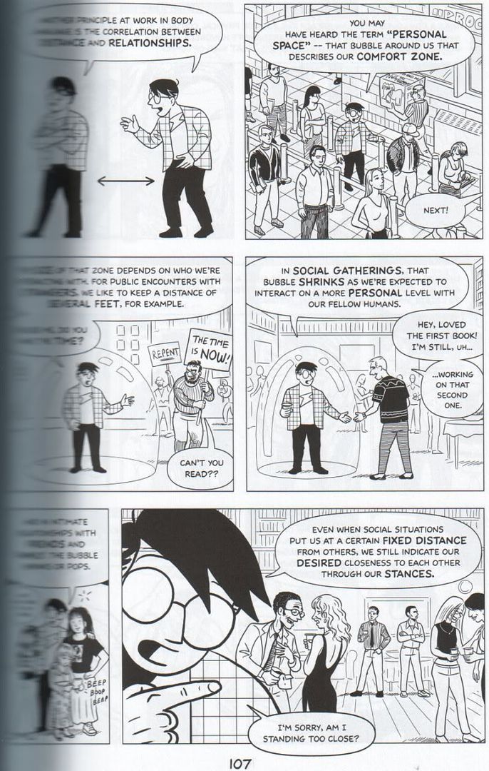
p. 107 /
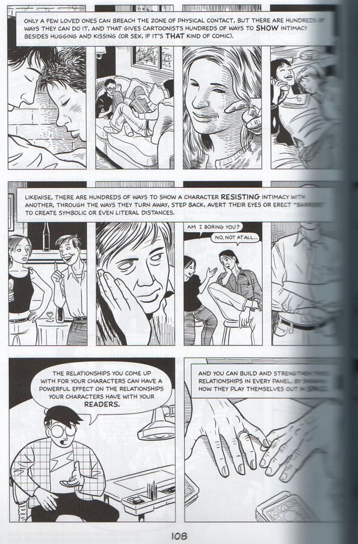
p. 108 /
p. 109 /
p. 110 /
p. 111).
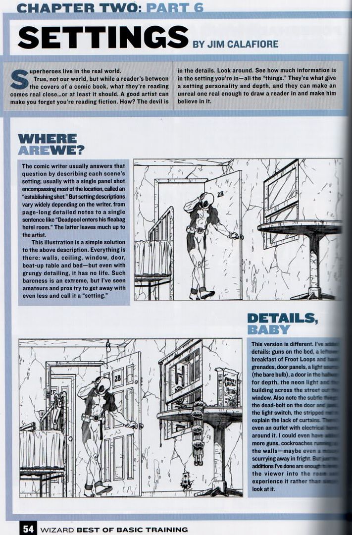
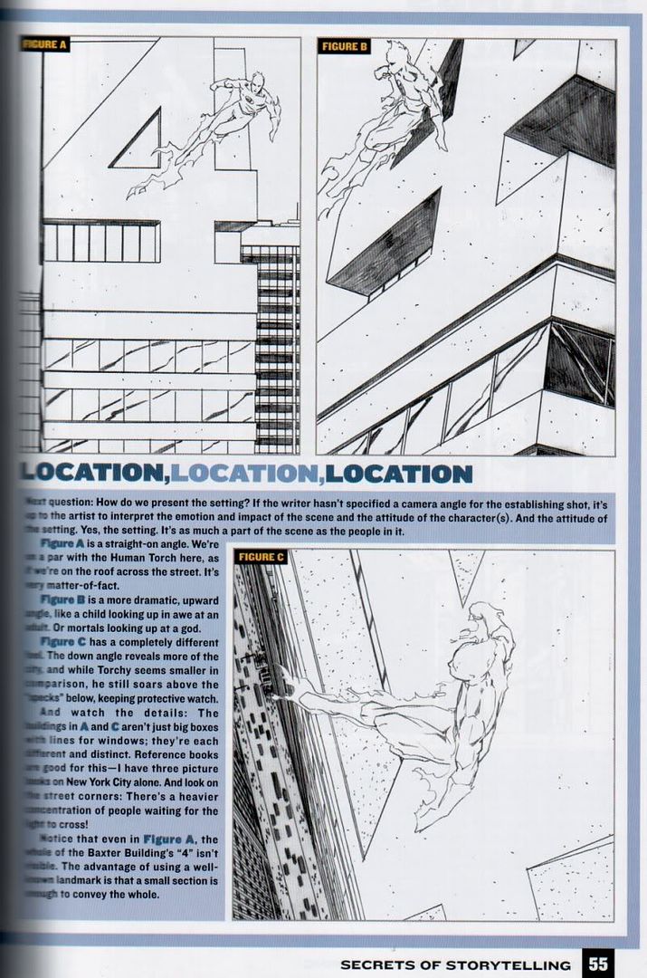
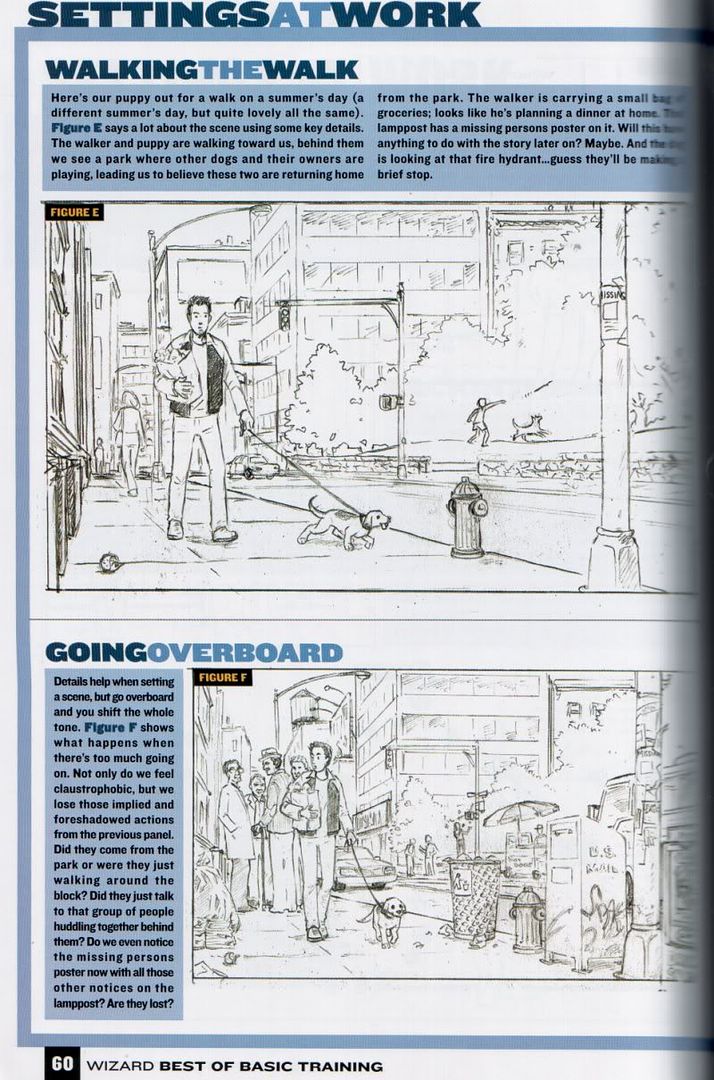
2. Setting the mood with your backgrounds.Another one from McCloud's comic (what can I say, it's convenient, and I like McCloud's suggestions). It's taken from page 183:
Choose one of the following themes:- abandoned
- serene
- forbidding
- welcoming
- official
- exotic
- innocent
Then make a single page, nine panel comic showing fragments of a place based on that theme, no characters and no words. Just images from a setting, real or imaginary, that you think expresses the theme.
Now give the list and your comic to a friend and see if he/she can guess which theme you were trying for.
Of course you don't have to do this exercise in comic form, you can just draw a regular background to evoke a mood just as well.
3. Drawing hands.Hands are notoriously hard to draw. Far too many complicated moving parts, something is always seen at an odd angle with obnoxious perspective issues, it's hard to figure out what position they are supposed to be in to make a character look right in the first place, and four fingers never really fit onto one palm either (which is why so many cartoons only have three fingers and one thumb after all). Still, you can't always draw your characters hiding their hands or wearing mittens (though that's always an option to consider for winter pics *g*), so that leaves no choice but to deal with them.
The only bright spot is that at least you can always look at your left hand while drawing it with the right (or vise versa for left handed people), and it's far easier to put your hand into some position than to try to convince someone that they should serve as reference for that acrobatics pose you need (or attempts at self-photography achieve the same).
So practice drawing hands, not just in easy positions, but hands in gestures, hands doing things, hands seen from various angles... If you are at a loss how to start, take a look at
glockgal's tutorial on hands for a basic introduction. Also, someone put a complete copy of
Hogarth's Drawing Dynamic Hands up on scribd.com, which I guess might not be entirely legal, since I don't think the copyright is expired yet, but if you don't have that book or a similar one looking at hands in detail, you can take a look there.
4. Drawing objects belonging to a character.Pick (or create) a character, and draw five objects that they might carry on their person at an average moment. This can be either mundane (like you could empty your own pockets and draw what you find) or fantasy. For fun others could then guess what kind of person you had in mind.
5. Drawing clothes.Unless your characters wear tight spandex which looks painted on or are naked, there's no way around drawing clothes, which come with their own problems, like folds that ideally have to match both the posture and the type of clothing and material. Do some sketches that show different types of clothing, whether fantasy costumes, historical or every day clothes, that display different kinds of material, e.g. heavier and thinner cloths that fold and flow differently, loose and tight clothing and so on. Maybe do some sketches of humans moving and how that affects the way the clothes look, or try to make a movement look more dramatic or interesting through the clothing (the obvious example for this are superheroes' capes and such, but regular coats, skirts and so on can also add flair).
Looking at clothing (whether in RL or on photos) it's at least for me not easy to judge which folds are the best to capture the clothes, so I looked for tutorials to simplify it.
This is a manga tutorial site, but even if the style isn't your thing, the basic introduction to folds and how to draw clothing is quite neat to make sense of how clothing works.