Tweak

InsaneJournal

Tweak says, "Bite me Creeper!!"

Username: 
Password:    
Remember Me
  • Create Account
  • IJ Login
  • OpenID Login
Search by : 
  • View
    • Create Account
    • IJ Login
    • OpenID Login
  • Journal
    • Post
    • Edit Entries
    • Customize Journal
    • Comment Settings
    • Recent Comments
    • Manage Tags
  • Account
    • Manage Account
    • Viewing Options
    • Manage Profile
    • Manage Notifications
    • Manage Pictures
    • Manage Schools
    • Account Status
  • Friends
    • Edit Friends
    • Edit Custom Groups
    • Friends Filter
    • Nudge Friends
    • Invite
    • Create RSS Feed
  • Asylums
    • Post
    • Asylum Invitations
    • Manage Asylums
    • Create Asylum
  • Site
    • Support
    • Upgrade Account
    • FAQs
    • Search By Location
    • Search By Interest
    • Search Randomly

jlroberson ([info]jlroberson) wrote in [info]scans_daily,
@ 2009-08-24 04:46:00

Previous Entry  Add to memories!  Tell a Friend!  Next Entry
Current location:Seattle
Current mood: discontent
Current music:Do Make Say Think
Entry tags:char: lulu, creator: frank wedekind, creator: john linton roberson, genre: adaptation, in-joke: shameless plug

Lulu: 10 Pages of a Work in Progress

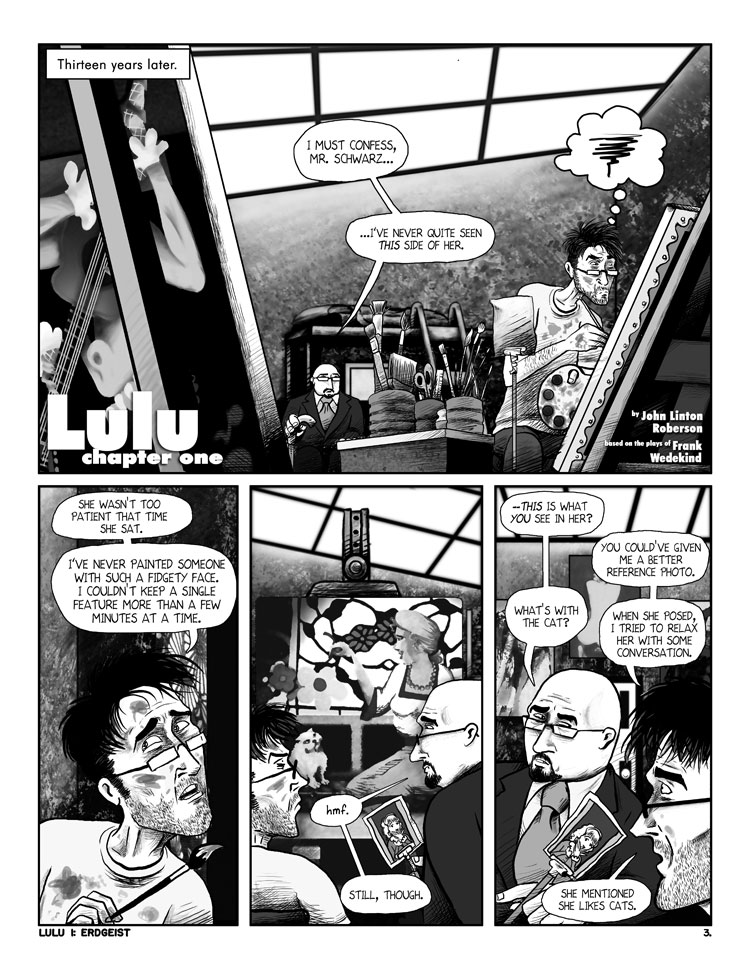
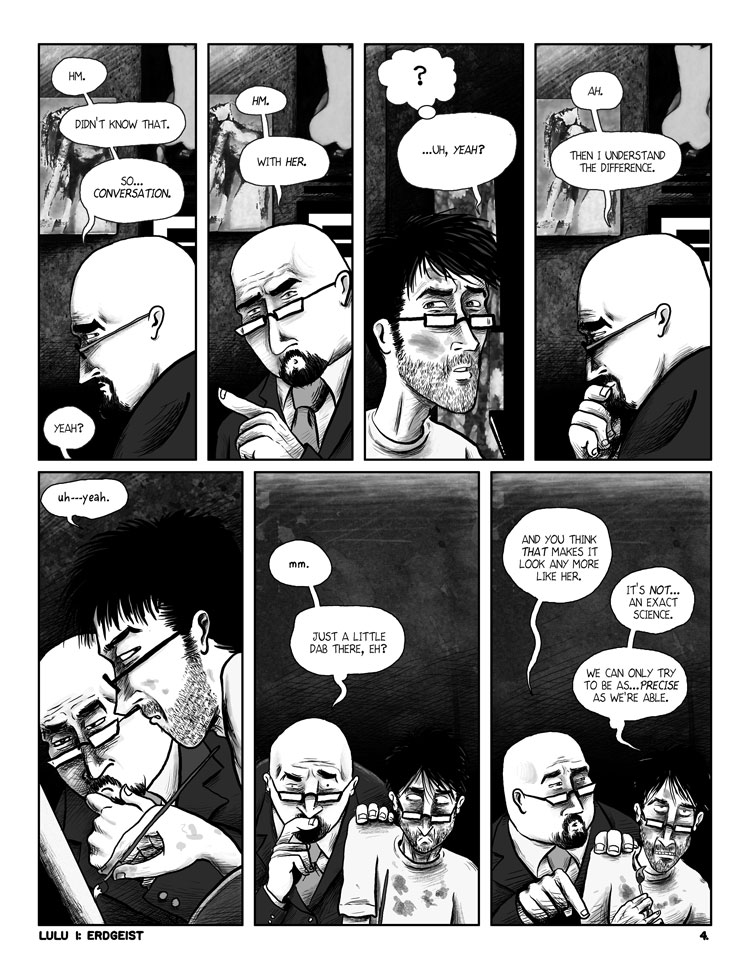
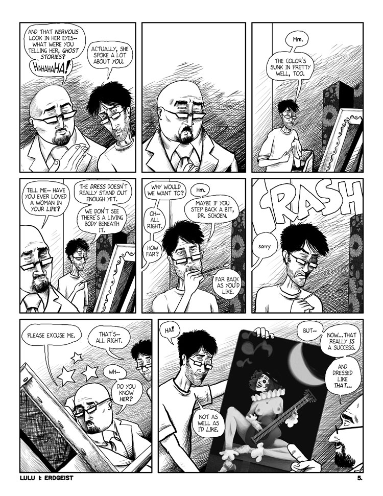
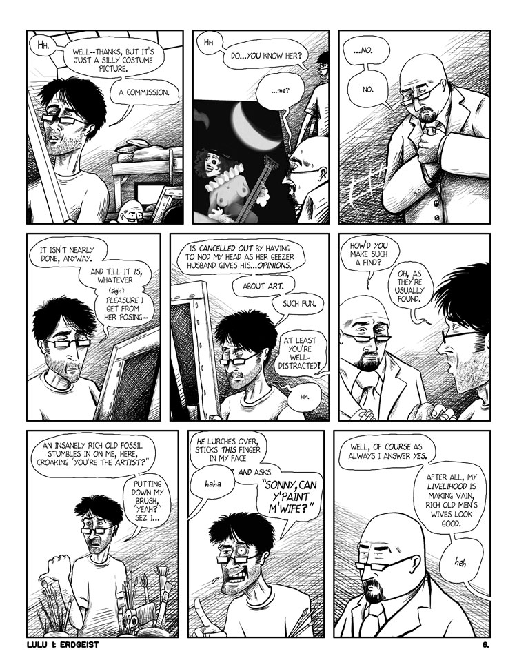
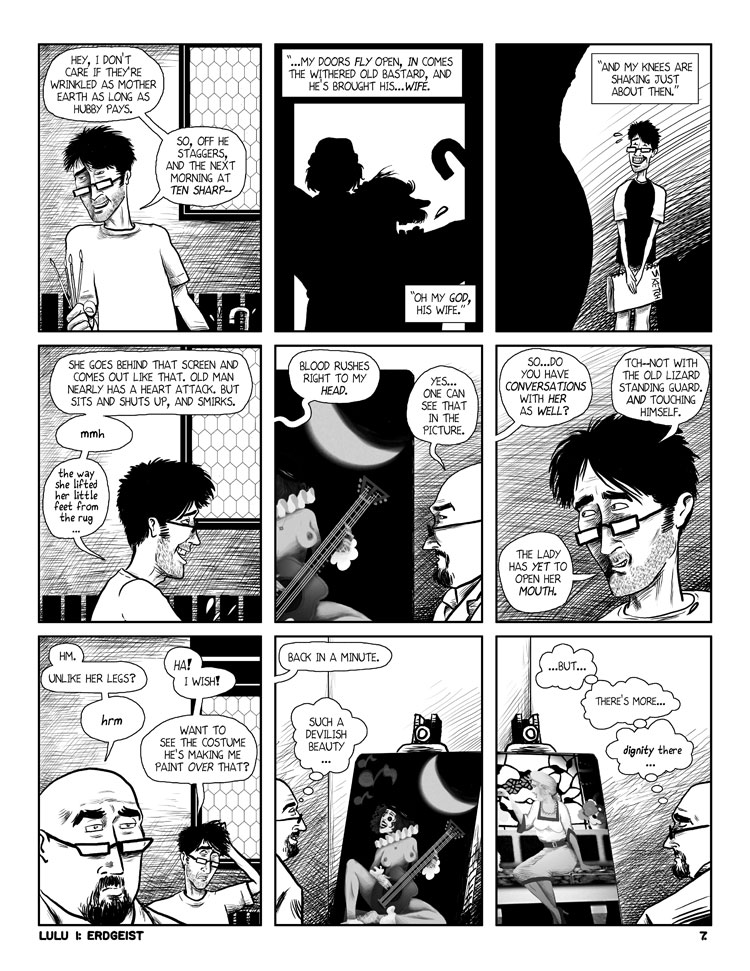
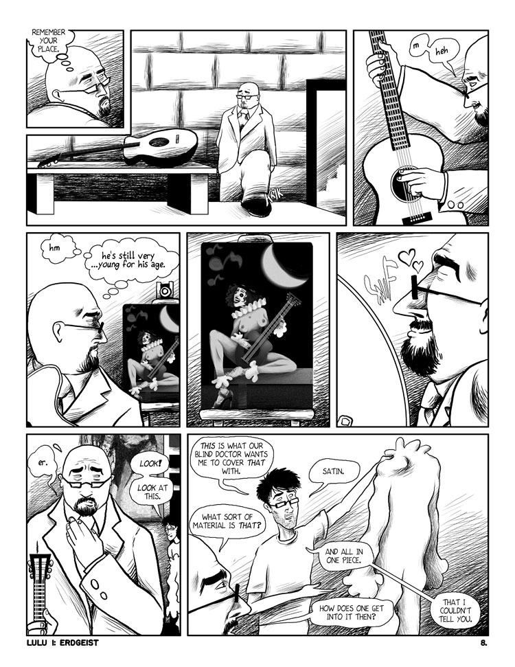
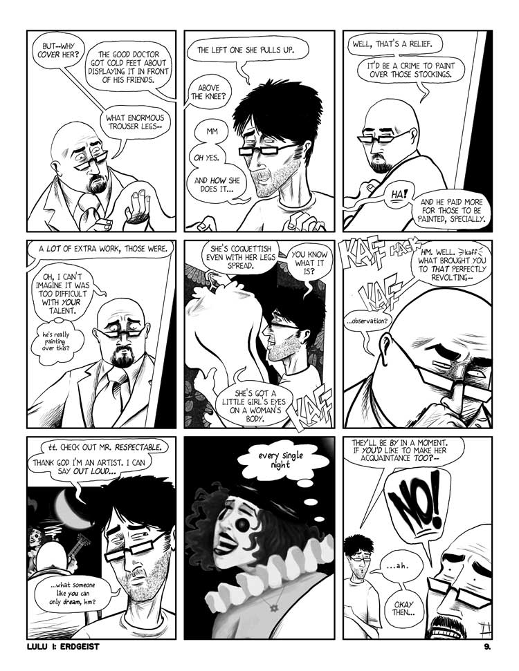
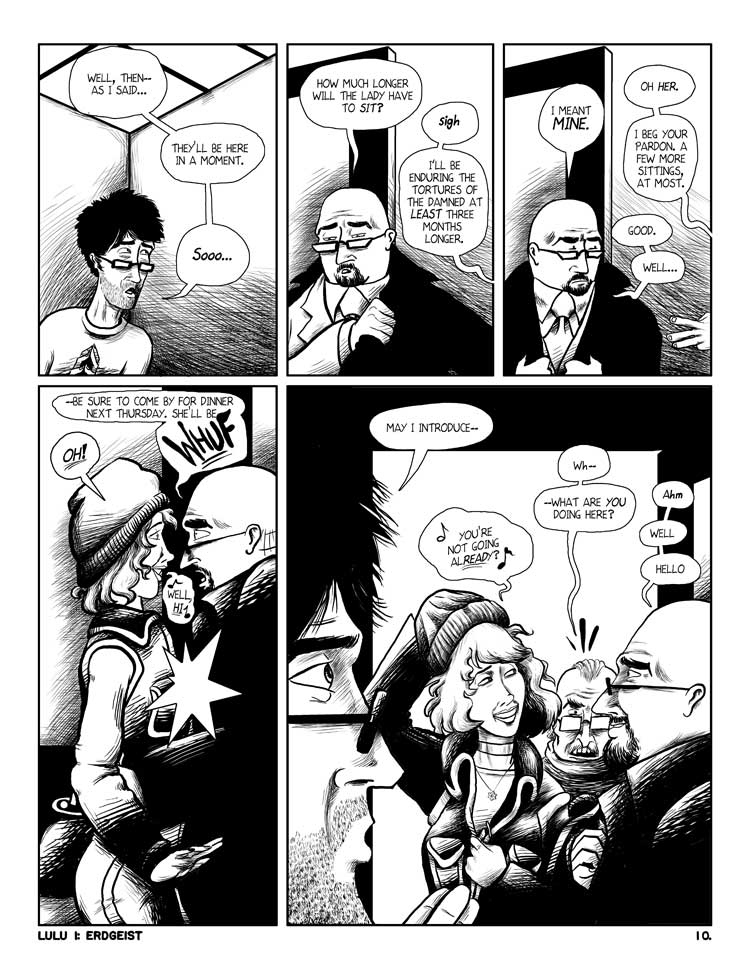
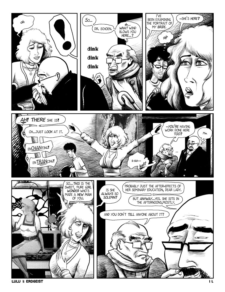
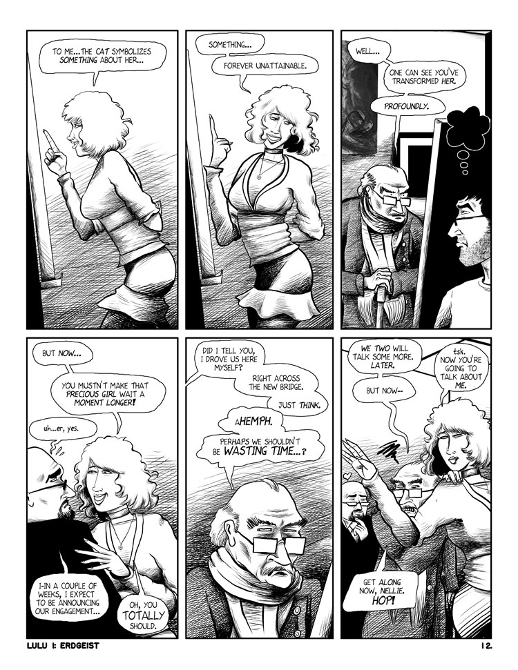
As some of you know, I'm an indie cartoonist, and some time back I posted an autobio story, "Martha," which was my final story in my 4-year exploration of the smut genre. Having gotten tired of that, I have been working this year on a long-planned adaptation of Frank Wedekind's LULU plays(the other plan was WOYZECK, but, uh, a bit too heavy for me at this time), "Erdgeist" and "Pandora's Box." The latter of which is best known as a silent Louise Brooks vehicle. I love Brooks, but that's been done, and besides, it was hardly a definitive adaptation. Mine isn't either but I'm trying to be at least faithful to its spirit. But mine is set in the modern era, and I am being a bit loose with the rather archaic PD translation I'm working with.
In any event, I though this might be a good venue to show some of it so far, as you folks have taste, and I'm certainly not putting it on my site before shopping it around. So, here's ten pages of it. Most of these lack the greys I'm going to add later(more or less as you see in the first two), so please keep that in mind. Without further comment, here you go.


Mods: this is my own work under my own copyright, so hopefully I can post as much as I like.
(c)2009 John Roberson. All rights reserved.


(Post a new comment)


[info]nezchan
2009-08-24 04:31 pm UTC (link)
I must say, I like this. I was a bit critical of the pages you were thinking of submitting to Marvel earlier, but here it's just the opposite. I like how the storytelling is handled, the expressiveness and suitability of each character's look, even though they're not strictly realistic. I believe your style suits this sort of storytelling much more than superhero work, to be perfectly honest, where expressiveness and attention to detail take priority over sharp realism and broad action.

There's so much nice character detail going on here, in how the bald fellow acts, and the body language of the artist. Keep it up, you've got some real strengths here.

(Reply to this)


[info]foxhack
2009-08-24 06:11 pm UTC (link)
I can totally see you doing Vertigo stories.

(Reply to this) (Thread)


[info]jlroberson
2009-08-25 02:46 am UTC (link)
Ohh, I'd like to, believe me...(thanks!)

(Reply to this) (Parent)


[info]blake_reitz
2009-08-24 06:23 pm UTC (link)
I really like this. The caricature-like aspect to the characters and the panel layouts (especially the last page, with six tall panels) remind me of Alex Robinson's work. And this might just be me, but I actually think the straight B&W pages work better without any gray. The shading on the people is fine, but the gray walls and background feels a little overbearing. I've got to give some props out to your clear composition, It's very clear where and when everyone is.

In short, good job!

(Reply to this) (Thread)


[info]nezchan
2009-08-24 07:04 pm UTC (link)
I've always preferred straight black & white work too. Since the shading is being handled quite aptly by crosshatching, why add in an extra level?

(Reply to this) (Parent)


[info]jlroberson
2009-08-25 03:22 am UTC (link)
It's funny, I've been hearing these comparisons to Alex Robinson for ages now, all the way back to 1999. Not that I mind them, I just think it's interesting I hear that more often than any other. And yet, to this day, all I've ever seen of his work was two panels--which I think were very early work--quoted in a Comics Journal review of BOP in 2000...maybe I should have a look at it sometime.

(Reply to this) (Parent)


[info]greenmask
2009-08-24 08:53 pm UTC (link)
Oo! Well I said I was looking forward to seeing it before. And I honestly enjoyed reading these pages. They're full of life. Also, I find that there's just enough perky cynicism in the writing to distance me from the characters enough that I can enjoy reading a story where I don't particularly like - in a personal way - any of the characters (this is not a criticism!).

I do so like black and white comics. Especially, in this case, how you've drawn (Lulu's?) hair. Fluffy!

(Reply to this) (Thread)


[info]jlroberson
2009-08-25 03:25 am UTC (link)
Thank you! (and to everyone)

Yep, she's Lulu. There's a strange running gag in the play--which I considered cutting, but I'm trying to avoid doing that unless it's irrevocably dated(it won't be Jack the Ripper at the end, for instance)--that each of the men she's with renames her. In this case Goll chose "Nellie."

I don't think I can take any credit re: the writing, though as I said, I am modernizing and rephrasing almost everything in the process of adaptation(and Lulu's remark about the symbolism of the cat was my own invention), but that's Wedekind, really, not me. Well, via translation. (Christ, I wish I knew German)

(Reply to this) (Parent) (Thread)


[info]greenmask
2009-08-25 11:43 am UTC (link)
I think that modernising and re-phrasing counts, actually. Especially if you're adding cat-inventions here and there! :]

I watch a lot of stuff that started out non-modern or non-english (and my beloved likes to re-write character biographies from fighting games and make them make english sense) and the amount of bad subs or bad hip-shakespeare professionally produced has given me a healthy respect for people who can take dialogue and re-mould it whilst keeping the intentions and the freshness of the original.

(Reply to this) (Parent) (Thread)


[info]jlroberson
2009-08-25 02:01 pm UTC (link)
Well, that's higher praise than I deserve then. Thank you!

(Reply to this) (Parent)


[info]taggerung301
2009-08-24 09:11 pm UTC (link)
Awesome
I love your drawing style here

(Reply to this)


[info]rab62
2009-08-24 10:29 pm UTC (link)
I can't think of any better way to express how much I like this than to say that in the space of one scan, I went from trying to look at a new artist's work analytically to being totally caught up in the characters and their story. In one page! Now I've got to read the whole thing.

(Reply to this)


[info]goodfellow_puck
2009-08-24 10:45 pm UTC (link)
I like your expressions which is really important in a story that's carried by it's characters and their dialouge. Their designs are fitting of their character as well--their faces especially. The backgrounds are warped in perspective, or just plain flat in some places. You keep doing low ceilings with diagonal lines, but don't follow through with everything else in the scene. I agree with someone else that the background hatching is a bit odd. That's for two reasons: #1 It creates tangents between panels and some objects, #2 it's very sketchy and inconsistent which makes it distracting to the eye. Check out some Bernie Wrightson stuff to see max amount of hatching done to aid the art.

You flipped the bride 'n' cat painting. Cat is on the left in first panel, and on the right in the rest.

Good luck!

(Reply to this) (Thread)


[info]jlroberson
2009-08-25 02:42 am UTC (link)
Oops. Well, fortunately the paintings I've been keeping on separate layers, so flipping it back isn't too difficult...

Thanks for the words on the background hatching. And my obsession with hatching is in fact the result of Wrightson, specifically his FRANKENSTEIN drawings, as well as Totleben and Sim, two others who I will never match. I agree that it's probably too much. I've been going back & forth on whether to do it there but it seems to me after reading your comments I'd be better off just going painterly on the backgrounds and letting greys do the work there to avoid some of what you mention. Besides, it's extra work and very tedious and I'm gathering it's not going to any better effect.

And also, I spent 6 years when I was doing VITRIOL(my first big work and the reason I spent 4 years after on something far less work-intensive) doing that style and I should probably move on. It's hard to break habits.

I gotta say, I was starting to consider dropping this out of doubt before posting it here, and you folks have encouraged me to continue. Thanks.

(Reply to this) (Parent) (Thread)


[info]goodfellow_puck
2009-08-25 02:16 pm UTC (link)
Haha, I adore my Frankenstein DH reprint. I look at it whenever I need a kick in the ass not to suck so much. ;)

Ink washes might be a neat effect against the hatching on your figures. You're right that it would take a lot less time too. Do it light in scenes like this though. :)

(Reply to this) (Parent) (Thread)


[info]jlroberson
2009-08-25 02:55 pm UTC (link)
There's a reprint? That's cool, because the binding went on the first edition I've had since it came out long ago.

It's back to being a portfolio!

(Reply to this) (Parent)


[info]jlroberson
2009-08-25 02:58 pm UTC (link)
Note: paintings fixed to match p. 3 now.

Oh, and on the backgrounds: the ceiling's weirdness is intentional, in that it's a diagonal roof, not flat. I based it on the top floor of a warehouse I used to work, that had a large skylight shaped that way. (Though I also notice I am not totally consistent about that in the later pages)

(Reply to this) (Parent)


[info]jlroberson
2009-08-25 03:39 am UTC (link)
A serious question, as you folks seem to understand this pretty objectively(I appreciate both the nice and the critical words, both are helpful--the latter especially as it will save me from wasting effort in the wrong directions): If I were to choose 4 pages of this(not necessarily consecutive) to submit to an indie publisher, which 4 would you suggest?

(Reply to this) (Thread)


[info]blake_reitz
2009-08-25 05:42 am UTC (link)
I would say 6-9, but I'm curious as to what others think. I do think 10 should be in there too, but I'm tempted to keep it so there's a cohesive story throughout.

(Reply to this) (Parent)


[info]psychop_rex
2009-08-25 08:09 am UTC (link)
I'd do the first four, personally - they're not as flamboyant as some of the others, but they carry off the conversation very well, which is a real art. Not everyone can make two people talking to each other visually interesting, but it works very well here.

(Reply to this) (Parent) (Thread)


[info]greenmask
2009-08-25 12:07 pm UTC (link)
Yeah, I agree. They also (like was mentioned upthread) make one interested in what's going to happen next.. which is surely something you want a publisher to be, right?

(Reply to this) (Parent) (Thread)


[info]jlroberson
2009-08-26 08:35 pm UTC (link)
One hopes...particularly when one is adapting a century-old play whose most notable claim to fame was becoming a modernist opera.

(Reply to this) (Parent)


[info]psychop_rex
2009-08-25 08:09 am UTC (link)
Niiiice, man! Good stuff.

(Reply to this) (Thread)


[info]jlroberson
2009-09-05 09:52 am UTC (link)
You want to know what's funny? You all liked it, mostly. And you're mainstream comics fans, and you liked an alty-drawn adaptation of a German play.

You know what alt people, like at the Comics Journal Message board thought? They spat venom upon it.

I think that's interesting. And counterintuitive of what people would assume about comics fans.

(Reply to this) (Parent) (Thread)


[info]psychop_rex
2009-09-05 10:37 am UTC (link)
In my experience, the artier side of comics (and, uh, no offense meant here, because I know you lean more that way than I do) has a tendency to be rather humorless about its own personal standards. It's much like arthouse cinema - the diehard devotees go into paroxysms of ecstasy over what they view as 'art', and rage and howl at what they don't - and their standards are often fiendishly high.
Mainstream comics fans, on the other hand, have been handed some pretty poor stuff these days, what with mishandled characters, generic artwork, sadly predictable plotlines, etc. Therefore, they tend to be a little less scathingly particular when it comes to quality stuff - following the cinematic metaphor, it's like when 'Dark Knight' and 'Iron Man' came out in theaters within a few months of each other and everyone went 'whoa, nelly!', because they'd gotten so used to superhero films that were half-hearted affairs that having two terrific examples of the genre one after the other was like a breath of fresh air. They turned out for the so-so ones anyway, but they TEEMED towards DK and IM. The artsy types still largely turned up their noses at them - or liked them, and felt REALLY guilty for it, and wrote five-page articles trying to explain away just WHY they liked them - but we nerds were happy, because we knew what we liked, and we'd seen it. We're more the pragmatic types. We may not know art, but we know what we like - and we like your stuff. It's good.

(Reply to this) (Parent) (Thread)


[info]jlroberson
2009-09-05 11:32 am UTC (link)
My feeling is that "art" is something that expresses something, and to me that has a component of fun or at least the excitement of seeing a way of doing things you might not have thought of. And I can enjoy both BLACKEST NIGHT and MAUS and see no contradiction there. The alt people have a tendency to define themselves more by what they exclude than what they include, and I think there's good stuff in all genres or non-genres, even if some genres are capable of more than others are.

So among the alt hipsters, I'm neither fish nor fowl. It's a puzzle. But again, it tells me something about comics fans that's heartening, and thanks again.

(Reply to this) (Parent) (Thread)


[info]psychop_rex
2009-09-05 11:18 pm UTC (link)
Any time, man.

(Reply to this) (Parent)

Aquaman and Wonder Woman
[info]kiss1
2011-01-15 01:58 am UTC (link)
We Sale the Supra Shoes and Supra Footwear including Supra Vaider, Supra Skytops, Supra Skytop II, Supra Cuban, Supra Cruizer, Supra Terry Kennedy (TK) Society, Supra Suprano High, Supra Strapped NS, Supra Trinity NS, Supra Indy NS and Supra Thunder Hightop. Buy Cheap Supra Shoes with High Quality, Free Shipping !

(Reply to this)


Home | Site Map | Manage Account | TOS | Privacy | Support | FAQs