| geoffsebesta ( @ 2009-05-22 03:35:00 |
|
|
|||
|
|
|
|
|
|
|
To celebrate the return of the Scans_Daily that I knew and loved (with this thread http://asylums.insanejournal.com/scans_
Web of Spider-Man Annual #4! 1985 go go go!
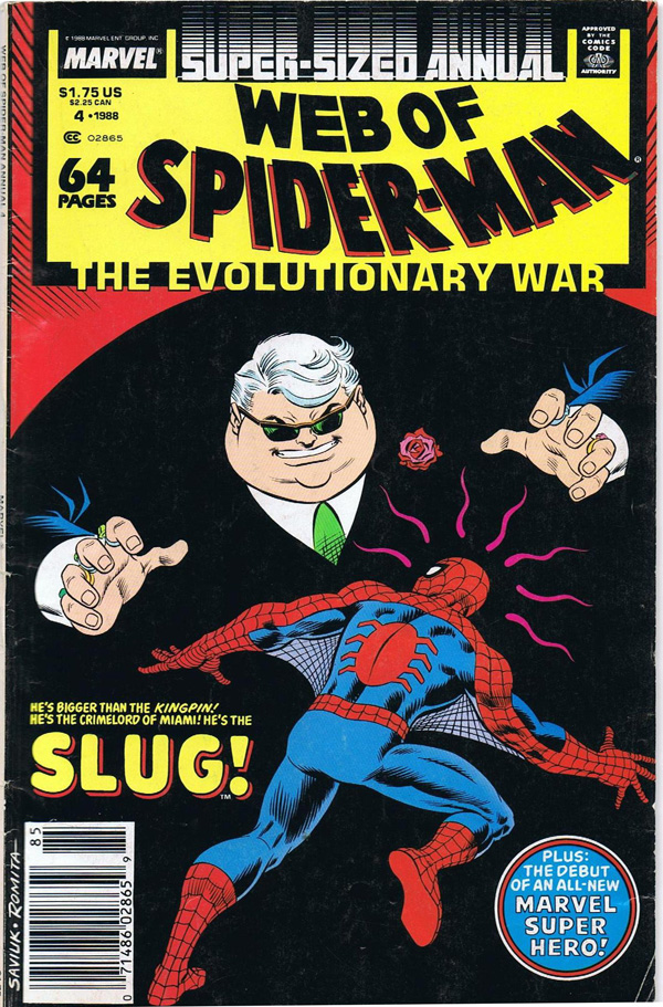
That's the Slug. He appears in this issue.
This is some work-for-hire that I happen to like. Steve Gerber wrote it, Cynthia Martin drew it.
It's part of a forgettable summer crossover that you probably forgot, the Evolutionary War. Steve Gerber wasn't interested in it either, and wrote a different story entirely, about the maid at Peter Parker's motel. Spiderman appears jut enough to fill the contract. It's thirty-two pages or something and I scanned ten.
Cynthia Martin is one of the overlooked auteurs of Marvel, a minor penciller who just happened to be really, really good. She's gotten a lot of respect, but she deserves more.
This is not her best work.
She's phoning it in pretty hard here. I don't mind. I love it when great artists pick up a paycheck, because they aren't trying all the time. There's nothing to clutter it up. You're left with almost conversational work, where instead of trying to espouse a concept or a point of view, they simply illustrate and move on. Script says Spider-Man shoots a Purifier in the face with his web-shooters? Then that is what you shall see.
I apologise for the lousy job I did scanning this. As you will quickly see, you cannot follow the story from these pages. I'm really only interested in Ms. Martin here. And as you will see, she is not interested in Spider-Man.
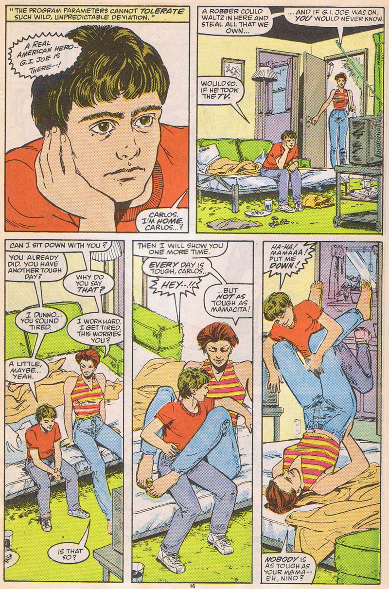
This page is technically perfect. I challenge anyone to spot errors on this page. You have to stare.
Alright, I found four: in panel two her waist is too thin and the television, front wall, and back room do not agree. In three, her breasts look odd and his feet don't quite turn right. SO WHAT. This is a fabulous page. Note the expression in her TOES in panel four. Note the fantastic composition in the second tier, where the eyeline literally sweeps the reader up with the little boy (and the orange blanket and green cushion that act as bumpers, reinforcing the upward sweep).
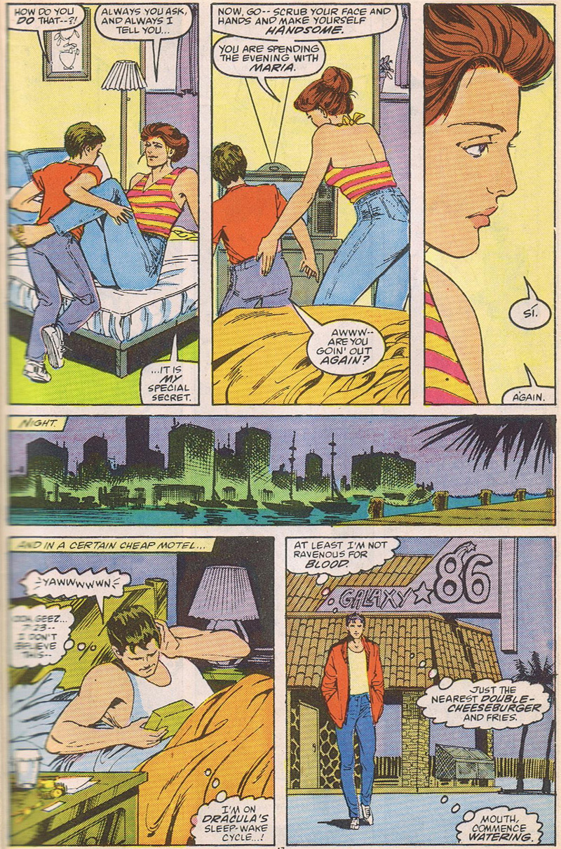
And she gently puts the reader back down. By panel three you absolutely love that woman and her son. Talk about creating characters.
The second tier brings to mind Corto Maltese and Wolverine's Madripoor stuff (was that Miller? Can't remember). It balances the two stories, one on the top and the one on the bottom. Again, fantastic use of textures to guide the eye, though they are rather artlessly inked.
Perspective is wonky again in the last panel. I would call that background flat, and also slightly impossible, since the eye is meant to be level with Parker's ankles.
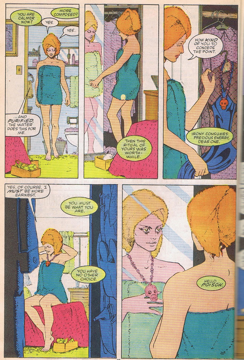
Ah, the attention she lavishes on Poison's pages. See the high-heeled shoe in the closet in panel four, implying both a gun in a holster and an erect penis? There's a lot of sex and death symbols on this page.
Flat, flat backgrounds. Flat backgrounds automatically cast a story into symbol-space, a sort of mental storytelling area. You know that what you are seeing happens as much in the characters head as outside.
But I also think she's being lazy on the backgrounds.
"Reflection," "mirroring," and "doubling," are very common concepts in a lot of the shamanic stuff I've been reading lately, but I'd be lying if I told you I understand them. All I know is that they show up a lot. And she is discussing showering as a shamanic ritual with a spirit of some kind, so I think it's intentional. Note her careful rotation.
FIRST TIER
Face-on
3/4 profile
3/4 facing away
left profile
SECOND TIER
Face on but slightly away, recalling the pose of the first panel but without the locked-in symmetry.
3/4 profile
3/4 facing away. So she purposefully recalls the first tier, and uses the repeated pose and emphasized eyes to illustrate the schism, the change from one character to another. Panel three is the decision panel, where we (much like a Neal Adams giant-head page) establish that much of this is happening inside her head.
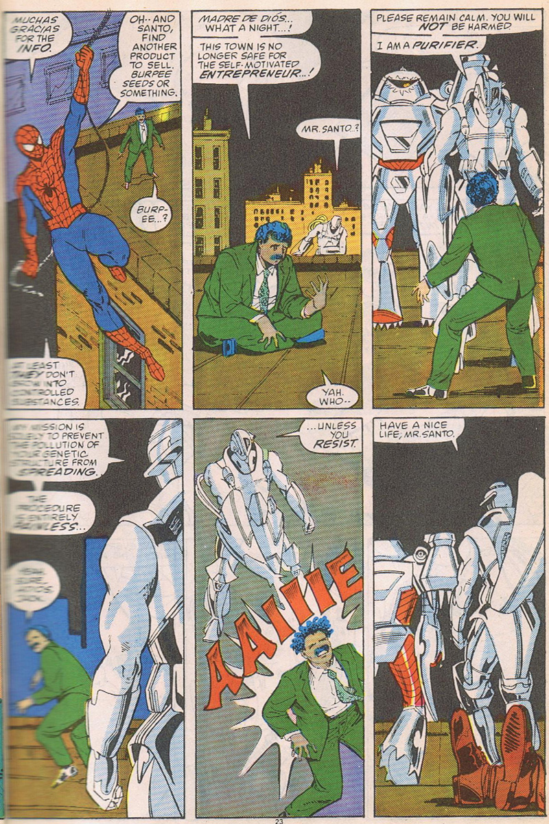
Cynthia Martin does not care about Spider-Man. I am so sorry that this page got malscanned because the dialogue is quite funny and the guy in green (Santo) is the obvious focus of the page. Look at panel two. Just look at it. I know it's unassuming but it's awesome. That is a sharp, sharp, phat, tight, dope picture of a guy sitting cross-legged and saying to himself, "Well what the fuck." It's great. Even the 80s coloring can't ruin it.
Panel 5: We are so lucky this page was drawn in the 80s because if they did this now they would slap gradients all over it. Instead we are left with the pure unmarbled unadulterated disinterest. Look at it: his lazer beam is WHITE. The background is GREY. They would NEVER do that now. I'm not sure if this panel is great or horrible, but I can certainly imagine Roy Lichtenstein making a giant painting of it.
Panel 6: The perspective in this comic is SO BAD. Are we to believe that the roof gently curves down from Santo's body to the roof edge so that the edge of the foot can be hidden like that? And is the edge of the roof circular too? Because it's a flat line any direction we look.
I didn't scan the actual page that proves this, but I suspect that they did not hire a background inker for this book. You can tell when Spidey shoots the webs. Spidey's webs were traditionally the responsibility of the background inker, and they are pathetic in this issue. According to the Internet Ms. Martin inked this but I strongly suspect one of the following:
a) an assistant did it
b) someone else (for some reason I think Rick Parker) inked it uncredited. This happened sometimes for various reasons, usually because somebody missed a deadline.
c) she was tired the day she inked it and couldn't have cared less.
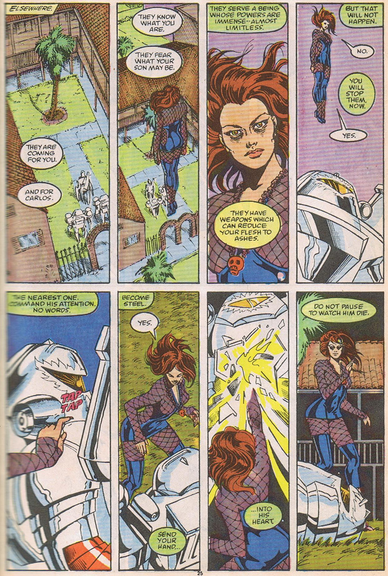
I mean, as you can see the woman can draw backgrounds. The first tier is flawless. She is definitely hovering in the air high above them. You could make the case that her head is too small for her body, but I would just say "Heroic Anatomy." Costume is...meh. I guess it suits the story, because I think they're trying to say, in some Gerberesque way, that she is a super-powered prostitute taking revenge on men for enslaving women. That's my best guess.
I will point out, as re: the previous conversations about sexy superheroine costumes, that the choice of how "exploitative" Poison's costume is belongs entirely to the colorist. If they color the fishnet grey, she's fully clothed. If it's peach, she's naked.
Note the careful assymetry of her leggings. I don't know what it means but I know it's important. Also note the way the background goes absolutely flat in the last panel -- I think that's another cue that she's in shaman-space.
Now that I look at it, the composition of the second tier is sort of amazing. She reverses the angle 180 degrees in the third panel, but it works. You really feel like she punched him so hard it busted his chestplate into his heart. Hmmm...armor, penetration.... Man, I really wish they'd just told this story, instead of shoehorning it into a Marvel Summer Crossover with Spider-Man.
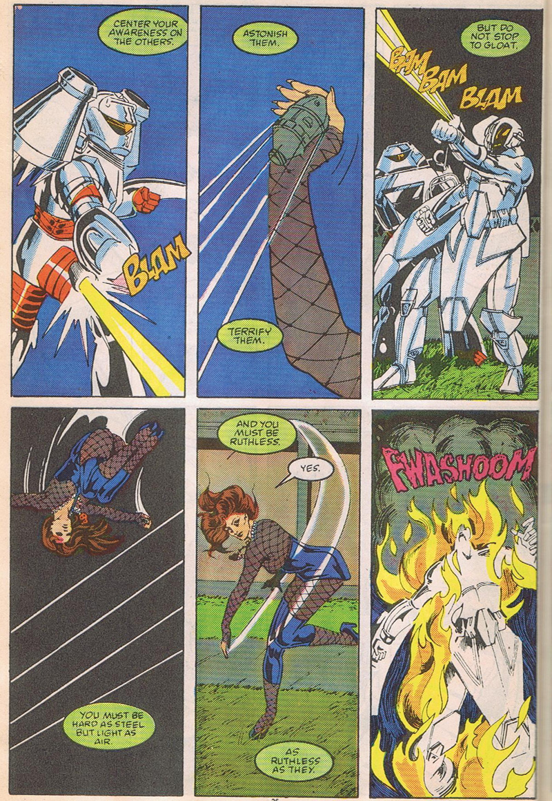
Panels one and six are awesome. Parker's lettering style for SFX pisses me off. It would work for cartoon animals, but not this.
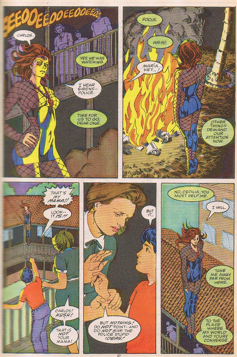
Panel two recalls the second panel of two pages before. It's a very good replacement strategy, where she shows you what the courtyard was like before, and what the courtyard was like after.
Textures in panel three are sweet. Note that the focus of the panel is very, very clearly her vagina. Not her bellybutton. All lines in this panel point to the lowest point of her hips.
I do NOT find this exploitative (and I think if you need any more proof, note that her breasts are perfect, not enormous. They are, IMO, the way a woman would draw perfect breasts, not a man). The Poison story is about sex and consequences and as much Spider-Man as the law requires.
Panel four -- the disapproving female figure tells the red-shirted boy to put that finger away. It's inappropriate to point that at your mother. REMEMBER.
Panel five is another flat background page, though it doesn't look like it at first. Maybe "flat" isn't the perfect word, because it's technically icosahedral. But it works -- it pushes the last panel into meta-commentary. I know I complained about it at first but I think I'm starting to like this trick.
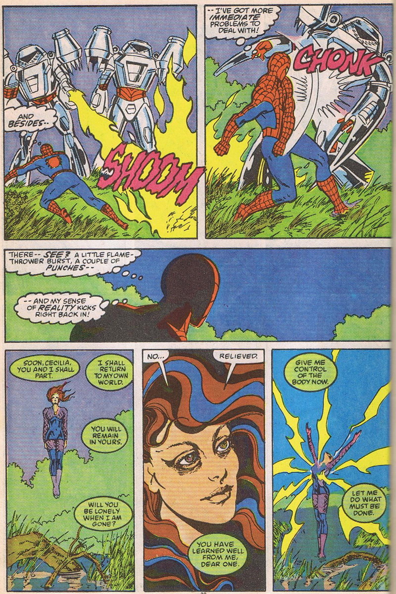
Yeah yeah Spiderman. Anyway.
Ooo spooky eyes. Man, Cynthia Martin probably could have done a heck of a Swamp Thing. I love the drugged-out exhausted blissful expression on the fifth panel, echoing the boy's expression when he's watching G. I. Joe.
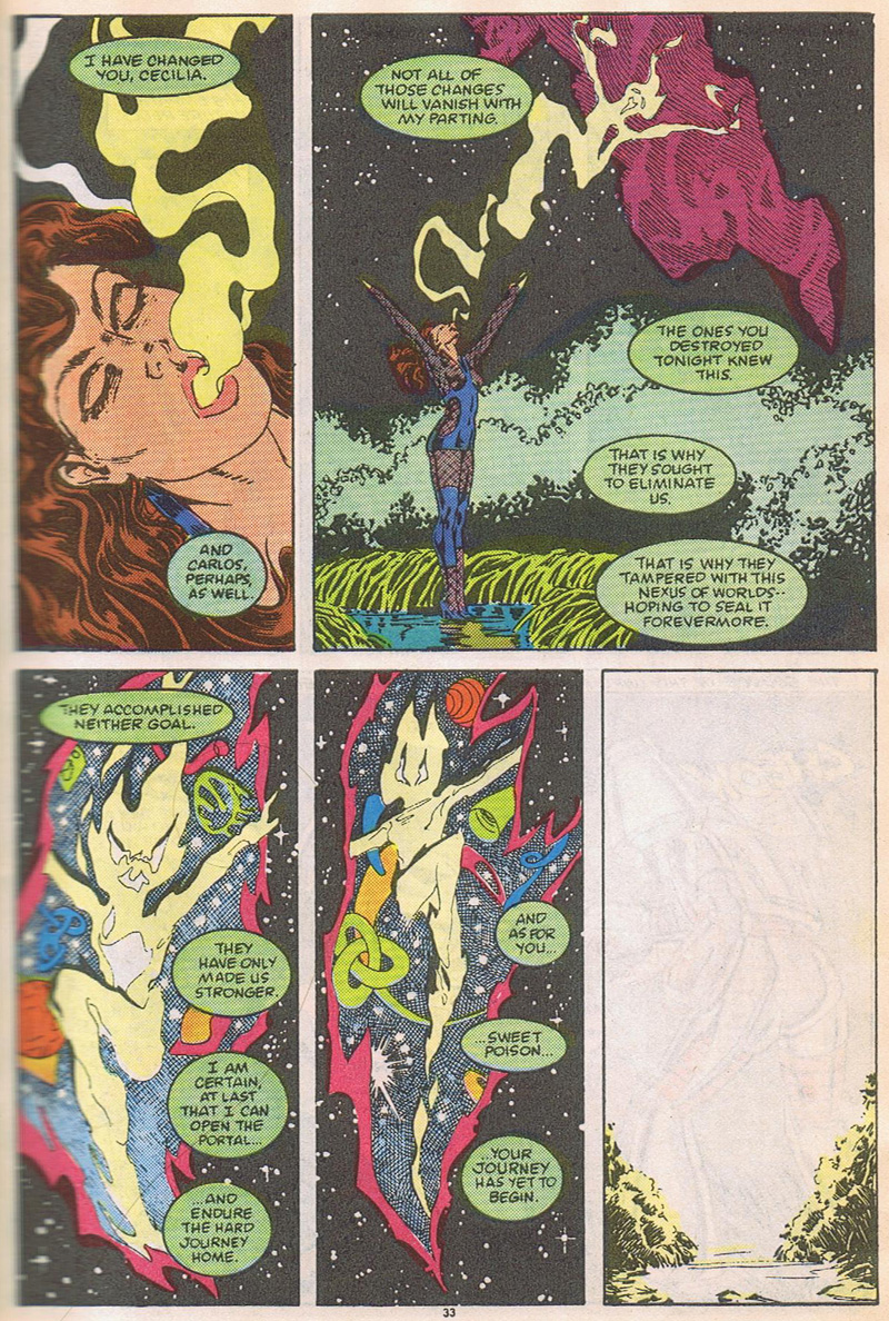
Here is that damn page that Steve Gerber did over and over again. I don't get it. But Martin draws it well. Note the perfunctory Dr. Strange bejeezits in the space-vagina there.
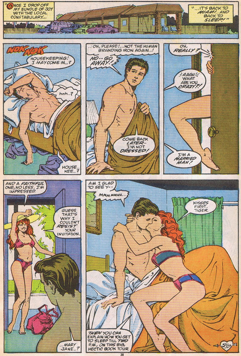
I like this page. I think Ms. Martin likes the relationship pages better than the fighting pages, because here we have the full Martin; perfect composition, great figure drawing, fabric textures and drapery of the highest quality, and storytelling storytelling storytelling. It's a sweet page.
I hate Mephisto for erasing it from history. Peter and MJ were good together and it showed.
Note the wrinkly organic form of MJ's luggage, clearly recalling a heart. Flat background in panel four -- she seems to do that when she wants you to pay attention. I love the Corto Maltese palm tree. I am not a big fan of the rough-outline shortcut for vegetation but I must admit that she makes it swing.
Also note how MJ's genitalia are bright pink, the same color as her luggage. I don't think this is pandering to a pubescent audience as much as it is trying to teach children about love, lust, and desire. It's tough work but somebody's gotta do it.
Alright, to sum up I think Steve Gerber was a smart, smart guy who tried to bring spiritual, sexual, and shamanic concepts into superhero comics...and failed, but what the hell, at least he tried. I think Cynthia Martin is equally intelligent and a great communicator who truly understood the complexities and implications of Gerber's story, but for whatever reason was not into this comic. But did a good, professional job regardless. The Marvel House Style is still one of the greatest storytelling devices ever invented. And I'm glad the 80s are over.
