
| geoffsebesta ( @ 2009-10-22 19:07:00 |
|
|
|||
|
|
|
|
|
|
|
| Current location: | Austin, TX |
| Current music: | Fela Kuti "Lady" |
| Entry tags: | char: superman/clark kent, creator: gil kane, in-joke: tl;dr, publisher: dc comics |
Superman Special #1 and twenty-four hours with Gil Kane
Hello there, I would like to present to you two works, or perhaps one and a half. The first is Gil Kane's classic Superman story, "Behold, the Ultimate Man!" The second is my 24-hour comic where I attempted to redraw and retell the story, with mixed success.
I don't know how easy this will be to read -- you're reading two things at once, and it can be confusing. There is a lot of writing below. Take your time and please feel free to respond to only part instead of the whole.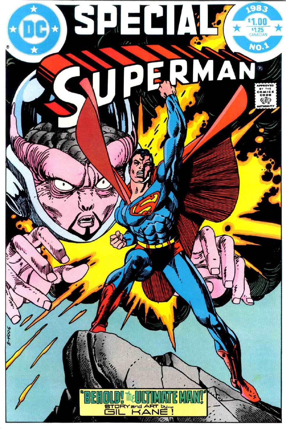
Superman Special #1: "Behold! The Ultimate Man!" 44 pages, of which the equivalent of 14 are reproduced below interwoven with 24 pages of hasty reinterpretation.
Gil Kane wrote and drew this story in 1982, apparently for the German market -- something complicated about publishing that I don't understand happened -- it was relettered and re-released here in America in 1983. I'd wager Julius Schwartz helped with the English dialogue....
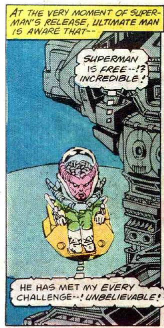
The villain(s) in this story never appeared before, and haven't been seen since.
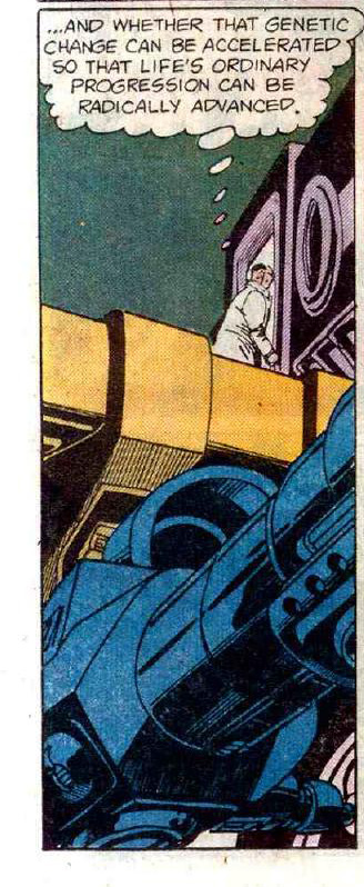
I have not figured out exactly what Kane was trying to say here. This is a philosophical work of some complexity.
This story is three iterations of the same theme. Superman defeats each iteration with his unique powers and then draws a moral conclusion that...confuses me, to say the least. Let's take a look.
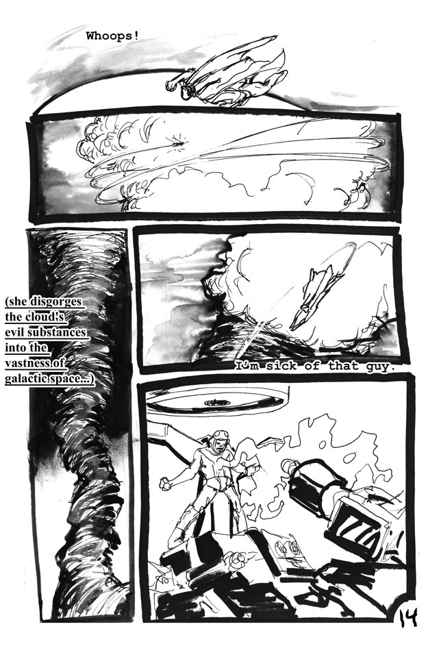
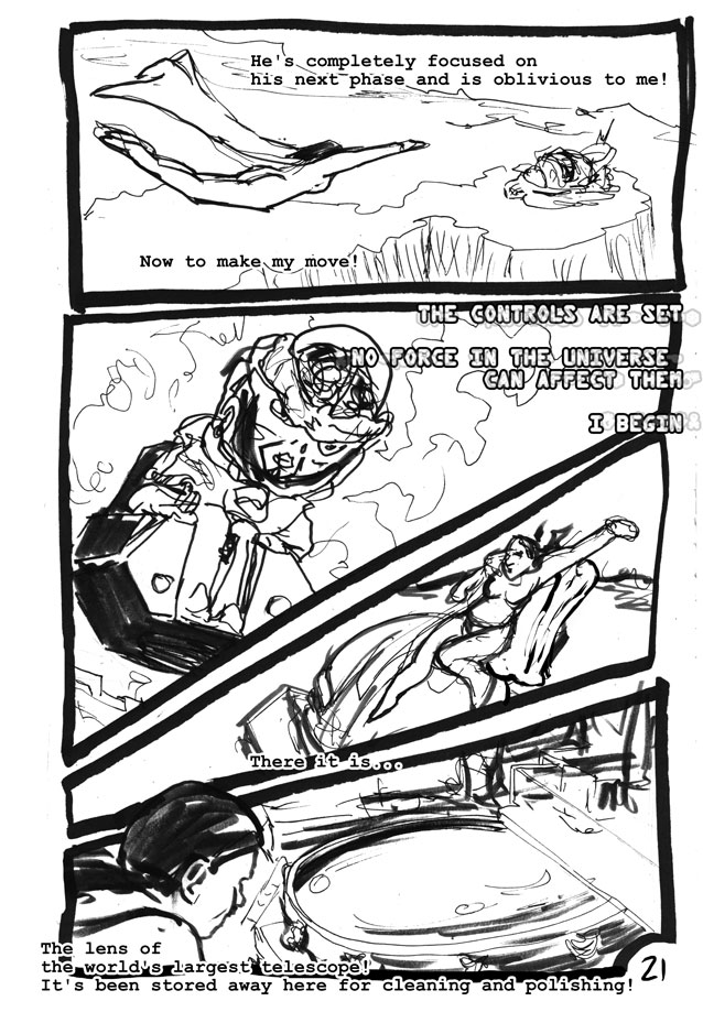
PAGE ONE: Superman flies through space.
PAGE TWO: he runs into Cthulhu:
http://unnecessaryg.com/lj/superspe
Lots of exclamation points in this story. After 24 hour comics day I had a problem with putting exclamation points on all my sentences for a few days. Seriously, just about every sentence in this story ends like this! IT'S ALL CAPS LOCK TOO! AND ITALIC!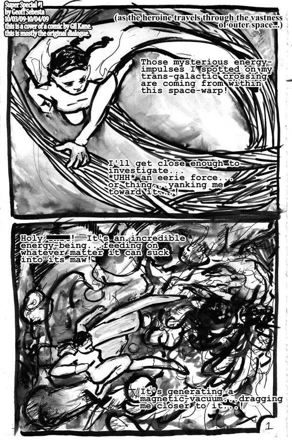
For those of you who never heard of it, 24 Hour Comics Day is when all sorts of artists get together and each produce a twenty-four page comic in twenty-four hours. I think this is the sixth time I've participated, so I decided to try something different. Instead of making up a new "song" I covered an old "classic."
I'm glad I tried this because it meant an intense twenty-four hours with Gil Kane. I learned so much that I can't even begin to list it all. Definitely one of the more artistically fruitful experiments lately.
In the two weeks since the event I feel my perspective drawings and life drawings have picked up remarkably, and also my invented landscapes and textures are much improved. I'll go through and mention things I learned as I go.
I also learned that I'm no Gil Kane, and without years and years of life drawing classes I never will be. But I was content to learn from the master.
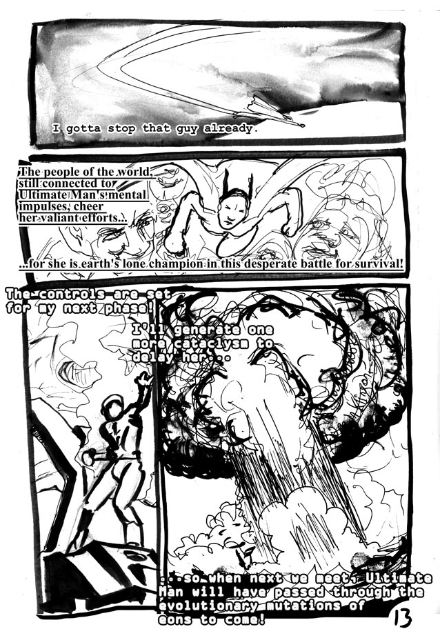
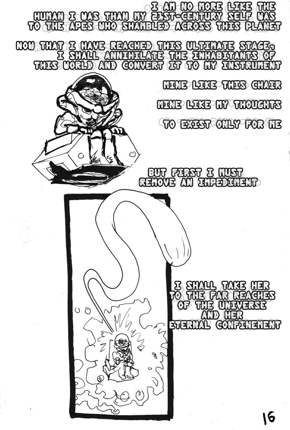
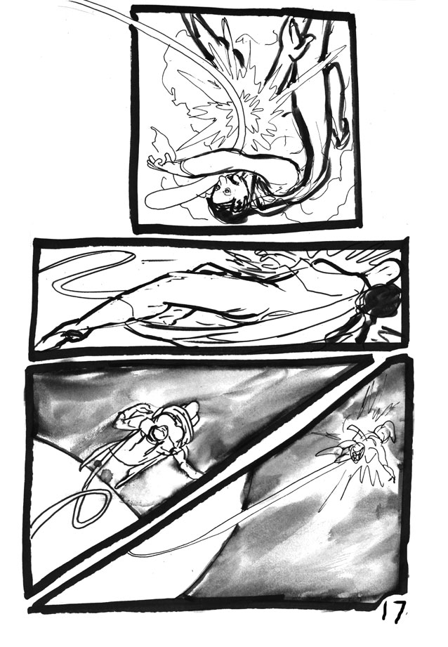
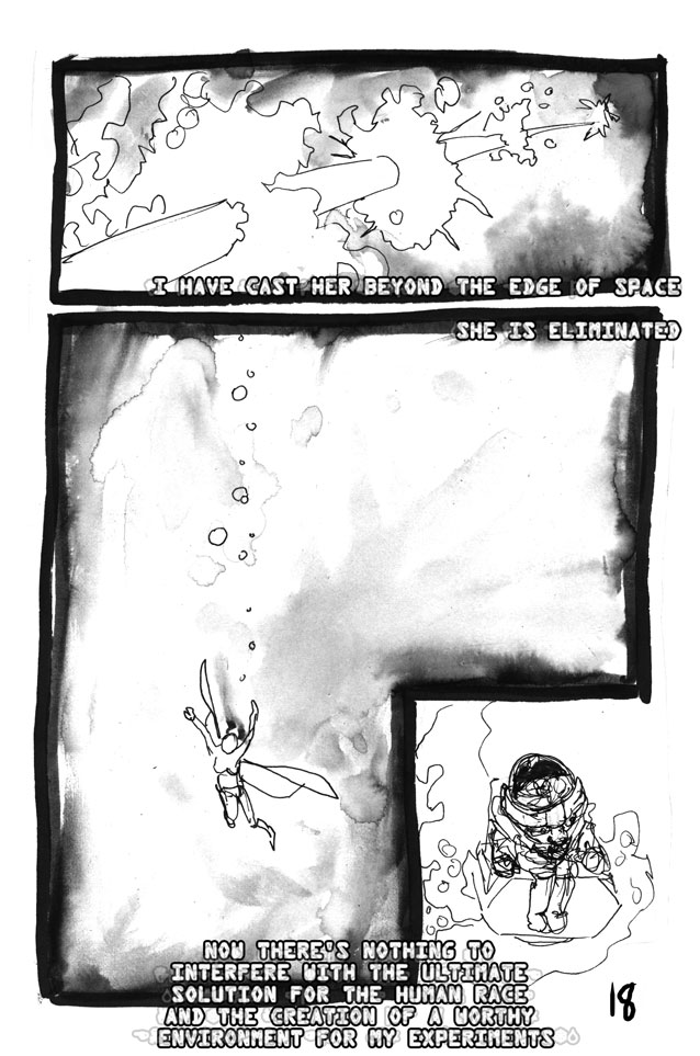
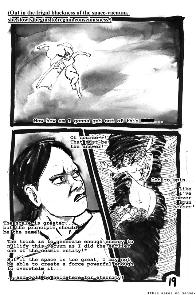
* I changed Superman to a woman because I wanted to do something to make my version different. I changed all her dialogue, sometimes it works, sometimes it doesn't. For the most part I kept the Silver-age looniness that I could.
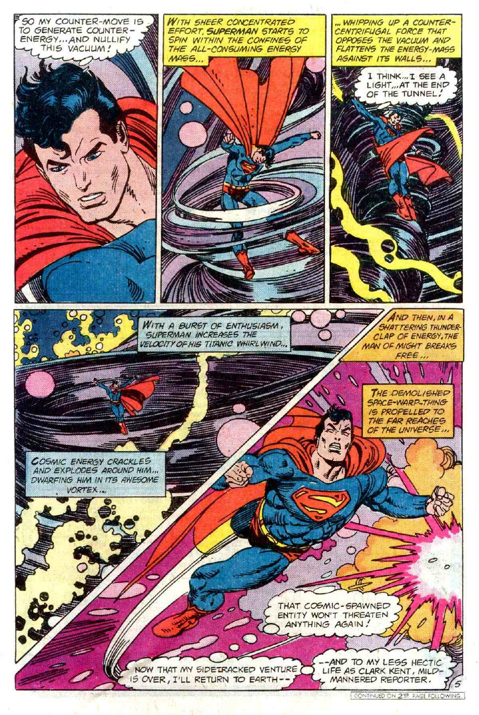
I include this whole sequence because, you guessed it, it's important later. My main question here is: does Gil Kane know something amazing I don't about quantum physics and spinning, or is he makin' stuff up?
I love the spinning poses. I have this theory he was watching figure skating as he drew this. And I love the way Kane...twists everything! I mean, his panel borders were always dead on and straight-edged -- this is as weird as his layouts get, he's no Neal Adams -- but Supes and his cape are always contorted in strange but logical poses. If you look at it, Superman is waving his arms around like a big gorilla! His legs and arms are always flexed, in action. It's amazing, I think responsible for a lot of the lifelike quality he has.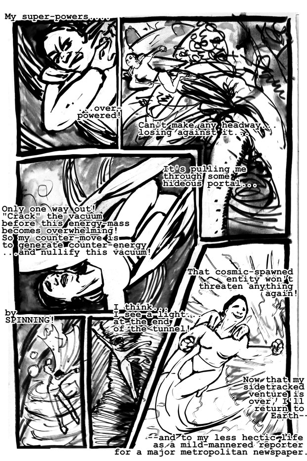
Of course I did not capture this very well. In fairness, Gil Kane probably had longer than 24 hours, but I'm not trying to kid anyone. Ah, well.
When I look at this page I mostly see how I do not draw as well as Mr. Kane. I hope it brings you some pleasure to see my rather crude reproduction.
I did learn a lot, though. For example, it's here that I started to notice Kane's approach to landscape. I know that seems odd to say "landscape" for a sequence that is supposed to happen in vacuum, but every panel has some kind of background and they happen in the same pattern you see a thousand times in this issue: three textures. Backgrounds, to Mr. Kane, are made of three interweaving textures. I don't think my art reflects this yet; you can probably watch me figure it out as the evening goes on.
Also I began to notice here that my approach to faces is entirely different from his. His Supes is naturally pretty grim and I tend to draw my heroine with a more active smile.
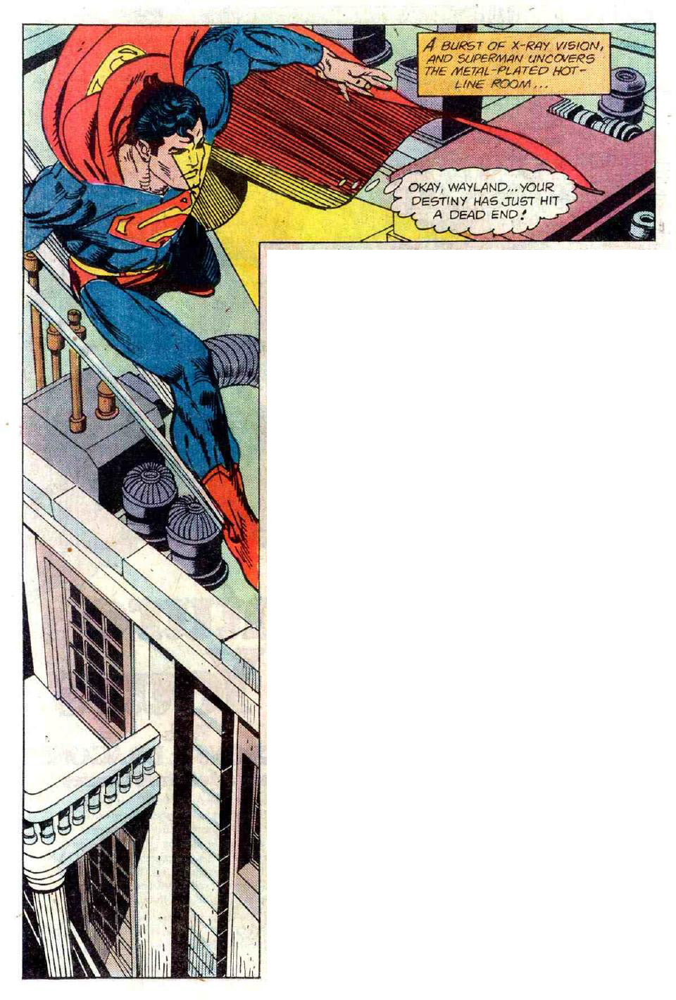
^^^That's a bit of exposition about Bentley Wayland, who was the actual villain of Iteration Two.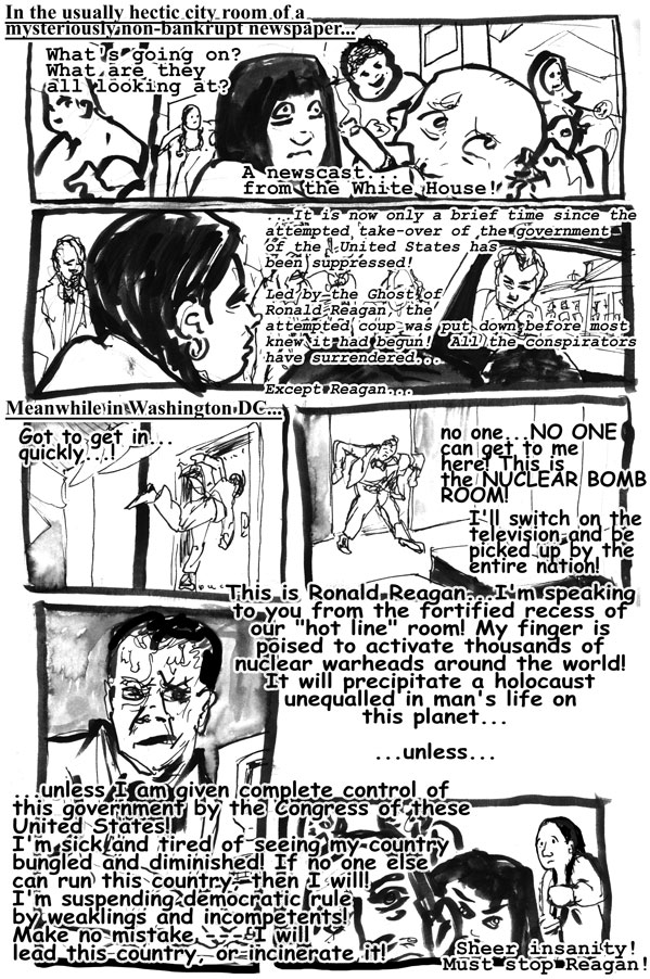
I changed him to Ronald Reagan. Because I'm immature, I guess. I can't figure out who he's supposed to be, in the comic. I thought maybe Nixon? But then I began to wonder if he's some European politician from the 70s or early 80s....anybody know?
Reagan was actually in the White House when this comic came out, so it's not too far a stretch. Also remember this was for a European audience.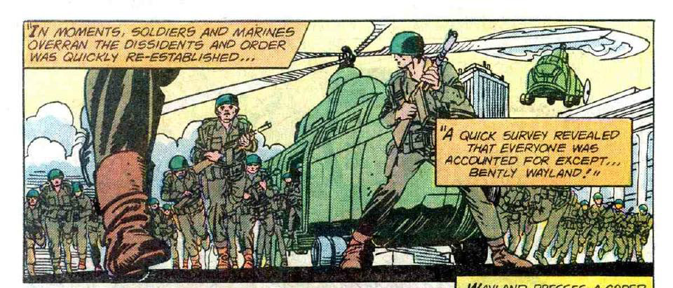
^^^Lovely, lovely framing panel -- ripe for all sorts of re-uses. Gil Kane's work has this cool beauty...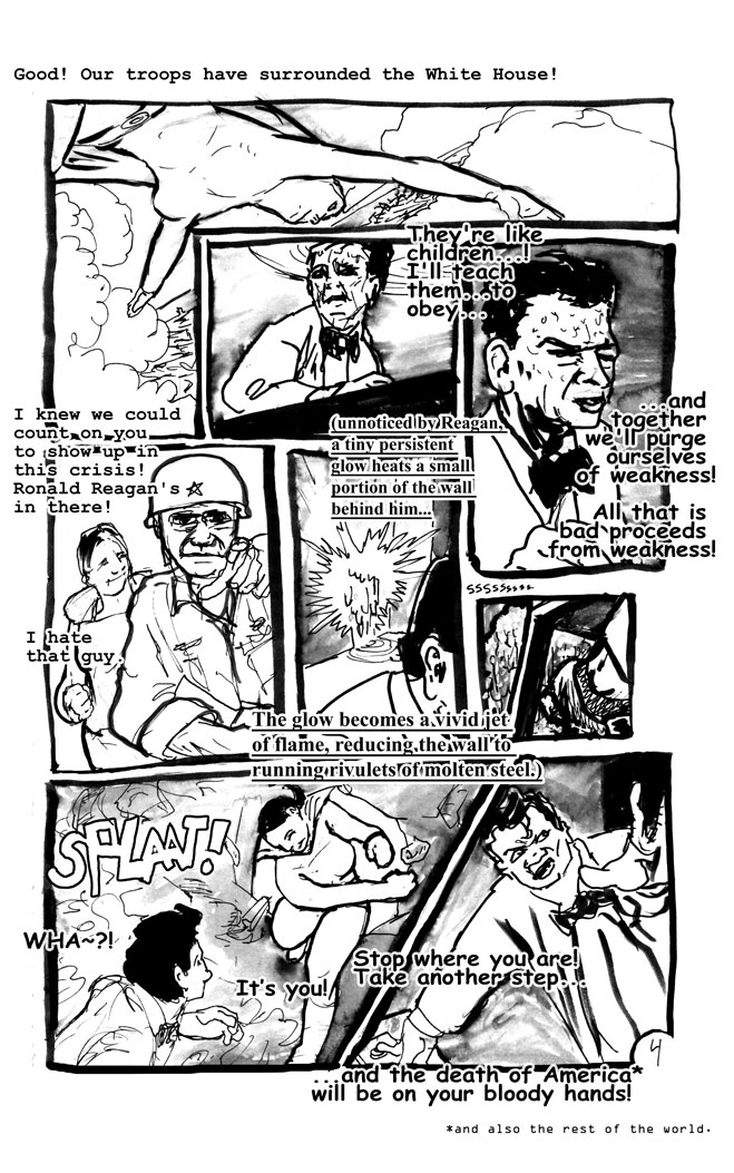
Curiously, this was not meant for American audiences at first. I wonder if the European version has "America" or the world. Gil Kane was Polish, by the way.
I don't care what you say I love my John Wayne panel.
Have I mentioned how amazingly satisfying this experience was from beginning to end? Could not recommend it more.
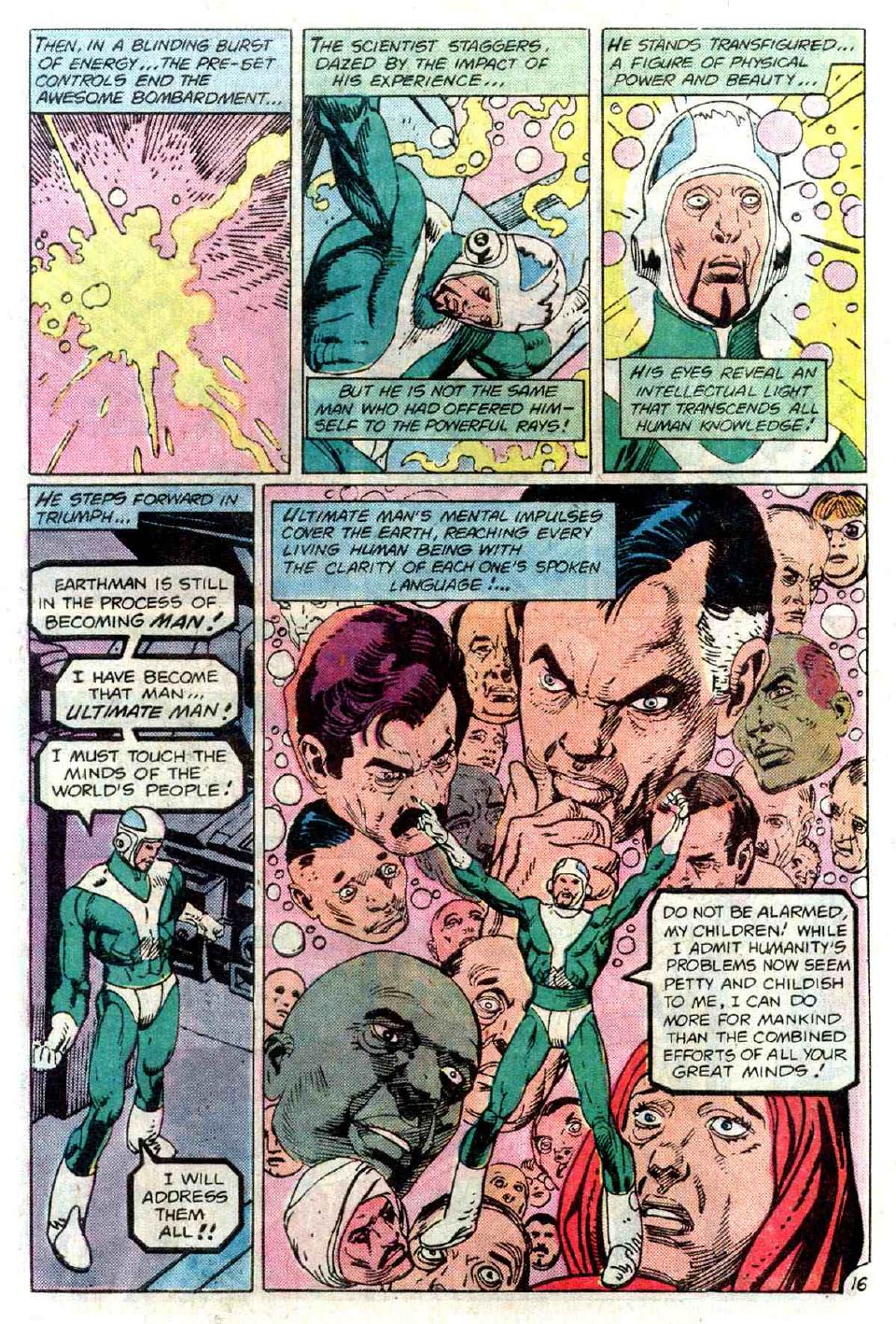
As re the story, I'd like to point out that once again Supes uses super-powers to defeat the threat. Supes does not act at all like a regular human in this story -- he appears as Clark Kent for EXACTLY three panels. He's more like a law of nature, relentlessly punishing blind ambition/hunger.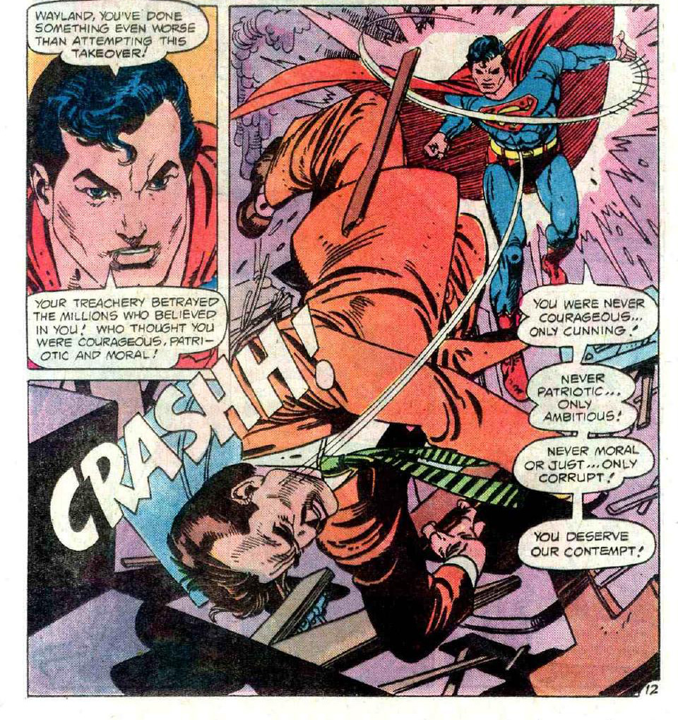
Anyway, he gives him a little speech as he smacks him through the wall.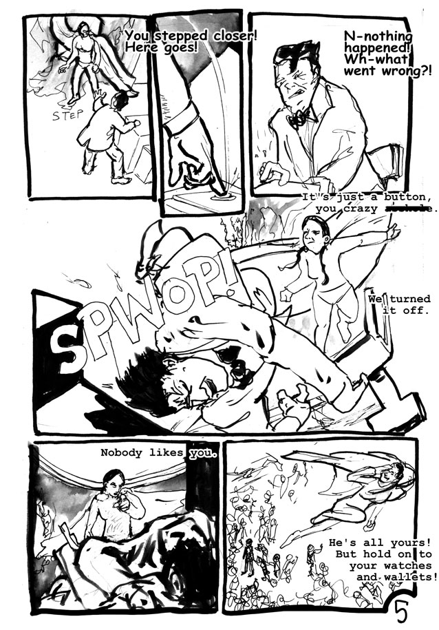
I'm more or less pleased with my dialogue here.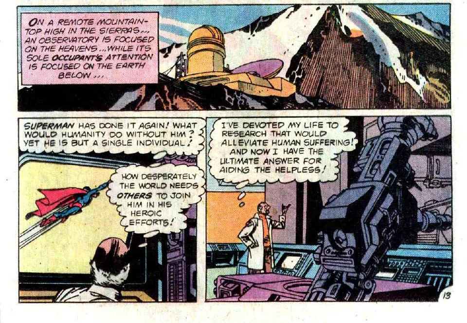
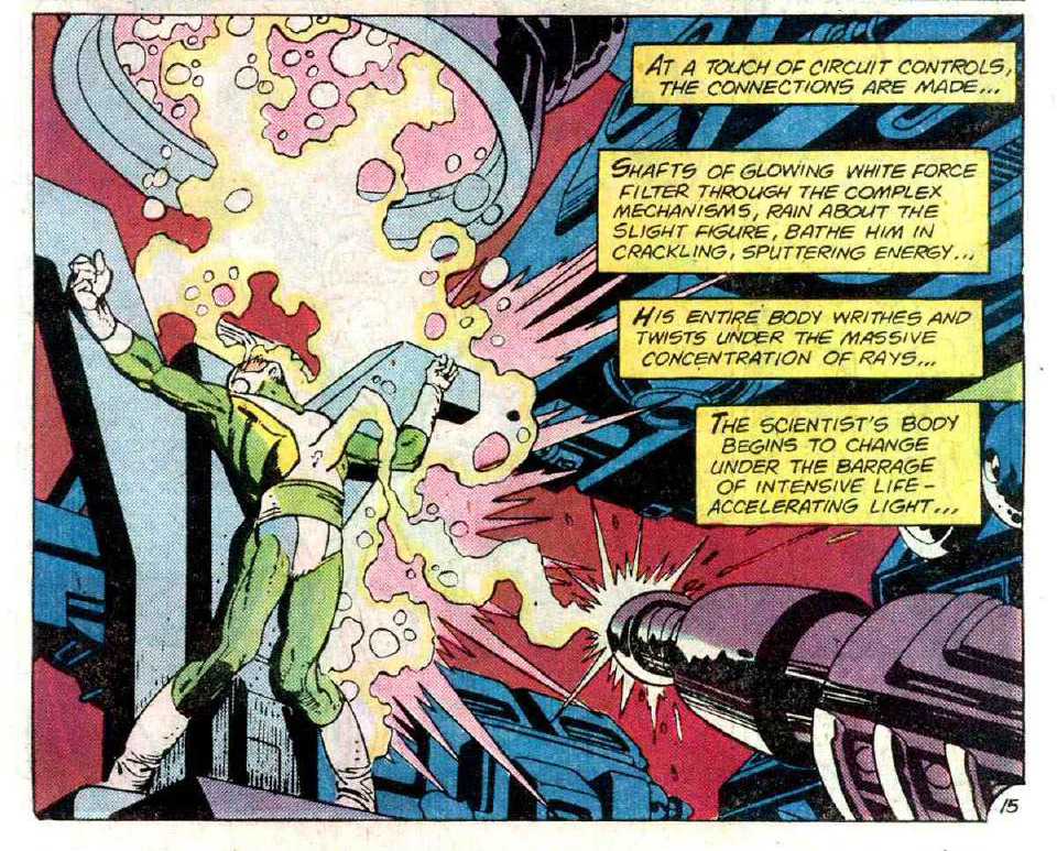
OMG so much sciencez!
It was here that I began to suspect that Sir Kane was drawing stereo equipment and cookware and using it for laboratory equipment. NOT THAT THERE IS ANYTHING WRONG WITH THAT. In fact if Kane does it I'm gonna do it too.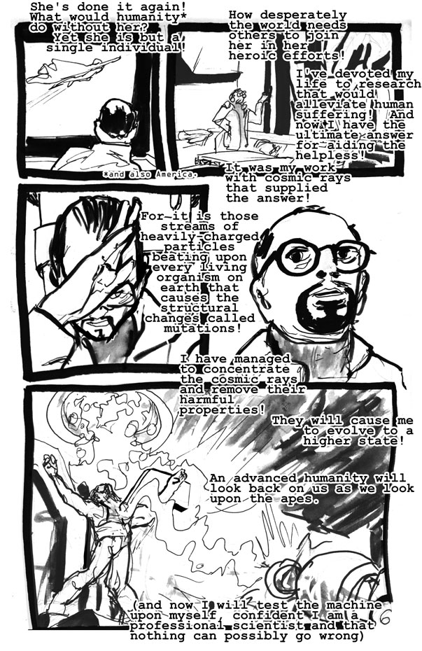
Gosh what a great page. That guy right over Ulimate Man is a bit crosseyed. Let me tell you; after spending 24 hours intensely staring at this issue, Gil Kane did not make very many mistakes!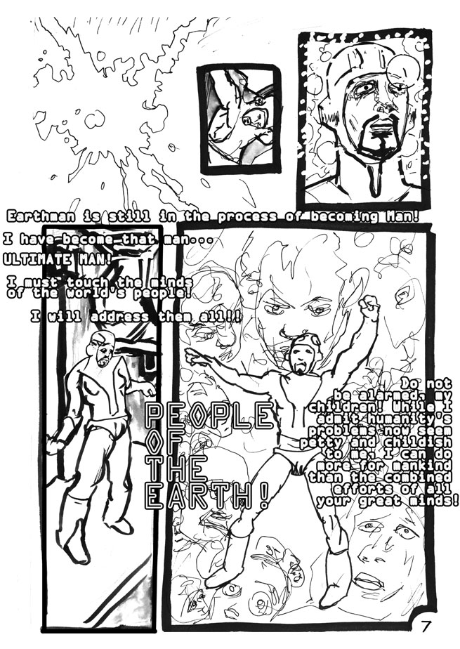
Did not nail it. I think my framing device at the top is alright, but I aimed for that expression in panel 3 and did not hit it. Also, note unfortunate hatching at top of page -- compulsive hatching is one of my worst habits.
This is one of my better attempts. You can see in the bottom panel that I am beginning to grok out his landscape structure -- three textures! Everything is made of three simple pen patterns, in approximate perspective, organized with a black area in the foreground, then a white area, and then hatched texture areas. Look! Pointy waves, blobs, and smoother waves overlaid by the pointy waves.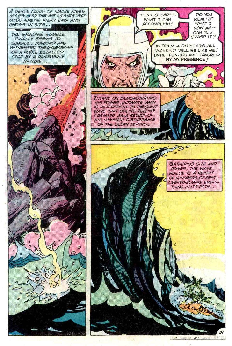
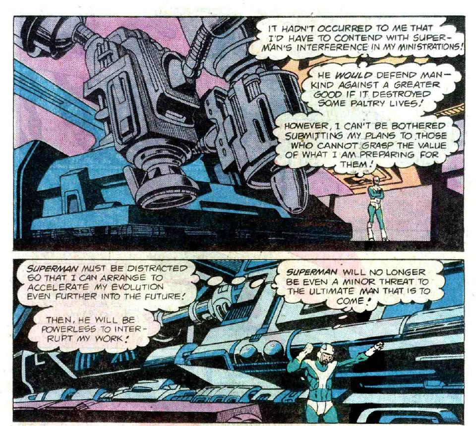
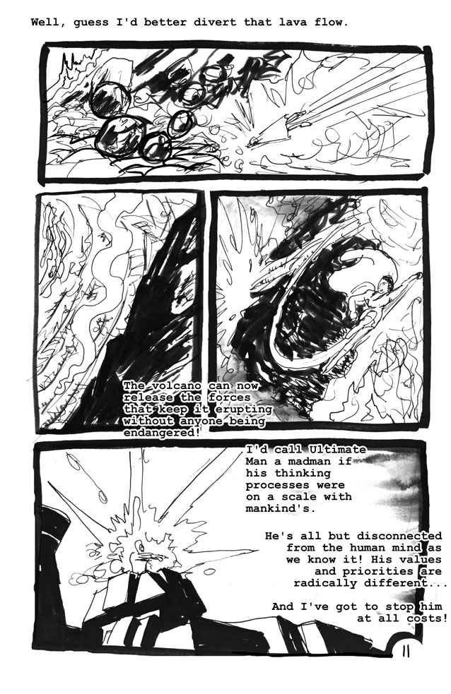
Now, this was one of the interesting things about the experience. This was not organized like a normal 24 hour CD. This is not organized like a modern comic at all. It's extremely repetitive, but with variations; much like a symphony. There is a long sequence here where the Ultimate Man basically sends textures to kill Superman, and Superman defeats them with curved lines. There are no people anywhere in this -- he's attacking uninhabited areas and anyway Kane didn't feel like drawing them. Other than the White House and the Observatory there are no buildings in this comic at all!
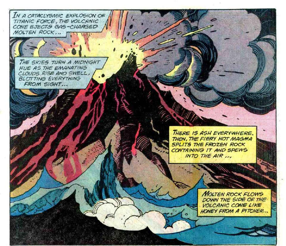
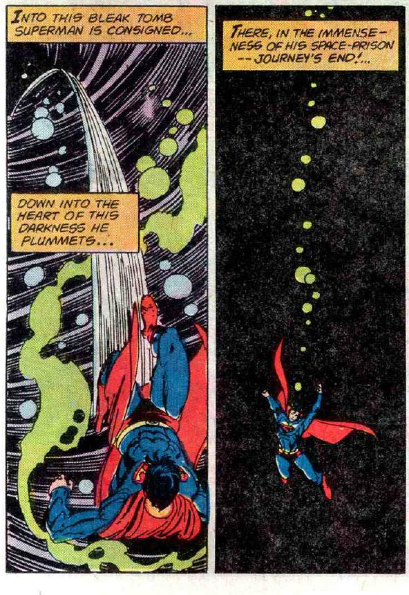
In the original comic this takes eleven pages and he fights all four of the elements -- water, earth, air, and kryptonite. Kryptonite kicks his butt, we'll get to that in a minute.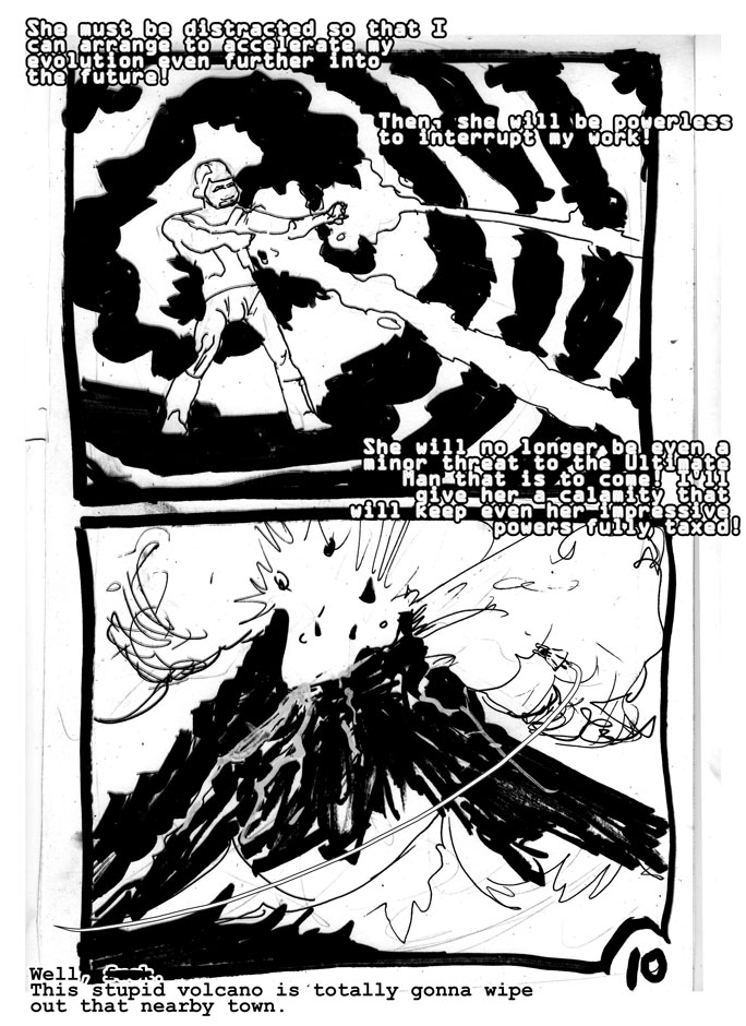
This is one of the very few times I feel my work stands up to the master's. Although I don't approach his draftsmanship this page has a pop-art feel that entertains me -- if I'd managed to do the whole comic with this sense of zap-boom-wonder I would have been happy.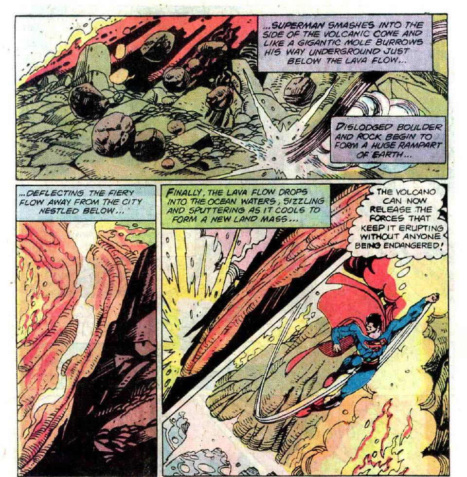
Q: "What if Jules Feiffer inked Gil Kane?"
A: "Readability problems."
Oh god I totally flubbed the podium here. It's the same podium at the same angle in every frame but I didn't notice that until page 20 or so.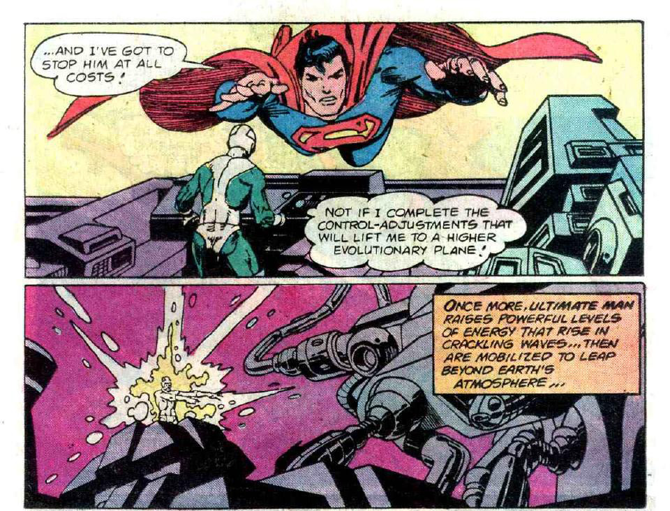
Ultimate Man sends another challenge ... a plague of meteors!
I cut almost all of Kane's meteor sequence because it was three pages, accomplished nothing, and had no one part that was all that beautiful to look at. So you're stuck with my version, which cuts to the chase: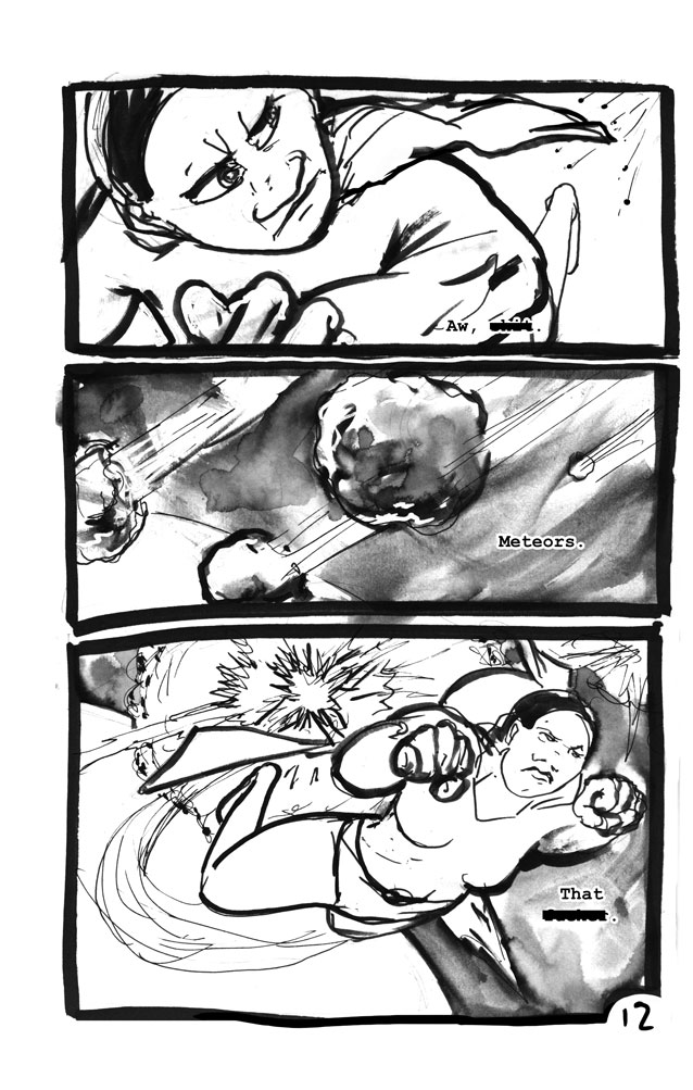
I am pleased with the dialogue. I do wish that I'd done my censorship bars a little better, though.
The textures in panel B please me. You can see me figuring out his pattern and adapting it -- instead of worrying about recreating his three textures here, I used my own (except instead of technique I used media; line, wash, and white-out).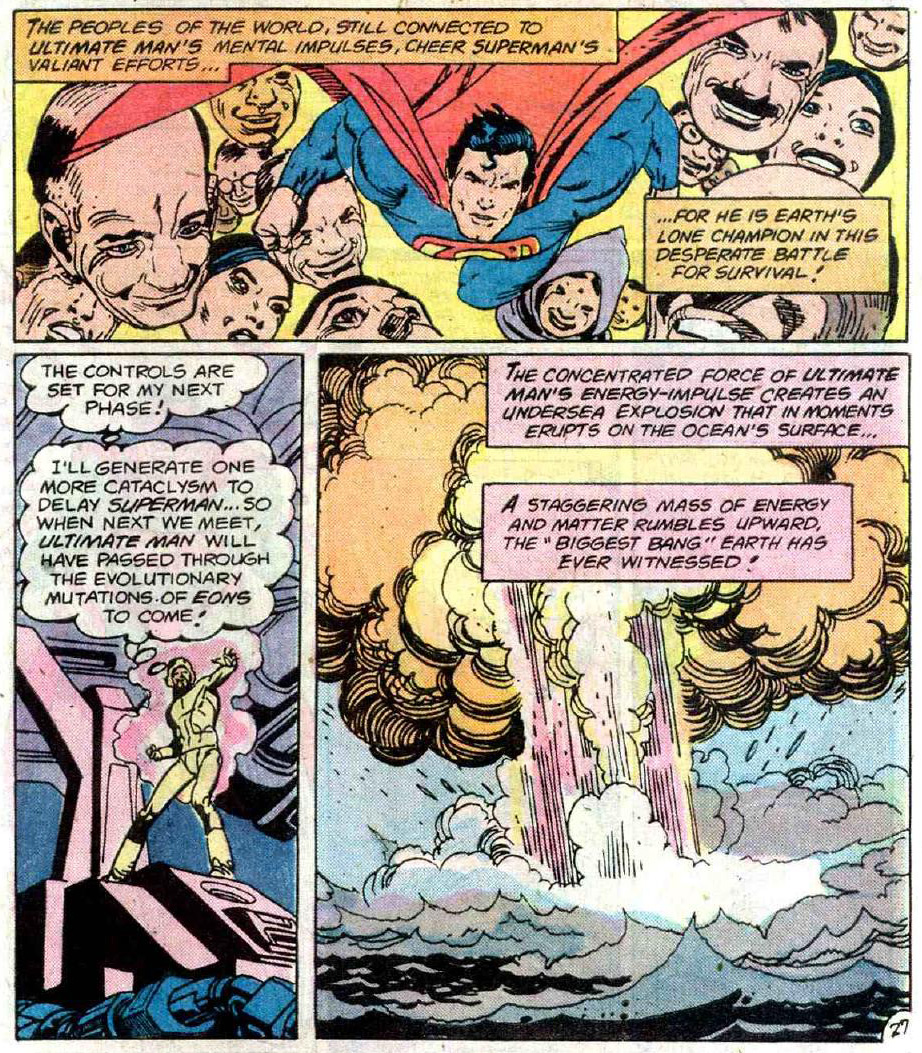
Panel A is alright. If I'd done a better job on panel B this would have been a great page.
You probably can't make out the secret message in the last panel, but it reads "If you own books on tape in Klingon, we can help." I think somebody said that when I was working on the panel.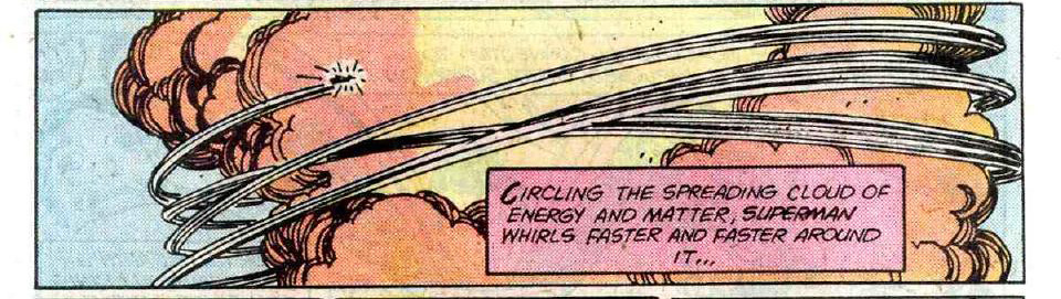
Panel two -- nailed it.
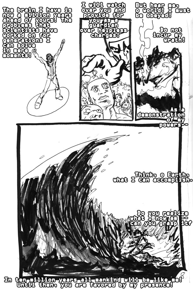
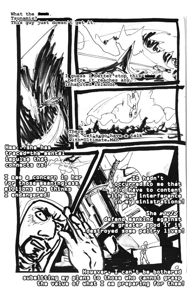
Anyway, he's defeated a tsunami, volcano, meteor strike, and now tornado. I was mapping this to air-earth-fire-water, but I think that's stretching it maybe. Maybe the volcano is fire and the meteor is earth, but why bother reaching that far? I don't know -- what do you think the significance of the challenges and their sequence is?
It's pretty clear we're looking at some sort of allegory about ambition and punishment. I am not at all sure I understand it yet.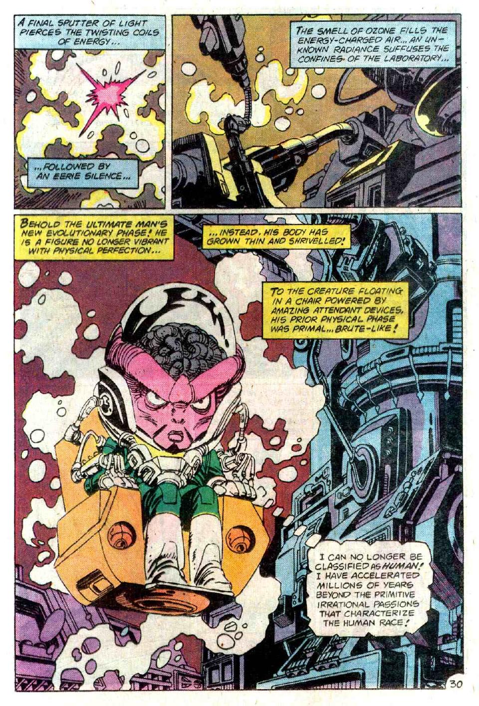
I had nothing to add, I was only pleased to learn at the feet of the master. Bonus points to anyone who can see what I did to the font here -- it entertained me. There are a lot of font jokes in this, like Reagan speaking in Comic Sans.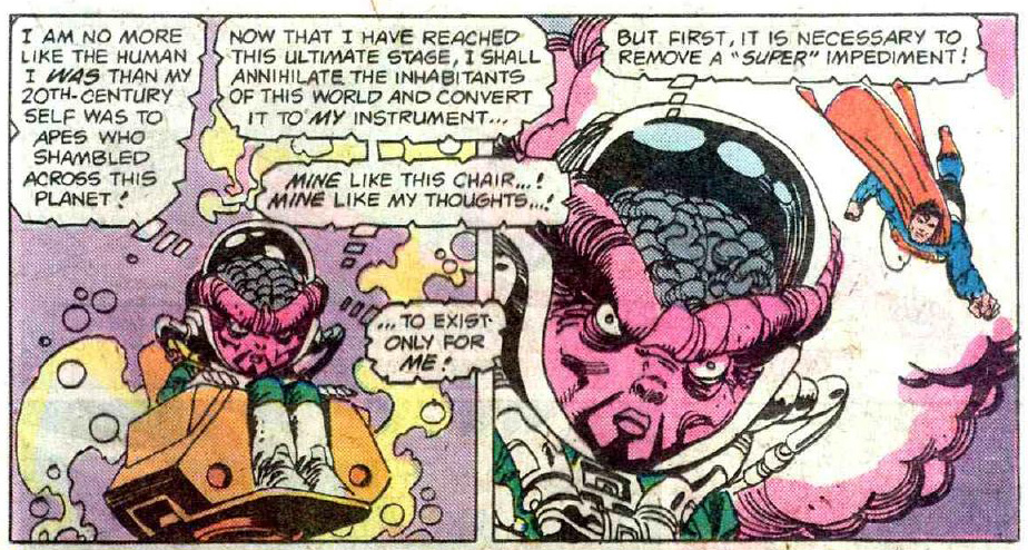
In theory the reframing works. In practice, not as much.
Anyway, force beams from the Punch Dimension! Of course they're green like Kryptonite -- that's why I mentioned it before -- but the real reason is that green is Supes' anti-color, especially in the Gold and Silver Age. I think this comic is Gil Kane's last love letter to the Silver Age. Flat color and giant word ballons.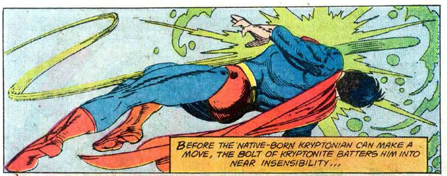
Oh God I am no Gil Kane. Look at his face in the last one. Look at it! What the hell was I doing? I was so tired by that point.
Anyway, Ultimate Man is beating him/her up with pure thought now. 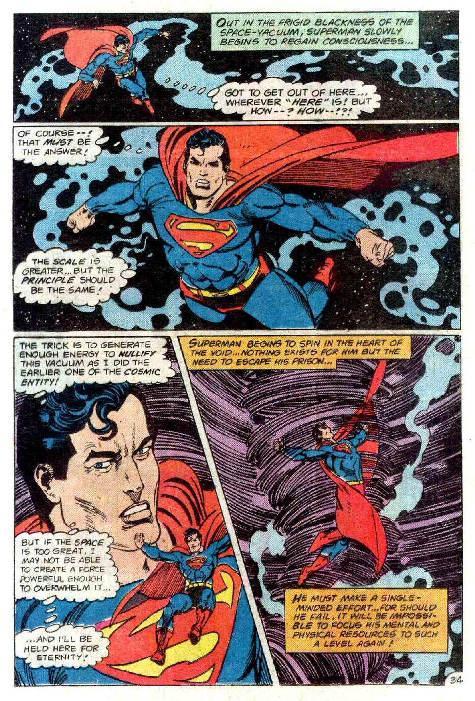
More spinning. I do not understand this stuff. What is he trying to say here? That kinetic energy can defeat vacuum? Is this an early version of Superboy punching Reality?
Let it be known that whoever Superman is and whatever he represents, he is immune to confusion. This sequence, as best as I can untangle it, shows the spirit of pure ambition (Ultimate Man) throwing Supes into a realm of pure thought. Which he defeats with the same trick he defeated Cthulhu, who is an inhuman principle of hunger (the most terrifying trope in literature -- the animal who is a predator to man).
So the Ultimate Man is a predator.
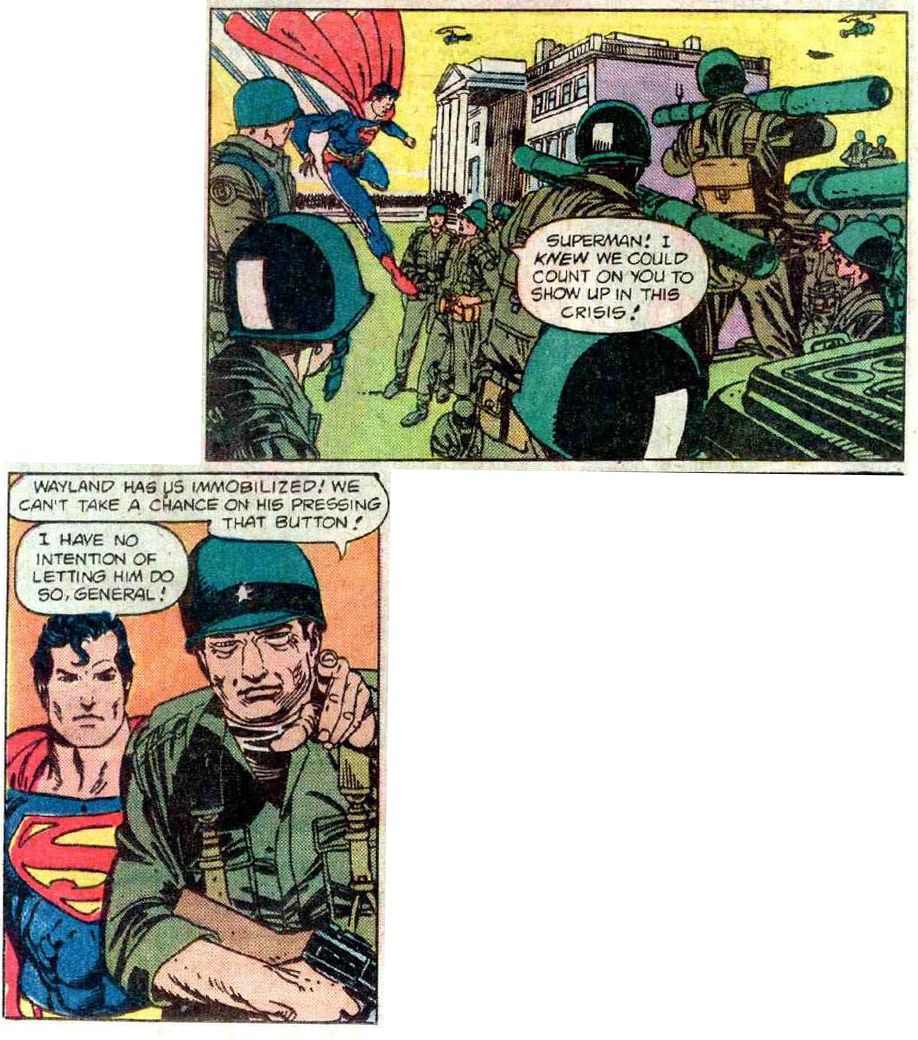
Superman/woman defeats him, through the use of "natural" principles. Mostly gently curved lines. And I'm not being sarcastic here -- there seems to be a consistent line symbolism in this book. These gently curved, loping lines are Superman's. Any time you see someone with a oval background over their head they're up to something -- Wayland/Reagan has that pattern in the Nuclear Bomb Room.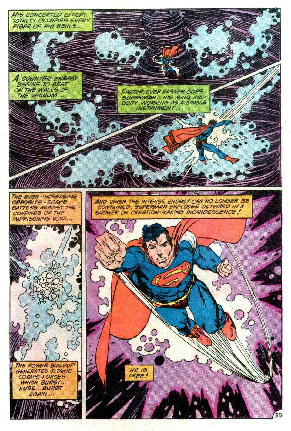
Yeah! Put your hips into it!
There is a coloring error on his shoulder in the last panel. I always feel good when I find an error in this book. His shoulder's also wrong in the first panel on this page: http://unnecessaryg.com/lj/superspe
Those are all the mistakes I've found so far.
:(
I love this panel, though I think the letterer botched it.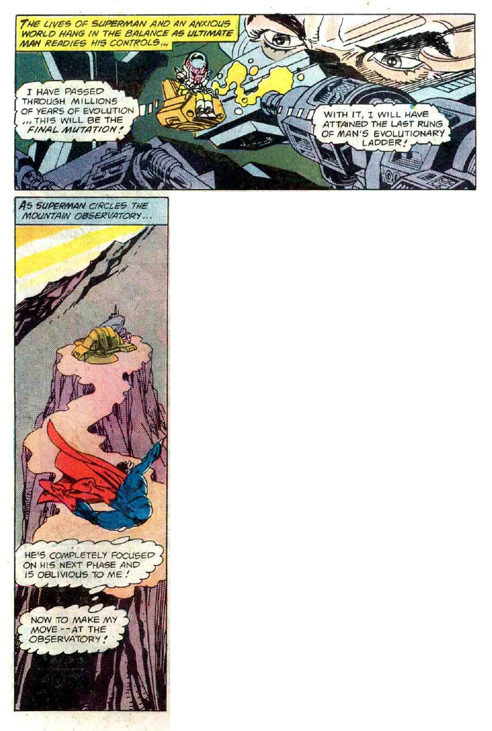
Baffling thing -- whose eyes are that in the top panel? Is that Supes or the original Ultimate Man or what?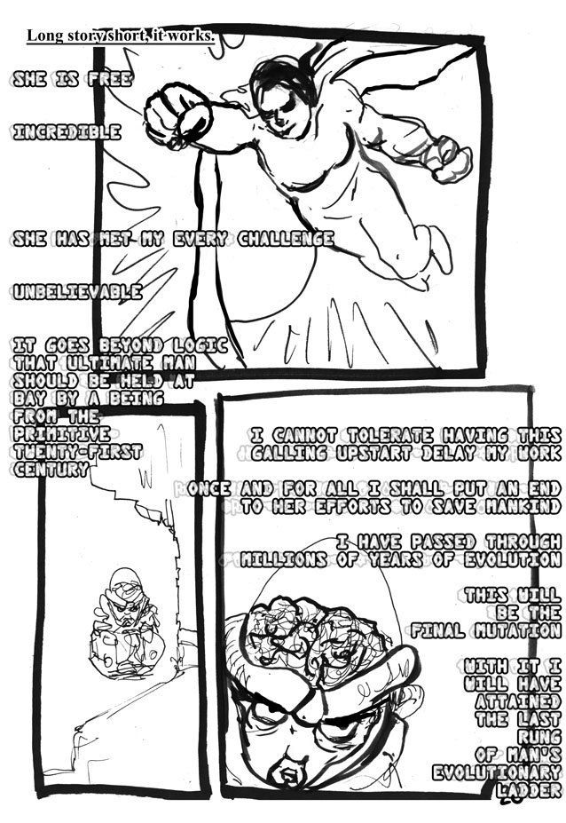
It was around here that I got tired and didn't care any more.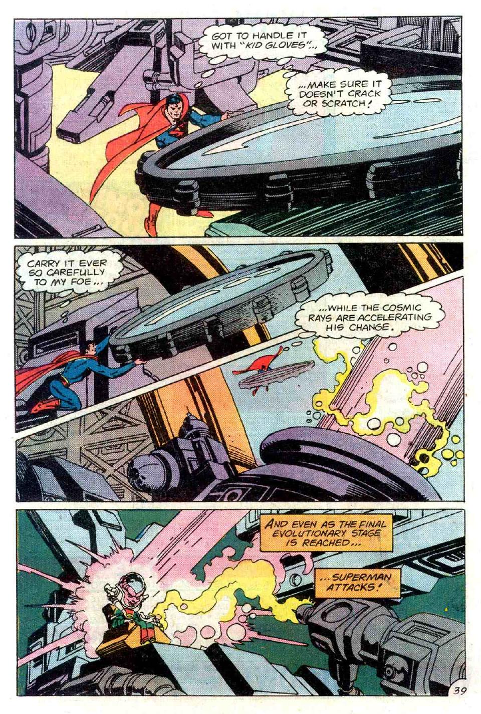
If you look closely at the next panel below, you will see that that is totally a frying pan.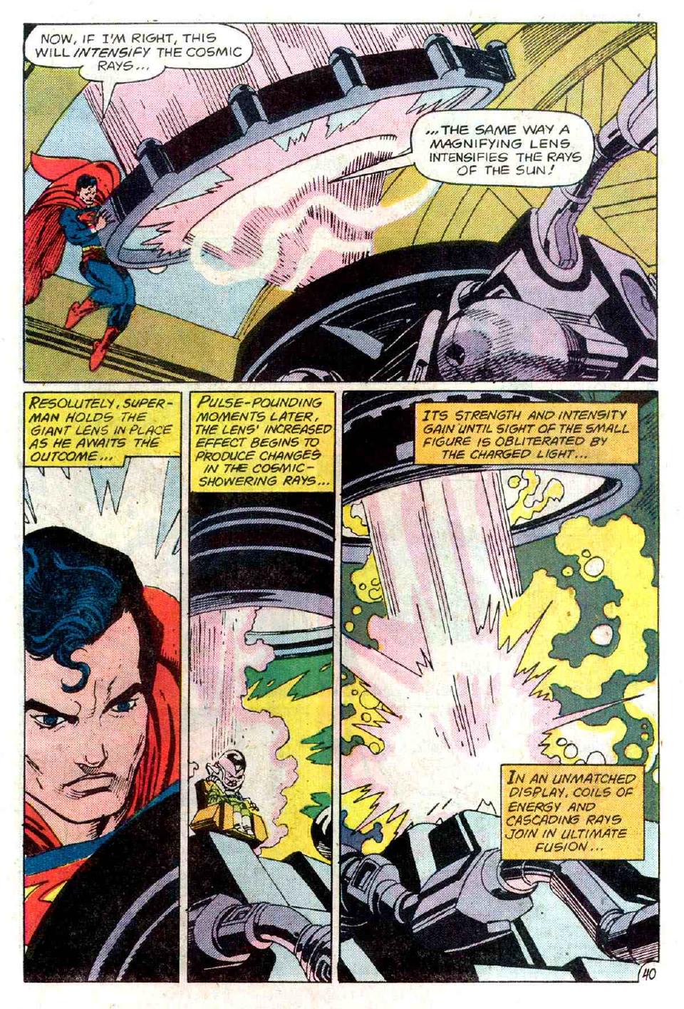
This is rather a grim prognosis for humanity.
So Superman tells us what we are supposed to learn here.
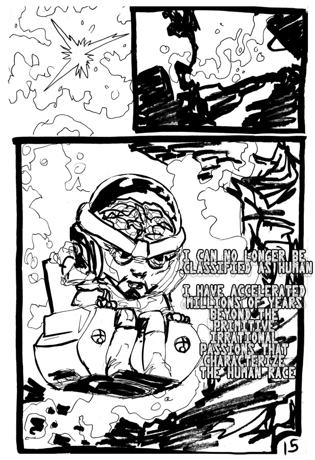
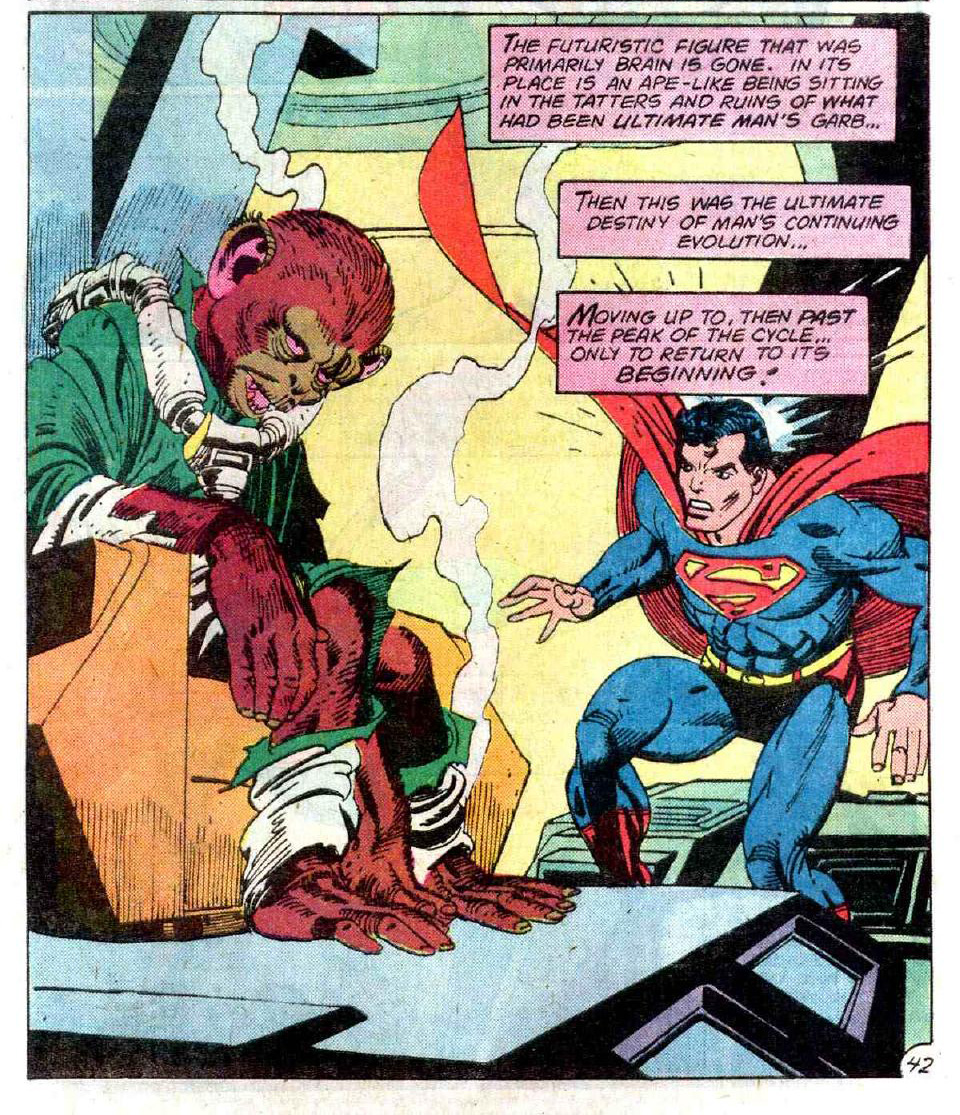
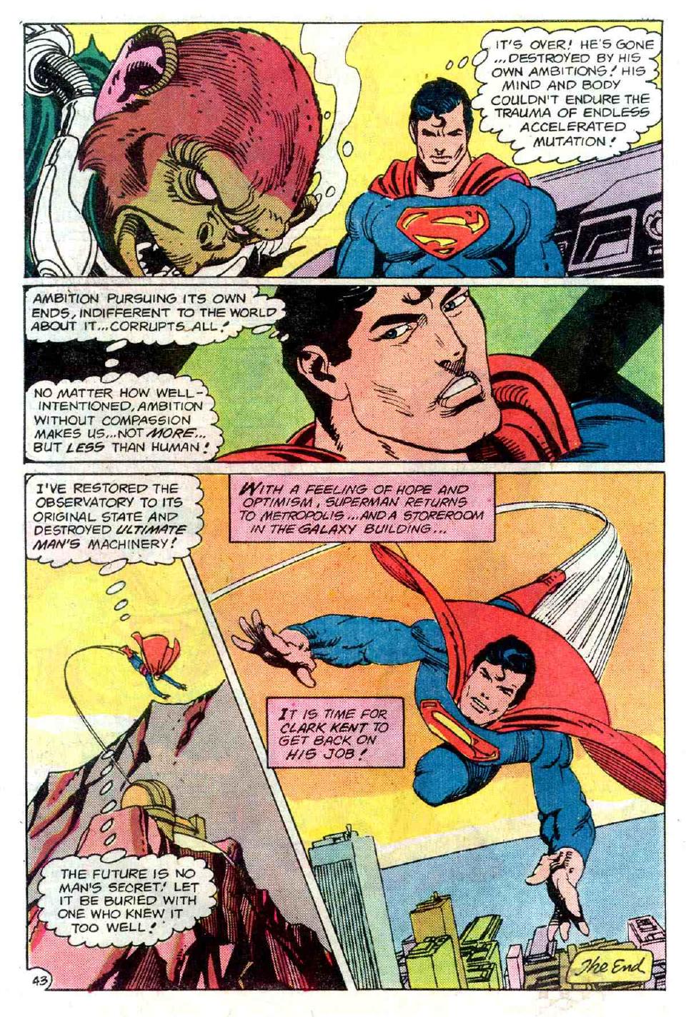
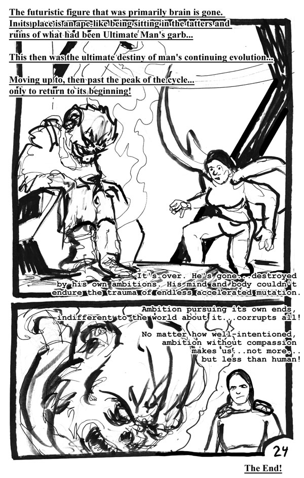
The first thing I see is that Superman is not human. He's a godlike figure at this time, pretending to be human because it suits his purposes. Somewhere between a paternal figure and a cosmological principle, he has no problem making decisions with vast consequences for all mankind. And he does a good job destroying the Observatory and all Ultimate Man's work; he's never appeared in another comic before or since.
And why would we want to know the future? First we become sociopaths in bodysuits, then MODOK, then apparently we suck so bad that we turn back into monkeys. No wonder Supes wants to protect us; it's a wonder he doesn't want to kill us.
But as he notes, it's the lack of compassion that's the problem. Ultimate Man would have been a good guy, but he wasn't really evolved. He just thought he was. Actually he was a primitive spirit grafted onto the body of a god, and that's why he failed.
Think about it -- Supes can do everything that Ultimey can do. Whatever he's got Supes will come on stronger. And so we are given the odd spectacle of watching an alien from Krypton fight and defeat the highest product of humanity...while everyone cheers on the alien...but let us not digress. Superman is already what Ultimate Man wants to be. But Superman has compassion.
This is demonstrated to be the only important value in this comic. It's funny that John Wayne steps in to agree.
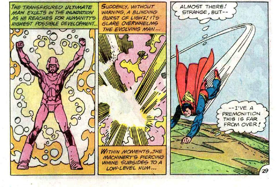
And so the Ultimate Man was struck back down to a monkey. This is much more metaphor than science. (I hope). If you accept that Cthulhu, Wayland/Reagan, and the Ultimate Man are all the same character, here's how the tragedy maps together:
good intentions (Wayland flashback, Ultimate Man in his first state)
power corrupts. Instantly, and through the gate of hubris (Wayland in the bomb room, Ultimate Man's fist monologue)
Hunger becomes all-consuming and mankind starts to look delicious (Cthulhu, Wayland's monologue, Ultimate Man's sociopathic tests)
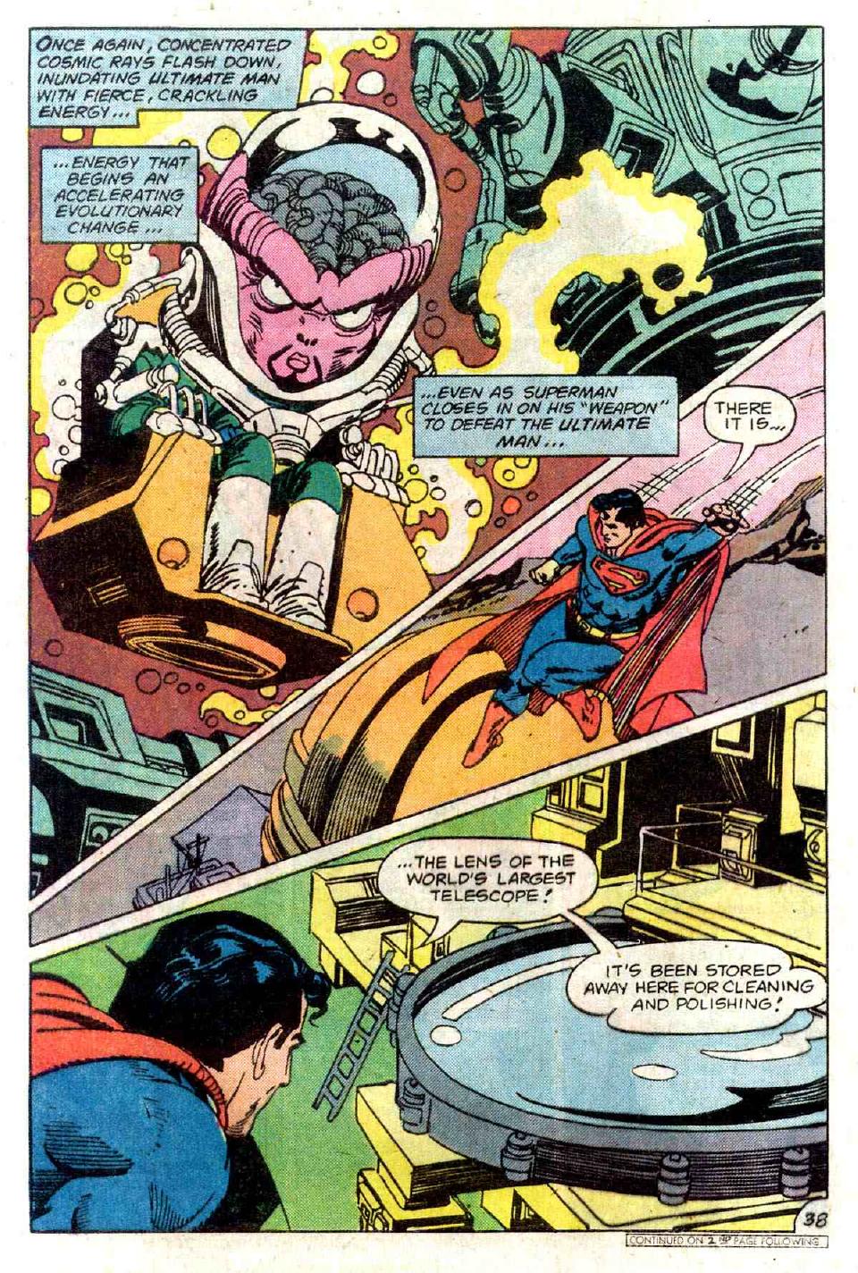
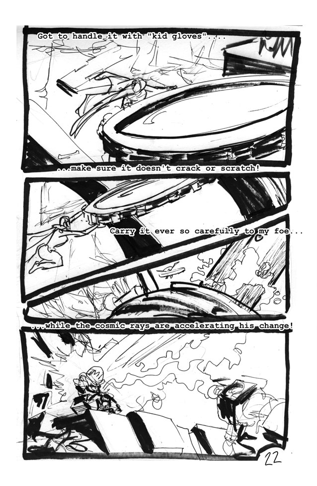
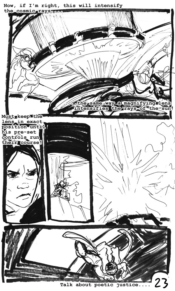
Supes smacks you around. With (1)spinning, (2)melting and punching, and (3)punching and spinning and a giant magnifying lens, respectively.
I'm tempted to view the giant lens as a sort of metaphor for the "spotlight" of fame and success. It has a concentrating effect, turning people into what they truly are.
I do not agree with previous commentators who say this is "Superman fights Objectivism." It's more "Superman fights selfishness," of which Objectivism is only a subset. But yes, what Kane's trying to say here is that if you get out of line and forget that you're human, a super-powered alien will beat you down.
Good advice.
Lousy science.
Moral of the story:
If I gained nothing else from this project, I see now that I've been drawing women's shoulders much too wide.
I learned a metric ton from this exercise. Spending twenty-four hours with Gil Kane is one of the smarter things I've done lately. Things I learned from the master:
Landscapes are made of interweaving combinations of three textures. They are organized from foreground to background as black silhouette, white silhouette, and hatched areas.
Arms and legs should often be drawn twisted. It looks cool, it takes the same effort to draw, since it's an odder pose people tend to be more forgiving and it gives a very pleasing sense of action and depth. Gil Kane did not use exaggerated perspective in figure drawing, at least in this issue.
Diagonal panel divisions work fine, especially when you have a main character who can fly.
Gil Kane can throw down the Kirbytech, and I don't have that knack yet. He uses it to create depth. The backgrounds in this issue are amazing. I've improved substantially since I did this comic but I'm not there yet at all.
On the other hand, Kane seems to know Kirbytech better than actual science. Either this story contains deep parables on quantum theory beyond my comprehension, or it's just some crazy pseudoscience. I mean, Superman beats up the vacuum of space. With his hips.
The Silver Age is a marvelous vehicle for a 24-hour comic, and if I knew at the beginning of the comic what I'd learned by the end I think I could have made something truly remarkable. Oh well, next time. But here is why the Silver Age works for this:
simple characters
repetitive action
clear design
redundant text (to cover awkwardnesses in storytelling)
lots and lots of text (to cover problems in the art)
This was also amazing for a 24hrcd, because for once there was no writing to do. I could concentrate exclusively on the art. I liked a lot of what I saw, and next time (we may even start doing 24hrcds quarterly, because it's a great way to get a lot of work done) I'll do the comic more in this way. To wit: simple story, repetitive action, lots and lots of dialogue. Baroque variations on simplistic themes. Maybe I won't do every comic that way but it's nice to have another trick up my sleeve.
Here are some other links to information about Superman Special #1:
http://www.supermanhomepage.com/other/k
http://grantbridgestreet.blogspot.com/2
http://www.ljpoisk.com/archive/5454
^^^^that's the only remainder I can find of the old article at the old s_d.
UPDATE SUPER COOL:
http://thenostalgialeague.com/olmag/ham
This is apparently the short story that this work was lifed from~! It was written in 1931, and as someone pointed out in an email to me:
"Julius Schwartz was an agent for pulp magazine writers. On page 34 of "Man of Two Worlds", his autobiography, he mentions being Hamilton's agent -- as well as his friend. So it's quite possible he gave Kane the "original" idea."
In other words; they needed something fast for the German market so they reached back in the files. Then they embellished it with a monster story and a political story about a coup in the White House.