
| kari ( @ 2009-09-06 03:26:00 |
|
|
|||
|
|
|
|
|
|
|
Tutorial for dark, blue-ish caps
Over the last months I learned a lot about lightening and cleaning up QaF caps, from tutorials by fellow icon makers or simply by trial and error.
Tonight I worked with a cap from episode 403, Brian and Emmett at Babylon. I was pleased with the result and thought that it would make a great tutorial. It is written for Photoshop, but I think most of it is translatable to Gimp in a way.
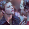
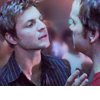
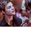
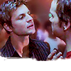
How to go from here 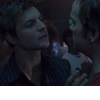 to here ==>
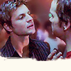
Since there are a few fans here who recently got started in the world of icon making, I addeda lot of blabbering in depth explanations why I did what I did (even if I didn't really know what I was doing. lol) So, beware of a long ass post by a non-native speaker.
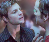
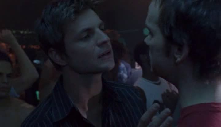
1. Original cap:
Crop, resize to 100x86 px
I usually try to crop 100x100 parts from a cap, but sometimes the scene doesn't work when cut into a square.
2. Create new file, 100x100 px, background: white, and drag the cropped pic into it.
==> That's a personal quirk of mine, but I heard other icon maker do that as well. The main reason is that in the beginning I often hit save while working on an icon instead of "save as" and the original cap was lost.
3. To brighten the pic up I add a curves layer.
RGB Input: 135 Output: 240
For more depth add another curves layer.
RGB Input: 91, Output: 109 and Input: 67, Output: 74
==> Moving the curve upwards increases the lightening, downwards darkens the pic, creating an s-curve increases the contrast.
4. Strg+Alt+A+E: creates a new layer by merging all the current layers and puts that new layer on top. It's useful when you like to use the current state of the icon for blending or for using adjustment options that don't work as layers. Before I add these kind of adjustments I usually duplicate the current layer once more, just in case I mess something up.
5. Image -> Adjustments -> Shadow/Highlight...
My default setting is as follows:
Shadows: amount: 50%, tonal width: 50%, radius: 30px
Highlights: amount: 0%, tonal width: 50%, radius: 30px
Adjustments:
Play with the color correction and the midtone contrast: the more to the right the more intense the effect.
This time I just increased the contrast to +15.
Now we've got a picture that is even less dark and has some more depth.

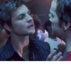
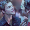
6. Before I continue to work on our two guys I'd like them to stand out more from the
crowd in the background. I zoom into the picture (100x100px sometimes is just too tiny for the finer adjustments).
I roughly mask the parts that are not Brian or Emmett with the polygonal lasso tool (feather: 3 to 5px => makes for smoother edges) and use the "Gaussian Blur" set to radius 2,0 (Filter -> Blur...) With the blur tool and a soft round brush (9px, strength: 22%) I add a bit of fine-tuning around the edges, and while I'm at it I smooth out the skin slightly.
7. Now I start working on the coloring. Babylon caps often come in every shade of blue and nothing else. I use a curves layer instead of a color balance layer because ... I don't know. lol I just like the curves better, I suppose. Playing with them is smoother.
In the color circle the opposite of blue is yellow. So, moving the curve in one direction or the other changes the way the icon is colored: upwards increases the primary color, downwards increases the color in opposition.
Blue Input: 80, Output: 64
Since that gives the picture a greenish look I change the setting for the green curve as well which adds a tad magenta.
Green Input: 87, Output: 80
I set this layer to "Color", which makes the picture a bit brighter.
8. Just to contradict myself I now add a color balance layer. ;-)
To make the skin tone look more healthy I increase the red and blue.
Midtones: +10 0 +10
9. What the icon still lacks is a certain depth. To work it out is my favorite part of icon making. To achieve that effect I use a variety of "tricks".
First I add a black/white gradient map layer, set to "Soft light" and an opacity of 40%. It steals a bit of color but the contrast is a real bonus. You can get a similar effect when you do the Strg-Alt-A-E stamp move (see step 4) again and use the same setting on the resulting layer.
10. I add another color balance layer.
Midtones: +16 -10 -19 => to get rid of the blue some more
Shadows: +7 0 -15 => for more depth and contrast
11. Well, there is a Brightness/Contrast layer after all, so let's use it.
Contrast: +5, opacity: 40%
==> I often use a higher setting and adjust it via the opacity afterwards. It's a matter of personal taste I guess.
12. I like my icons clear and shiny, so let's get to this part.
I select the layer with the actual picture in it.
Filter -> Sharpen -> Unsharp mask...: amount: 24%, radius: 1,0 px, threshold: 0
==> The Unsharp mask sharpens the picture in a subtle way and also increases the contrast once again.

13. Filter -> Sharpen -> Sharpen, then go to Edit -> Fade Sharpen: 40%
==> 100% Sharpening often leaves the picture too grainy. Again a matter of personal taste, but I like my icons smooth, the skin in particular. To prevent the skin from suffering from the sharpening I often use the blur tool afterwards to lessen the grainy effect.
14. Another useful adjustment feature for more contrast is hidden here:
Layer -> Adjustment -> Exposure...
Exposure: +0,07, Offset: -0,0050, Gamma: 1,04
Edit -> Fade Exposure: 85%

15. One last tiny tad of shiny you'll get via Filter -> Sharpen -> Sharpen edges,
then fade to 30%.
16. Almost there. :)
Since we lost quite a bit of color on the way I add a Hue/Saturation layer, set to
master saturation +12.

17. Now all we have left to do is cover that awkward looking edge of the cropped pic.
Since I'm pretty lazy I used this brush image by![[info]](https://www.insanejournal.com/img/userinfo.gif) ohfreckle, set to "Screen", rotated it and moved it downwards until it roughly covered the edge of the picture. However, there is too much of Brian covered now. So I add a layer mask and use a splatter brush (24 px) to paint the part of the mask with black until most of Brian's shirt is visible again but the edge of the pic still hidden.
ohfreckle, set to "Screen", rotated it and moved it downwards until it roughly covered the edge of the picture. However, there is too much of Brian covered now. So I add a layer mask and use a splatter brush (24 px) to paint the part of the mask with black until most of Brian's shirt is visible again but the edge of the pic still hidden.
18. Looking at the result I was thinking: 'OK, there actually is such a thing as too shiny in an icon.' lol
To subdue the "blazing" I add a Color fill layer, filled with #061232 and set it to Exclusion by an opacity of 30%.
==> The higher the opacity the more muted the colors become.
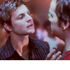
Voilá! :)
There is probably a shorter way to achieve this result, but detours can be fun too and can lead you to discover new and surprising effects.
As usual with these tutorials the steps and the settings are only suggestions. The best advice I can give is: play with your graphic program, find out which results you get with different settings.
If you read this far my sincerest thanks go out to you. *hugs*
Feel free to ask any questions to clarify one step or the other. :)
Over the last months I learned a lot about lightening and cleaning up QaF caps, from tutorials by fellow icon makers or simply by trial and error.
Tonight I worked with a cap from episode 403, Brian and Emmett at Babylon. I was pleased with the result and thought that it would make a great tutorial. It is written for Photoshop, but I think most of it is translatable to Gimp in a way.
Since there are a few fans here who recently got started in the world of icon making, I added
1. Original cap:
Crop, resize to 100x86 px
I usually try to crop 100x100 parts from a cap, but sometimes the scene doesn't work when cut into a square.
2. Create new file, 100x100 px, background: white, and drag the cropped pic into it.
==> That's a personal quirk of mine, but I heard other icon maker do that as well. The main reason is that in the beginning I often hit save while working on an icon instead of "save as" and the original cap was lost.
3. To brighten the pic up I add a curves layer.
RGB Input: 135 Output: 240
For more depth add another curves layer.
RGB Input: 91, Output: 109 and Input: 67, Output: 74
==> Moving the curve upwards increases the lightening, downwards darkens the pic, creating an s-curve increases the contrast.
4. Strg+Alt+A+E: creates a new layer by merging all the current layers and puts that new layer on top. It's useful when you like to use the current state of the icon for blending or for using adjustment options that don't work as layers. Before I add these kind of adjustments I usually duplicate the current layer once more, just in case I mess something up.
5. Image -> Adjustments -> Shadow/Highlight...
My default setting is as follows:
Shadows: amount: 50%, tonal width: 50%, radius: 30px
Highlights: amount: 0%, tonal width: 50%, radius: 30px
Adjustments:
Play with the color correction and the midtone contrast: the more to the right the more intense the effect.
This time I just increased the contrast to +15.
Now we've got a picture that is even less dark and has some more depth.
6. Before I continue to work on our two guys I'd like them to stand out more from the
crowd in the background. I zoom into the picture (100x100px sometimes is just too tiny for the finer adjustments).
I roughly mask the parts that are not Brian or Emmett with the polygonal lasso tool (feather: 3 to 5px => makes for smoother edges) and use the "Gaussian Blur" set to radius 2,0 (Filter -> Blur...) With the blur tool and a soft round brush (9px, strength: 22%) I add a bit of fine-tuning around the edges, and while I'm at it I smooth out the skin slightly.
7. Now I start working on the coloring. Babylon caps often come in every shade of blue and nothing else. I use a curves layer instead of a color balance layer because ... I don't know. lol I just like the curves better, I suppose. Playing with them is smoother.
In the color circle the opposite of blue is yellow. So, moving the curve in one direction or the other changes the way the icon is colored: upwards increases the primary color, downwards increases the color in opposition.
Blue Input: 80, Output: 64
Since that gives the picture a greenish look I change the setting for the green curve as well which adds a tad magenta.
Green Input: 87, Output: 80
I set this layer to "Color", which makes the picture a bit brighter.
8. Just to contradict myself I now add a color balance layer. ;-)
To make the skin tone look more healthy I increase the red and blue.
Midtones: +10 0 +10
9. What the icon still lacks is a certain depth. To work it out is my favorite part of icon making. To achieve that effect I use a variety of "tricks".
First I add a black/white gradient map layer, set to "Soft light" and an opacity of 40%. It steals a bit of color but the contrast is a real bonus. You can get a similar effect when you do the Strg-Alt-A-E stamp move (see step 4) again and use the same setting on the resulting layer.
10. I add another color balance layer.
Midtones: +16 -10 -19 => to get rid of the blue some more
Shadows: +7 0 -15 => for more depth and contrast
11. Well, there is a Brightness/Contrast layer after all, so let's use it.
Contrast: +5, opacity: 40%
==> I often use a higher setting and adjust it via the opacity afterwards. It's a matter of personal taste I guess.
12. I like my icons clear and shiny, so let's get to this part.
I select the layer with the actual picture in it.
Filter -> Sharpen -> Unsharp mask...: amount: 24%, radius: 1,0 px, threshold: 0
==> The Unsharp mask sharpens the picture in a subtle way and also increases the contrast once again.
13. Filter -> Sharpen -> Sharpen, then go to Edit -> Fade Sharpen: 40%
==> 100% Sharpening often leaves the picture too grainy. Again a matter of personal taste, but I like my icons smooth, the skin in particular. To prevent the skin from suffering from the sharpening I often use the blur tool afterwards to lessen the grainy effect.
14. Another useful adjustment feature for more contrast is hidden here:
Layer -> Adjustment -> Exposure...
Exposure: +0,07, Offset: -0,0050, Gamma: 1,04
Edit -> Fade Exposure: 85%
15. One last tiny tad of shiny you'll get via Filter -> Sharpen -> Sharpen edges,
then fade to 30%.
16. Almost there. :)
Since we lost quite a bit of color on the way I add a Hue/Saturation layer, set to
master saturation +12.
17. Now all we have left to do is cover that awkward looking edge of the cropped pic.
Since I'm pretty lazy I used this brush image by
18. Looking at the result I was thinking: 'OK, there actually is such a thing as too shiny in an icon.' lol
To subdue the "blazing" I add a Color fill layer, filled with #061232 and set it to Exclusion by an opacity of 30%.
==> The higher the opacity the more muted the colors become.
Voilá! :)
There is probably a shorter way to achieve this result, but detours can be fun too and can lead you to discover new and surprising effects.
As usual with these tutorials the steps and the settings are only suggestions. The best advice I can give is: play with your graphic program, find out which results you get with different settings.
If you read this far my sincerest thanks go out to you. *hugs*
Feel free to ask any questions to clarify one step or the other. :)