No purge @ 09:07 pm
Leave a comment
Graphics_R_Us |
|
|
April 6th, 2017August 14th, 2010Smooth curvy lines @ 03:00 pmHelp! Help! I am trying to make a smooth, curvy line with the Pen tool. All of my lines look really jagged though, like:  All of the tutorials I've read have the curvy lines looking smooth without telling how they got it that way. See here for what I am trying to do. Can any of you help? Thanks! ETA- Thanks to nerilka, I can do smooth curved lines. Now, how do I make a smooth spiral, like a tornado? June 3rd, 2010Tutorial #6 @ 10:06 amThe dreaded blue screen caps again! I just made this icon and since it was surprisingly simple to fix the blue coloring I decided to throw this tutorial together. We're going to go from this --->  to this ---> to this --->  ( Steps in here ) March 25th, 2010My first ever Icon Tutorial. @ 05:26 pmI've never done one of these before so bear with me okay.  ( Gus Icon Tutorial ) Icon composition @ 10:57 amI'm trying to get fancy with my icons, but I don't really know how to do this. I've been just jumping in, but I wonder if there are any guidelines, rules, or tutorials for this. ( Here are some of the icons I've been working on. ) March 15th, 2010Color Adj @ 12:43 pmCan someone tell me how reduce the white on Brian and Justin's faces in this pic? Thanks! ( Large pic ) March 11th, 2010My turn! @ 08:02 pmCurrent Mood:
Old -->  New --> New -->  Old -->  New --> New -->  Old -->  New --> New -->  Feel free to tear the old ones down, they deserve it! A work in progress @ 10:20 pmHope it's OK to post this here, but after So I thought it might be fun to share one of our very first icons and a fairly recent one, as encouragement for newcomers, and to show that we all had to start somewhere. The graphic genius that is Without further ado I'll be the first. Almost 4 years passed between these two icons. I hope there is indeed some progress visible here. lol Then: ETA: So, I showed you mine, now show me yours. ;-) I'll add the links as we go along. * * * * * * Here is * * * * * * And here is * * * * * * Here January 4th, 2010Question about "depth" @ 02:31 amI know the basics and some intermediate steps for making icons. However, my icons still seem to lack a certain depth that I see in others' works and I am not quite sure how to capture that. ( Here are some examples. ) December 22nd, 2009Falling object icon tutorial. @ 11:06 pmI wrote up a falling object icon tutorial, to explain how to use Photoshop to make icons such as: Check it out at my journal. November 17th, 2009Icon Tutorial Links @ 05:01 pmHere is a great tutorial that helps explain Histograms, Levels, and Curves. And if you don't know what those words mean, don't be scared off. Before I read this tutorial, I would play around with the sliders and noticed the changes, but I didn't know what the point was and was mostly stumbling around in the dark. While looking up references and links for a tutorial on animated icons, I found one specifically for Gimp, which many of you use: Here. I don't use Gimp, so I can't verify the quality of this tutorial. Remember that the size limit for icons is 40 kb for Live Journal (and elsewhere) and 100 kb for Insane Journal. November 12th, 2009Putting Text on Icons @ 12:21 pmI was wondering if someone could give me a few tips on putting text on icons. I've had a scroll through the asylum and didn't see a tutorial on this subject. I'm pretty useless at making icons but I can manage in a pinch, however I have never been able to do text. Can anyone help? Oh! And I use Photoshop but I have access to GIMP. October 15th, 2009Tutorial #5 @ 09:38 pmMy result: 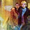 ( Just 4 little layers ) September 6th, 2009Tutorial for dark, blue-ish caps @ 03:26 amOver the last months I learned a lot about lightening and cleaning up QaF caps, from tutorials by fellow icon makers or simply by trial and error. Tonight I worked with a cap from episode 403, Brian and Emmett at Babylon. I was pleased with the result and thought that it would make a great tutorial. It is written for Photoshop, but I think most of it is translatable to Gimp in a way. Since there are a few fans here who recently got started in the world of icon making, I added ( Here we go ) August 27th, 2009Color correcting @ 01:32 pmCan anybody help me color correcting this (taken by inner_justin, I believe). I have been using Photoshop and keep messing around with the color balance and selective color options, but I am not sure I am maximizing the change potential. Any help?  August 19th, 2009Question about coloring/lighting @ 09:36 pmIs there anything to do to this icon to lighten it, to see the skin and hair color better?  July 19th, 2009Tutorial #4 @ 10:14 pmSeveral weeks ago ( The sketch effect ) Tutorial #3 from me :-) @ 12:08 amI made this graphic today and thought it turned out pretty cool so I figured I'd share how I made it. This was surprisingly easy to do. 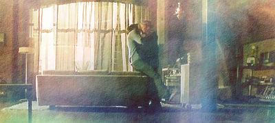 ( Textures are our friends ) June 24th, 2009Question about polaroid-style brushes @ 03:06 pmI come with a question! I am trying to make a graphic with a Polaroid-look, ( more info ) June 18th, 2009Blue light tutorial @ 10:24 pmCurrent Mood:
This is in response to ( Here we go! ) | ||||||||||||||||||||||||||||||||||||||||
| Powered by InsaneJournal |
Graphics_R_Us |
|