
| LS Asphyxiated. ( @ 2012-05-27 18:35:00 |
|
|
|||
|
|
|
|
|
|
|
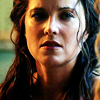
Okay, so. The lovely Claire (
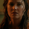 |
Step 1 For the sake of this tutorial I am going to be using this image by Grande Caps of the beautiful Lucy |
 |
Step 2 Flatten your image, and do an Auto Contrast. A lot of people insist that you need to do all the Autos - Tone, Contrast, and Color. I don't think that is always a necessity. The thing about Spartacus caps is that they are gorgeously lit with natural light. If you hit auto color, more often than not it tints the image blue to even it out and you lose the FEEL of the original scene. Now, if you're trying to make the icons look a little more modern, Auto Color/Tone might be for you. For the sake of Sparty caps, we're only doing Contrast. Later on I'll show you the difference between these functions. |
 |
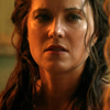
Step 3 Duplicate your layer, and set the top layer to Screen, with an opacity of 100%. Easy enough, no? |
 |
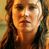
Step 4 Duplicate the top layer, and set this one to Soft Light, opacity 100%. Oooh, lookit that color POP. Yeah. That's how I like it baby. You so good to me I--sorry, carrying on now. |
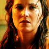 |
Step 5 At this point you may find that your image is too dark or too bright. What I want you to do is go back to your MIDDLE LAYER, the one set to Screen, and play with it. If it's too bright, lower the opacity until it looks right. If it's too dark, duplicate the Screen layer. However, I feel like the coloring on MY image is absolutely perfect. Dramatic and shadowy WITHOUT losing the importance of her expression. So I click on the TOP layer, the one set to Soft Light, and I sharpen. Here's the thing, boys and girls: I NEVER sharpen my base directly. The sharpen tool is a deadly weapon in the hands of some. If it's a choice between no sharpen at all or over-sharpened, I take none at all every time. Over-sharpened icons just look GROSS. Have you ever seen what dried puke looks like after it's been left in the sun too long? That is what I think of over-sharpened icons. For real. I only sharpen my soft light layers - and even then, sometimes I feel the need to lower it. You can do this (if you need to) by going to Edit: Fade Sharpen. |
At this point, I consider this particular icon complete. But this was a particularly gorgeous cap, and took very little effort on my part. Here are some other icons I've made using this process: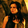 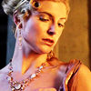 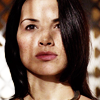 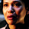 So, what does that same icon look like if I use Auto Tone and Auto Color? Well, it looks liiiiike... |
|
 |
Let's face it: still pretty hot, right? But the lighting is different, and for period icons, I feel that the natural coloring is very important. This is not always the case! Here are a few icons I made where I used the exact same technique, only with the addition of Auto Color and Auto Tone on the base: |
  In the end, I encourage you to go with what you feels works best for your set. I firmly believe that the same icon coloring does not work for every show/photoshoot. Like, I don't use the same technique for Sparty that I do for Game of Thrones. It just doesn't look good. If you want to make super simple icons and make them fast, I think my method is decent enough. It's enough to get you started, anyway. ;) |
|