
| geoffsebesta ( @ 2009-08-25 08:17:00 |
|
|
|||
|
|
|
|
|
|
|
| Entry tags: | creator: keith giffen, creator: larry mahlstedt, creator: steve lightle, publisher: dc comics, theme: panel layout, title: legion of super-heroes |
Legion of Super-Giffen, Prologue III
But Keith Giffen left the book.
They say it was the poster that did him in.
This poster:
http://unnecessaryg.com/lsh/GiffenPoste
Ah yes. The famous compositional style, unique to 80s DC, of people randomly standing around in the air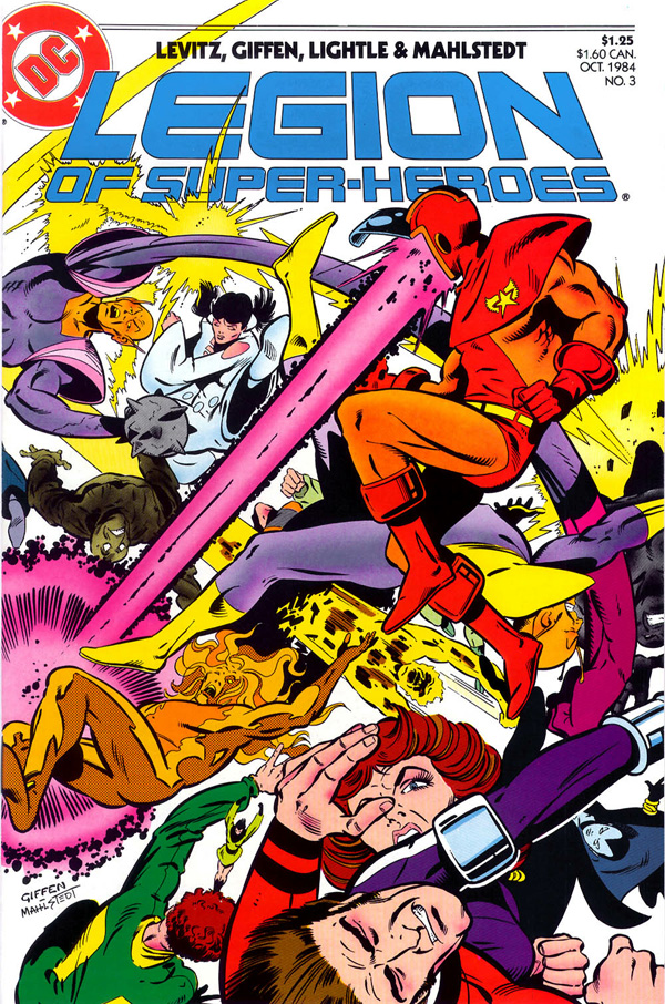
wonder why nobody does that anymore.
Keith Giffen, I adore Keith Giffen. His career is filled with brilliant ideas that don't work. He's tried everything. Most none of it works. BUT HE DID IT!
He was "co-plotter and designer" for issues #3-#5. That probably means he did breakdowns. He was assisted by Steve Lightle, who draws great robots and weird faces. Inked by Mahlstedt, whose work here raises the eternal question,
LSH v3#3
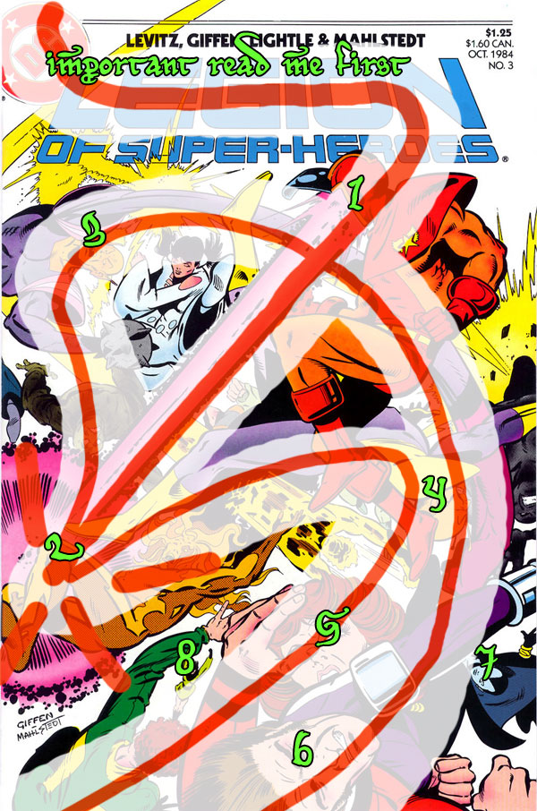
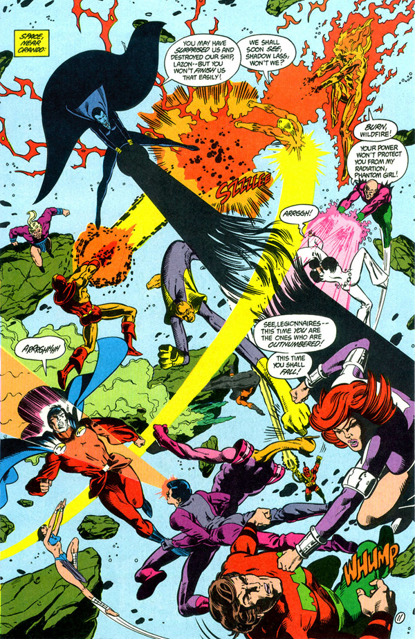
Okay, look at the composition here. Even though this is essentially a flat field in which nothing happens besides FIGHT, there is an amazing structure here.
Splash-page crowd-scene dynamics are baffling me in my own work right now, so let's take a minute to examine it.
Giffen has a page that expresses only the eternal concept of two gangs beating on each other. (It would be fun to see the original art for this)
What order does he want us to read this in?
This page is only about direction. It's about movement, and vectors, and absolutely nothing else. There is nothing in this page but things colliding against other things, right?
Not even a background. It's as if a piece of blank paper came to life and started beating the crap out of itself.
Obviously they want you to read the masthead first. You come in with the bullet, the creators and the title. This comic was sort of unusual and "prestige" in that it had the creators named on the cover.
That shade of blue in the title is never used again. By the way, did you know that the Russians have separate words for light blue and dark blue? They consider them two different colors.
Now, two things break the logo -- the yellow of Lazon, and Wildfire's head. Lazon is Yellow, and he's not the only yellow on the page, but there is only one Yellow. Yellow blends with white and yet has a tremendous urgency. So the yellow fields are used to direct the eye, and they say only one thing -- down and to the right.
Wildfire takes the more interesting path. Let us say the "story" path, though there is no particular story here. THose viewing this get a sense of urgency from it, but no sense of narrative per se. Don't get me wrong; I bet it sold well and it is a very pleasing work. But it's not the sort of thing that impresses details on the mind, you know what I'm saying? It's oddly reminiscent of the wallpaper in a child's room. Story here mostly serves to entertain the artist and get them through the assignment.
And to impress those who like to think too hard about such things.
1. ZAP. Let's start off with bright red, breaking the logo. The supersaturated magenta commands the eye to travel past the dull purple of Chameleon's leg and Phantom Girl's awkwardly drawn crotch to
2. ORANGE. The next color in the progression from red (the entire rainbow is represented on this page), and this is where it gets interesting because the direction fragments. The dynamism of the page springs from this moment. The clear path of the eye scatters at that point (echoed with tiny yellow shards ) into two paths.
3. PATH ONE. Back over Terrax (to Chameleon King. who forms the outer frame of the work, driving you over (past Phantom Girl again...}
Okay, it is time that we address the issue of phallic imagery in this piece.
Okay, it's a piece about thrusting and colliding, so you know it's gonna have some sort of phallic imagery. How could you do it otherwise? How could you draw this page in a way that didn't.
That said.
There is a fist exploding from Chameleon Boy's crotch and punching Timber Wolf in the face.
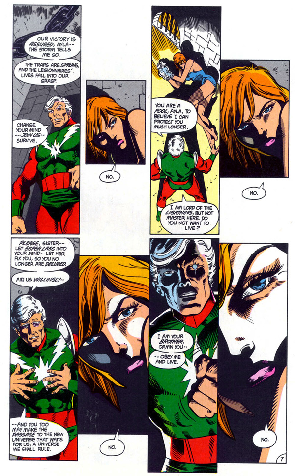
So. I don't know if I want this analysis to be about the sexual politics of 80s comics, because they were quite bad. And there's all sorts of hinkey stuff in here, there's some bondage stuff going on with Ayla right now and a bisexual tentacle rape in a couple issues... I can't decide to ignore this stuff, or laugh about it, or harrumph a lot. What do you think?
This one I think we're gonna laugh about it.
So where were me? Oh, yes. Chameleon King was menacing Phantom Girl's vagina with a mace. And also punching Chameleon Boy in such a way as to create a frame and carry you to:
4. Colors are cooling down and desaturating as we travel further away from the magenta explosion. Blok is also back here, but only colored so as to provide a bumper, a shadowed area to reinforce the movement.
5. I don't mean to imply that there are two paths here, but your eye is travelling slower by this point, and the area of attention opens up far the end. The purple bar of her arm and the look on her eyes (and remember the viewer always follows the eyes of the characters on the page) brings the entire weight of the page down on:
6. Ultra Boy, and boy does it look like it hurts. Nice jaw.
7. Shadow Girl, who does nothing on this page but produce a cool special effect for Lazon to burst (probably phallus-like) through in the center and to look pointedly down there at 6.
8. A "shadowed" area. It mostly serves as a dual convergence point, which is why it has its own, cool, color. Perhaps this area carries the most "story", as readers of the magazine would probably impute the most significance to their fight. The dual convergence there produces a not-entirely-unpleasant "wobbling" effect, as it is unclear whether she is kicking his head or springing off of it, and his body language doesn't help. But it's amply clear something's happening, so I vote this my favorite spot.
This will be important later.
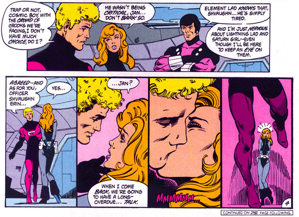
Compare and contrast with this page (from last issue):
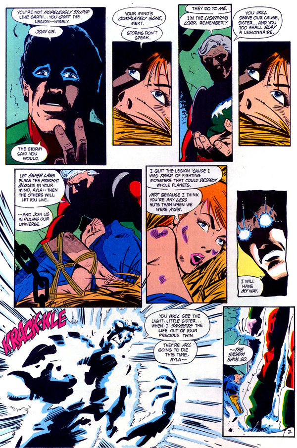
Variations on a theme. Musically, you could say last issue's was the verse and this issue's is the breakdown. I prefer the second, though Giffen's rendering has so much more appeal than Lightle's.
However, Lightle's trademark "expressionless eyes" have never been put to such fine effect. Giffen was only able to get an approximation of a steely stare by using a cut-and-paste panel*. If you could get Giffen's eyes on Mekt and Lightle's eyes on Ayla...
Which raises the question:
Mahlstedt inked them both. So we know he can draw it both ways. So why didn't he?
Neat. By the way, weird tricks with panel borders often go awry, but that one works.
I believe there are five or six pages like this in this issue. I really think there's a relationship between that and the poster. I can see why this would burn someone out.
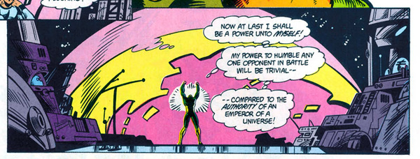
Good point. And a panel that would do Ed Wood proud. Those magenta-and-yellow spheres are important or something.
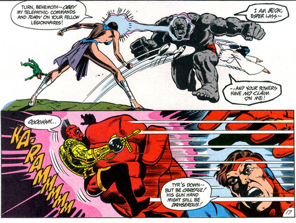
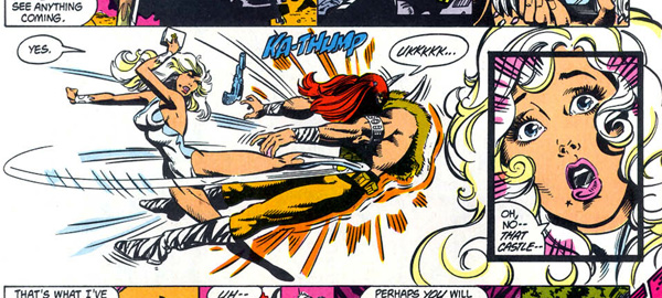
Esper Lass rockin' the Blok, followed by:
STEVE LIGHTLE'S FINEST HOUR.
If any artist can be said to have a greatest panel, it's probably this, and that's in spite of Captain Hookah-Hand there. And the awful expressions.
Okay, maybe it's just the nostalgia talking. But I remember them using that panel in an ad for the RPG, and I remember nodding and saying, good choice guys. Ya summed it up.
meh. HAW. Whuh?
I love that weird alien teleporty guy. He gets his time to shine when Joe Orlando draws him, so I dub him Sea Monkey of Space.
*back when that literally meant cutting and pasting. After a long visit to the Photostat Department, that is.