
| going_x_crazy ( @ 2008-02-20 19:52:00 |
|
|
|||
|
|
|
|
|
|
|
[018] TUTORIAL - Part Two
this is part two
go here for part one
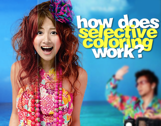
Now in Part One I explained briefly how selective coloring works. There are so many ways to use it, I thought it'd be better just to make this in a second post. Here you will find 3 examples of SC at work.
WARNING: IMAGE HEAVY
EXAMPLE #1 Ayumi Hamasaki - Calendar 2005
Okay, I have my image here, and I want to make the colors more vibrant (without going overboard). What should I do?

Well first lets just concentrate on the reds/yellows/magentas in the image. After fiddling around with those three sections only, I have this:

I like it, but now the greens and blues need to be pumped up! So I make a new SC layer. This time I'll work on the greens/cyans/blues and whites/blacks/neutrals. This is what I manage to come up with:

TADA! :D That was easy, right? Making separate SC layers makes it easier to go back and edit the coloring. Also, you can set the different layers to different opacity levels, making some stand out more than others. I like to do it this way, because then I can concentrate on one part of the image's coloring at a time.
EXAMPLE #2 Ayumi Hamasaki - misc promo

So here's my image, but it's a bit dark/dull. Before using SC, I made a levels layer. I just want to brighten it up a little bit.

Now sometimes all you really need is a levels layer (IMO), but maybe we want to make the purple backgroud pop a bit more, and brighten up Ayu's face.

Negative cyan makes the red tones lighter and softer. I used a lot of yellow to keep the face from getting too red/pink. And then negative black because we don't need the red to be that strong.

Again, I have negative cyan making the facial features even softer. I still want pink cheeks, but I don't want her to be too yellow, so we have the magenta slightly positive, and the yellow in the negative. And again, negative black to keep the yellow from being too strong.
Since there aren't really any cyans, blues, or greens in the photo, we can just skip those. Moving those sliders won't do a thing. That makes the next stop magenta.

I want a pinkish purple, so I set the cyan to negative again. If I had wanted a bluer purple, I would have made the cyan positive. Since magenta is a purpley color, we put that far up on the positive side. To make the magenta/purple more inentse, we set the black to a positive setting.

I skipped over whites and blacks, but edited the neutrals just the tiniest bit. You can hardly tell the difference, but this keeps the face from looking too washed out.
Now whenever I'm done, just to make sure I didn't get too carried away, I check back and forth between the image with the SC layer, and the image without the SC layer. I think the coloring may be just a tad too light, so I set the opacity to about 50%. (That made the purple background less... purpley, so I made a second SC layer and just edited the magentas to my linking.)
Here is the image before SC (after the levels layer), and our finished product:

EXAMPLE #3 mihimaru GT - Itsumademo Hibiku Kono melody single cover (girl=Hiroko, guy=Miyake)

Okay we start out with our image, and the coloring is nice the way it is, but I think I want something different. But what?
The littlest difference in SC layers can change the look of the entire image. Let me show you:
1)
For this version there was +cyan +magenta and +yellow for the reds and yellows. and -cyan +magenta and +yellow for the magenta. I honestly forget how I got the ocean that color, but its something between versions two and three. I also used -black for neutrals, to keep it from getting too bright.
2)
Now, this version is very red/yellow. I used -cyan -magenta and +yellow for both yellow and red. I also used -cyan +magenta and +yellow for the magenta section. To get that blue of an ocean, I used +cyan +magenta and -yellow for the cyans and blues.
3)
Finally, for this version, I used a lot of -cyan and +magenta for the red/yellow/magenta sections. Ah, and see how the ocean is a pretty sea green, while the sky is blue? I used +cyan -magenta and +yellow for the green, +cyan -magenta and -yellow for the cyan, and +cyan +magenta and -yellow for the blue.
So as you have hopefully learned, Selective Coloring can be fun and helpful if you know what you are doing. Hopefully this tutorial will help you NOT make people that look like they have a skin disease, or make my eyes bleed. Its outcomes like that, that make people hate SC. DX
this is part two
go here for part one
Now in Part One I explained briefly how selective coloring works. There are so many ways to use it, I thought it'd be better just to make this in a second post. Here you will find 3 examples of SC at work.
WARNING: IMAGE HEAVY
EXAMPLE #1 Ayumi Hamasaki - Calendar 2005
Okay, I have my image here, and I want to make the colors more vibrant (without going overboard). What should I do?
Well first lets just concentrate on the reds/yellows/magentas in the image. After fiddling around with those three sections only, I have this:
I like it, but now the greens and blues need to be pumped up! So I make a new SC layer. This time I'll work on the greens/cyans/blues and whites/blacks/neutrals. This is what I manage to come up with:
TADA! :D That was easy, right? Making separate SC layers makes it easier to go back and edit the coloring. Also, you can set the different layers to different opacity levels, making some stand out more than others. I like to do it this way, because then I can concentrate on one part of the image's coloring at a time.
EXAMPLE #2 Ayumi Hamasaki - misc promo
So here's my image, but it's a bit dark/dull. Before using SC, I made a levels layer. I just want to brighten it up a little bit.
Now sometimes all you really need is a levels layer (IMO), but maybe we want to make the purple backgroud pop a bit more, and brighten up Ayu's face.
Negative cyan makes the red tones lighter and softer. I used a lot of yellow to keep the face from getting too red/pink. And then negative black because we don't need the red to be that strong.
Again, I have negative cyan making the facial features even softer. I still want pink cheeks, but I don't want her to be too yellow, so we have the magenta slightly positive, and the yellow in the negative. And again, negative black to keep the yellow from being too strong.
Since there aren't really any cyans, blues, or greens in the photo, we can just skip those. Moving those sliders won't do a thing. That makes the next stop magenta.
I want a pinkish purple, so I set the cyan to negative again. If I had wanted a bluer purple, I would have made the cyan positive. Since magenta is a purpley color, we put that far up on the positive side. To make the magenta/purple more inentse, we set the black to a positive setting.
I skipped over whites and blacks, but edited the neutrals just the tiniest bit. You can hardly tell the difference, but this keeps the face from looking too washed out.
Now whenever I'm done, just to make sure I didn't get too carried away, I check back and forth between the image with the SC layer, and the image without the SC layer. I think the coloring may be just a tad too light, so I set the opacity to about 50%. (That made the purple background less... purpley, so I made a second SC layer and just edited the magentas to my linking.)
Here is the image before SC (after the levels layer), and our finished product:
EXAMPLE #3 mihimaru GT - Itsumademo Hibiku Kono melody single cover (girl=Hiroko, guy=Miyake)
Okay we start out with our image, and the coloring is nice the way it is, but I think I want something different. But what?
The littlest difference in SC layers can change the look of the entire image. Let me show you:
1)
For this version there was +cyan +magenta and +yellow for the reds and yellows. and -cyan +magenta and +yellow for the magenta. I honestly forget how I got the ocean that color, but its something between versions two and three. I also used -black for neutrals, to keep it from getting too bright.
2)
Now, this version is very red/yellow. I used -cyan -magenta and +yellow for both yellow and red. I also used -cyan +magenta and +yellow for the magenta section. To get that blue of an ocean, I used +cyan +magenta and -yellow for the cyans and blues.
3)
Finally, for this version, I used a lot of -cyan and +magenta for the red/yellow/magenta sections. Ah, and see how the ocean is a pretty sea green, while the sky is blue? I used +cyan -magenta and +yellow for the green, +cyan -magenta and -yellow for the cyan, and +cyan +magenta and -yellow for the blue.
So as you have hopefully learned, Selective Coloring can be fun and helpful if you know what you are doing. Hopefully this tutorial will help you NOT make people that look like they have a skin disease, or make my eyes bleed. Its outcomes like that, that make people hate SC. DX