| Simon Blackquill ( @ 2017-07-16 12:27:00 |
|
|
|||
|
|
|
|
|
|
|
So, who wants to see more of my old photoshop work? lmao I don't even have a working photoshop installation on any of my computers any more, I was always impatient waiting for that program to boot up and sai boots instantly THEN I discovered FireAlpaca. There was a free [legal] distribution of photoshop cs2 a few years back, I'll try to redownload that sometime and if I can I'll post the link here. But it was legit, it was on my old computer.
And as we all know by now, Photobucket shat the bed, so I've gone and reuploaded all my old graphics I hosted on there.
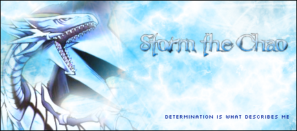
This was the very first thing I did in Photoshop and it wasn't even for myself. I looked up like five different tutorials to do this.

Actually, let me post some shit from before I got Photoshop some more. This was for Wave, I can't believe how much she liked this lmao
I HATE HOW JPEGGED THIS ONE GOT, HOW DID THAT EVEN HAPPEN.

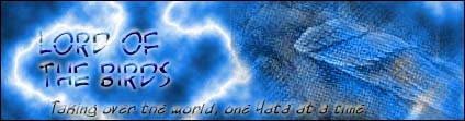
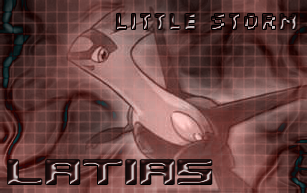
Surely I was capable of better than this at this point
This was for one of my own sock puppet accounts I talked about here. The easiest way to hide the fact that I made the signature was to just have the sock puppet request one from me. :V
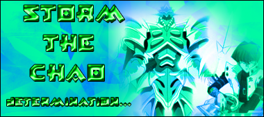
Now onto actual photoshop shit. I'm not posting ALL the old images, but there's definitely some early work here
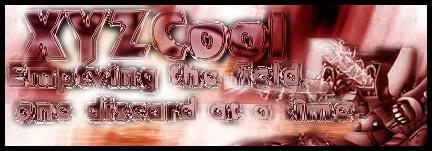
A thing I did early on was make a bunch of meaningless edits nobody would intend on using for anything. It was more or less practice with brushing, filters, and blending since the text on all of them is the same


For an affiliate forum. Readable text & text blending were my weaknesses for a long damn time.

Undertale joke
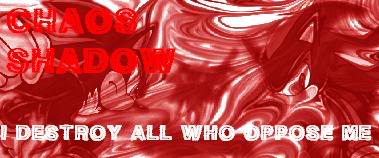
This was requested to be hard to read so I think I did ok lmao

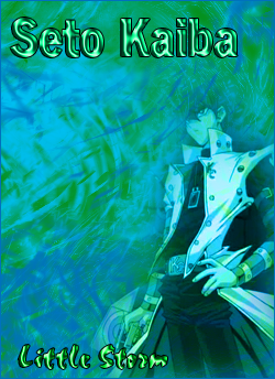
See I hate that this looks so good still but the text is so awful
This one didn't look so bad if you don't look at the beheaded yata-garasu over there

More Undertale jokes

When we'd try to squeeze as many images into a signature as possible before figuring out that gave horrible results

An improvement of the previous

I still kinda like this one but what if I sharpen it...

Looks even better.

That time MD made me their graphic designer

Improvements are slow but they're definitely taking place and I think this is good evidence of it. More things done right, a few things done badly or could use improvement.


I didn't really "get" icons/avatars for a while and generally mine only looked decent for a long time only when they were made to match a sig
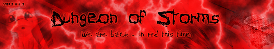
I've got over 400 images in this folder. There will be more posts like this.
EDIT: Since the urls broke I'm editing the post with the icons I made in the first comment you'll see on this entry