
| Sara ( @ 2007-08-13 00:10:00 |
|
|
|||
|
|
|
|
|
|
|
| Entry tags: | tutorial |
Tutorial: OotP Hermione
Tutorial: OotP Hermione
Going from  to
to ![]() using PS CS2.
using PS CS2.
Not translatable – uses selective coloring. Sorry PSP users!
First; find the picture that you want to use for your icon. I am using one of the OotP promo shots of Hermione. This picture came from the Leaky Cauldron.
Got that? Good.
Now; crop your picture to however you want.
I chose to crop it like this:
Since this is a little soft for my tastes and I want the details to stand out, I sharpened this picture once. Filter > Sharpen > Sharpen.
Mine looks like this: 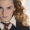
See the difference?
Add a Selective Color Layer. Layer > New Adjustment Layer > Selective Color
Normally, I just play around with the settings until I find the coloring I like. For this icon; I went with the following:
Red: -78, 0, +53, 0
Yellow: +82, 0, -90, 0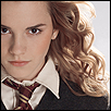
Not much change, huh?
Add another Selective Color layer, with these settings:
Red: -78, 0, +53, 0
Yellow: +82, 0, -90, 0
Neutrals: +19, 0, -26, 0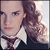
We’re getting somewhere now.
Duplicate the last Selective color layer. Set that to Soft Light and 100%
It’ll look something like: 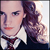
Add a Color Balance Layer. Layers > New Adjustment Layer > Color Balance. These are the setting for each tone balance.
Midtones: -34, +74, 0
Highlights: +8, +16, -14
Shadows: -13, -29, 0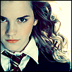
Nice coloring, right? We’re almost there.
Add a Hue/Saturation layer; Layer > New Adjustment Layer > Hue/Saturation.
Settings:
Master:
-Saturation +17
-Lightness +20
Pretty!
Since I wanted to make this icon pop a little more than just coloring the picture, I added a bit of text. I chose the font Elisha at 18pt and setting Sharp. The color I chose was # fae7d0. 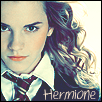
Put the text on a new layer so you can move it about or delete without messing up your image. 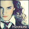
Since I thought the text was a bit on the light side, I duplicated my text layer and it darkened right up. Perfect!
Last step: Optional.
I thought that the icon was a little boring before the text, so I wanted to add a texture to it. Just for fun.
Choosing a texture from ![]() colorfilter, paste the texture onto a new layer.
colorfilter, paste the texture onto a new layer. 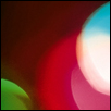
texture
Rotate the texture as needed to suit your icon and where you want the color to be on the icon. As you can see from the original texture, I rotated mine 180°.
Easy way to rotate textures:
-Take the rectangle marquee tool and drag it across the texture.
-Right click on the texture and hit “Free Transform”, and then right click again for rotate options.
-Choose the option for whichever you’d like to use.
Once you’ve got the texture wherever you want it, and pasted onto a new layer above the rest of your layers, it’s time to play with the settings a bit more. 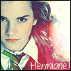
I chose to put my layer set to Lighten. That way, you can still see the subject of the icon and get a hint of color as well.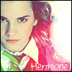
To brighten up the icon more, I duplicated the texture layer and set it to Screen.
That’s it! You’re done. And you’ve got a beautiful icon from all that. I hope you learned something today.
Questions? Please ask and I’ll try to help.